How to Create a Daily DFS Projections Report using Power BI

In this Tutorial
We'll show you how to use the Average DFS Score to create a report in Power BI.
By creating this report, we'll answer four questions:
- What players have the best Average DFS Score?
- What positions have the best Average DFS Score?
- How do the major DFS platforms compare for daily projections scores?
- What's the relationship between the Average DFS Score and common hockey statistics?
Getting the Data and Power BI Report
For this tutorial, you can find the data and report links below:
- Snapshot of Average DFS Scores with Sample of Hockey Stats
- Daily Refresh of Average DFS Scores with Broader Set of Hockey Stats
- Sample Power BI Report
For the sample Power BI report, you may also want to leverage the two background designs we created:
Creating the Power BI Report
This walkthrough consists of three steps:
- Download and review the dataset
- Design the background and structure for the report
- Create the report tabs
Download and Review the Dataset
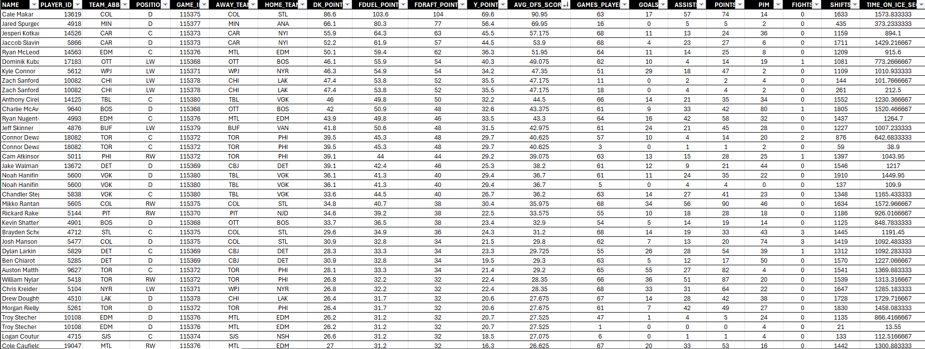
The datasets are a daily pull of DFS Projections data, which include the four DFS platforms mentioned earlier. We run the pull against our data provider and then calculate the Average DFS Score on the fly. In the resulting dataset, you'll find players and game data and hockey statistics for those players and teams playing the day the data is pulled.
When you download the first dataset listed in the previous section, you'll find player and team metadata, DFS Projection Scores from the four major DFS platforms and a sample of hockey statistics.
To explore the dataset:
- Download a dataset and save locally.
- Open it in your preferred spreadsheet program (you should see something similar to the below).
- Inspect the data in each of the columns from left to right.
The player and team metadata represents the following:
- Player Name, Player ID, Team Abbreviation, Position, Game ID, Away Team Abbreviation and Home Team Abbreviation.
The DFS Projections Scores represent the following:
- DraftKing, FanDuel, FanDraft, Yahoo, and the Average DFS Score across all of them.
The sample of hockey stats represent the following:
- Games Played, Goals, Assists, Points, PIM, Fights, Shifts, and Time on Ice (in seconds)
Be sure to understand the data and begin to think about ways that the hockey statistics might relate in some way to the Average DFS Score.
Design the Report
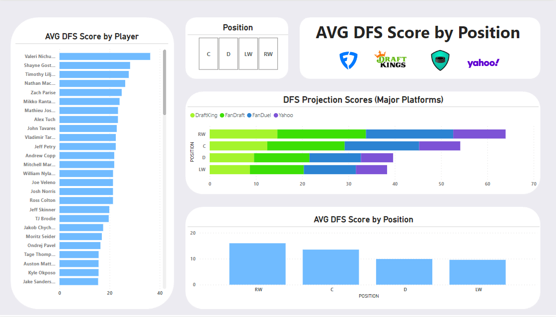
The Power BI report will have two tabs. The first tab will feature Players and enable you to filter by Position. To create a simple design with some structure, we created a canvas background design using PowerPoint.
When you create the Power BI report, you can load the background image and then create your report. The design has five controls: Player Bar chart, Position Slicer, Title, Stacked bar chart, and Stacked column chart.

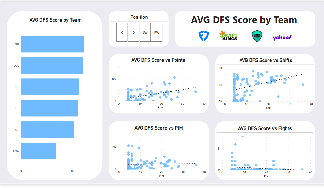
The second tab will explore the relationship between different hockey statistics and the Average DFS Score, so has seven controls: Team Bar chart, Position Slicer, Title, and four Scatter charts.

Now that you've got the design backgrounds completed, let's move onto creating the two tabs that will make up the DFS Projections report.
Create the Report Tabs
The first step to create the report tabs is to import the data. If you've created a Power BI report before, then you're an old pro at this. For those that haven't done this:
- Open Power BI.
- Click Get Data, Text/CSV and navigate to the dataset you downloaded earlier.
- Select the file you want to import and click Open and then Load.
The data should now be in the Power BI Data pane and ready for you to use for your report building.
The DFS Projections report comprises two tabs, one to view DFS Projections Scores by Player and Position, and the second tab to explore statistical relationships by Team and Position.
To create the first report tab:
- Add a Clustered bar chart to the left-hand side of the canvas. From the Data pane, drag NAME to the Y-axis and AVG_DFS_SCORE (set to Average) to the X-axis.
- Add a Slicer control to the upper middle control. Drag POSITION to the Value field.
- Click Add a text box to your report and type in a title for your report.
- Add a Stacked bar chart to the area below the title. Drag POSITION to the Y-axis and DK_POINTS, FDUEL_POINTS, FDRAFT_POINTS, and Y_POINTS to the X-axis.
- Add a Stacked column chart to the last open area. Drag POSITION to the X-axis and AVG_DFS_SCORE to the Y-axis.
Take some time to clean up the titles, colors, style and size of the controls (to make sure they fit the background design). When done, you should have something similar to the below.
To create the second report tab:
- Add a Clustered bar chart to the left-hand side of the canvas. From the Data pane, drag TEAM to the Y-axis and AVG_DFS_SCORE (set to Average) to the X-axis.
- Add a Slicer control to the upper middle control. Drag POSITION to the Value field.
- Click Add a text box to your report and type in a title for your report. (Here again, we inserted the DFS platform logos.)
- Add four Scatter charts to each of the four remaining areas. The X-axis for each of these should be AVG_DFS_SCORE. The Y-axis for each should be set as follows the others: POINTS, SHIFTS, PIM, and FIGHTS.
Similar to the first report, spend a bit of time cleaning up the visualizations and design. You should now have something similar to the below.
If you were able to complete the above, nice work! The next step is to spend some time exploring the two report tabs. After you're familiar with them, go ahead and edit the report to explore different statistical relationships or change out the left-hand charts to be another pivot.
For a more interactive tutorial, check out the following quick-hit walkthrough on YouTube.
Summary
In this tutorial, we used a metric we created in an earlier newsletter called Average DFS Score (or Average DFS Projections Score) to create a DFS Projections Report. For this tutorial, we walked you through how to create the report using a static snapshot of data. But you can also use a Web-based data source that gives you the latest Projections Scores.
The goal of the report is to allow you to make decisions about your DFS picks. You can pivot by player, team, position or explore the nature of the relationships across different hockey statistics to see what might impact your own DFS selections in and around game day.
Subscribe to our newsletter to get the latest and greatest content on all things hockey analytics!
Member discussion