Creating a Playoff Preview Metric and Dashboard to Gauge Team Performance

In this Edition
- The Playoffs are Almost Here!
- What is the Playoff Preview Metric?
- Why the Z-Score?
- Visualizing the PPM
The Playoffs are Almost Here!
Amazingly, the 2023-2024 NHL Regular season will close in a couple of weeks, after which the top 16 teams will start the real grind. And as we get close, we're already starting to see playoff preview and prognostication posts on who'll take the cup.
Now if you're like us data nerds, you may find yourself in playoff analysis Crazytown, looking at all of the different raw and calculated statistics across the competing teams, divisions and conferences, evaluating players, and the like. However, for this edition we wanted to offer a more aggregated way to compare teams for the playoffs and in the process introduce you to the Z-Score.
So, for this edition we created a composite metric called the Playoff Preview Metric, which creates a single, aggregated statistic that combines different areas of team play. In this edition, we'll walk you through this metric, talk through why the Z-Score was used (and how it can be used elsewhere) and walk through two example reports you can build using Z-Scores and the Playoff Preview Metric.
So, let's get started!
What is the Playoff Preview Metric?
The Playoff Preview Metric (PPM) is a composite statistical measure designed to evaluate the effectiveness and potential of a hockey team. It integrates three aspects of team performance – offense, defense, and goaltending – into a single score. It doesn't consider every hockey statistic, so you could integrate more statistics into each of the three dimensions if you wanted. For example, for offense we used Goals For, Power Play Percentage and Shots For. For defense we used Goals Against, Penalty Kill Percentage and Shots Against. And for goaltending, we used GAA and Save Percentage.
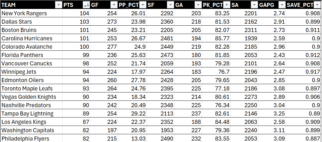
To calculate the PPM, you need to have the latest stats for each of the teams. For example, when we took a snapshot of the data, we had a summary view of the stats as follows. (Note that we sorted here on Points (PTS) from largest to smallest and trimmed the view for what would be the top 16 teams on that day.)
The PPM is calculated by first aggregating normalized scores within each category and then assigning specific weightings to the three categories, reflecting their relative importance in contributing to playoff success. Offense was weighted at 50%, defense at 30% and goaltending at 20%. You could choose to weight the categories differently. The resulting score provides a single metric through which one can measure and rank playoff teams. Here is the specific calculation for the PPM Score:
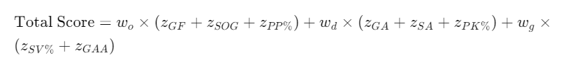
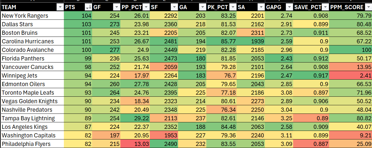
Below, you can see the resulting aggregated score (PPM_SCORE) mapped to the sorted list (by PTS). You can now get a sense for how a team might perform in the playoffs – combining their offense, defense and goaltending.
When you abstract a set of statistics into a single metric, you run the risk of introducing bias into the aggregated metric. For example, you might dilute the importance of discrete statistics, assign the wrong weightings to categories or statistics or you might inadvertently exclude relevant statistics. So, test out different combinations and be sure to note your assumptions and where your aggregated metric might be biased.
To make sense out the PPM Scores, we can explore the statistics we chose across offense, defense and goaltending. For example, Winnipeg Jets had a net PPM Score of 2.41, leaving them in the lowest spot out of this top 16 cohort. According to their statistics, they had the second-weakest power play, worst penalty kill, and less-then-stellar shots against. These all could be significant factors when it comes to tighter playoff play. Does that mean they are the worst option across these teams? Potentially not, but as you think about creating your own metrics be sure to evaluate how team or player statistics ladder into an aggregate metric so you can frame and use it properly and get some use out of it.
Below are a few more details about the PPM (or any aggregated score that you build similarly from raw or calculated hockey statistics):
- Multi-Dimensional Analysis: PPM combines statistics from different areas of the game, such as goals scored, goals against, special teams performance, and goaltender efficiency, to capture the team's overall ability. You can add/remove statistics per your liking and need.
- Weighted Components: Each aspect of the game is weighted according to its strategic importance in achieving playoff success. For example, goaltending might be more heavily weighted if historical data suggests it has a larger impact on winning playoff games. Changing the weighting will impact the value of the final PPM Score.
- Standardized Scores: The use of standardized scores (like Z-Scores) ensures that different performance metrics, which may have different scales and ranges, are comparable and can be combined meaningfully.
- Normalization: The final composite score is normalized to a scale between 0 and 100 to facilitate easy comparison between teams.
One important aspect of PPM – and any aggregated or multi-stat metric – is that each metric is measured across different scales. For example, Goals For is a total value whereas Power Play Percent is a percent. So, while we normalized the final PPM metric to sit between 0 and 1, there is a process of standardizing the statistics before we normalize. To do this, we used the Z-Score.
Let's explore the Z-Score in more detail.
Why the Z-Score?
A Z-Score measures how many standard deviations above or below the mean a data point is. Z-Scores are a useful for normalizing different hockey stats because they help to standardize diverse metrics onto a common scale. This is useful when comparing metrics that have different units or scales of measurement. A positive Z-Score says the data point is above average. A negative Z-Score says the data point is below average.
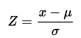
The formula for calculating the Z-Score is as follows:
A formula can be somewhat abstract, so the below image shows a normal distribution and is a useful diagram to show where the standard deviations and Z-Scores line up against a normal distribution. The dotted lines show the standard deviations moving positively or negatively away from the mean. The percentages at the top of the normal distribution represent the size of the sample within which that standard deviation falls. So, for example, a Z-Score between -1 and 1 falls within 68.26% of the sample.
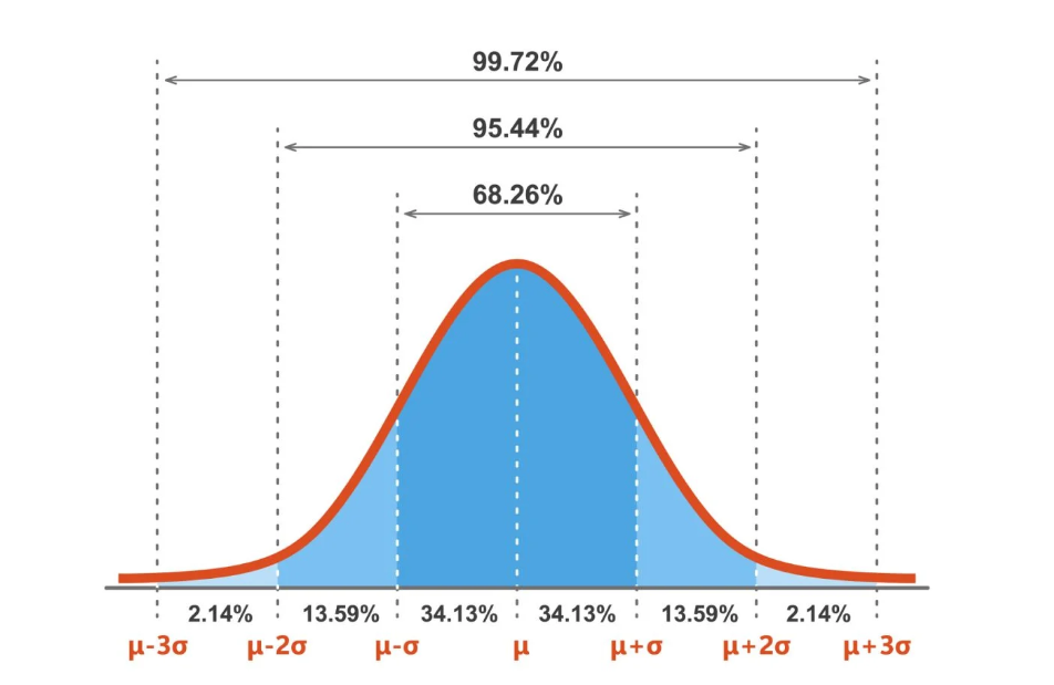
The percentages along the bottom of the distribution show the amount that each standard deviation represents – so data falling between a Z-Score of 1 to 2 represents 13.59% of the sample and a z-score between 2 to 3 represents 2.14%. In short, the higher or lower the Z-Score the more of an outlier that data point is and by virtue of the distribution curve, the less representative of the sample that data point is.
Why Z-Scores Are Useful
- Standardization: Z-Scores transform data from different scales into a standard scale with a mean of 0 and a standard deviation of 1. This allows for direct comparison across various statistics, like goals for, shots on goal, save percentage, etc.
- Relative Performance: They indicate how many standard deviations a value is from the mean, providing a clear picture of how a team or player performs relative to the average.
- Identification of Outliers: Z-Scores make it easier to identify outliers, as values far from 0 (e.g., greater than 2 or less than -2) are typically considered unusual or noteworthy.
Pros of Using Z-Scores
Example pros of using Z-Scores are:
- Comparability: Enables comparison of statistics across different types and scales, making it possible to aggregate diverse metrics into a single score.
- Normalization: Facilitates the combination of variables into a composite index by normalizing the data, thus mitigating the effects of large variances in the raw data.
- Flexibility: Can be used for many types of data and is applicable to various statistical analyses, including performance evaluation and anomaly detection.
Cons of Using Z-Scores
Example cons of using Z-Scores are:
- Sensitivity to Outliers: Z-Scores are highly sensitive to outliers. A few extreme values can skew the mean and standard deviation, affecting the Z-Scores of all observations.
- Assumption of Normality: The interpretation of Z-Scores as being "standard deviations away from the mean" assumes that the data follows a normal distribution. For datasets that deviate significantly from normality, Z-Scores might not provide the most accurate reflection of relative standing.
- Loss of Original Units: Converting to Z-Scores means losing the original units of measurement, which can sometimes make the results less intuitive to interpret for those familiar with the original metrics.
In summary, Z-Scores are a powerful tool for normalizing and comparing different statistical measures, but they must be used with an understanding of their limitations, especially regarding the distribution of the data and the presence of outliers.
Visualizing the PPM
In our final section this week, we'll explore how to visualize the PPM metric.
We'll first filter out the 16 teams (for the day we drew the sample) and then 1) take one of the Z-Scores and plot it to show where each team falls and 2) create a 1-page PPM Report using Power BI.
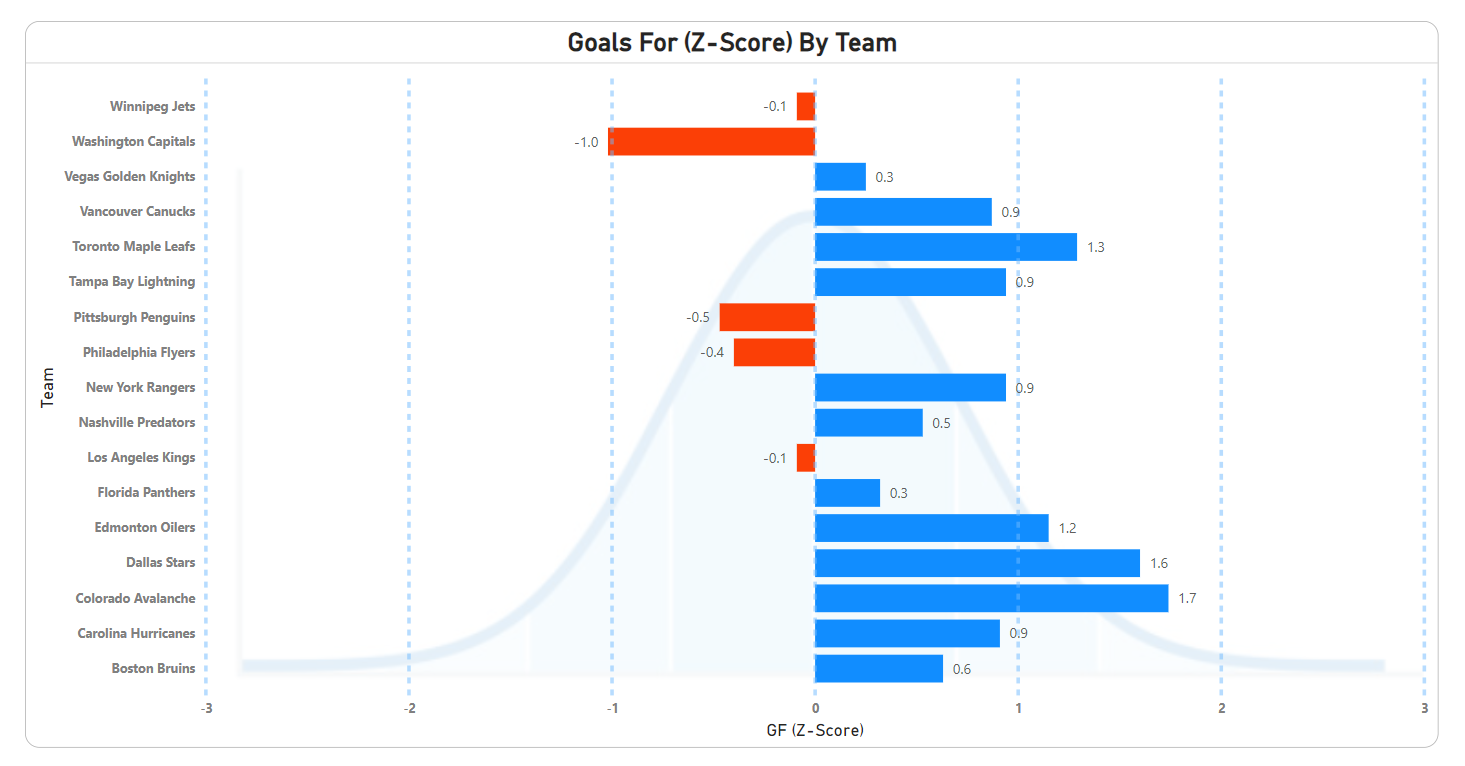
Visualizing Z-Scores
The first visualization we'll create is using a Bar chart in Power BI. The goal of this report is to show you the Z-Scores of a specific hockey statistic, in this case Goals For. This view will show you:
- The Z-Scores illustrated against a normal distribution.
- The nature of where teams are distributed for the Goals For statistic.
- If there are any outliers – either positive or negative.
To create this chart:
- Open Power BI and import the dataset.
- Add a Clustered bar chart to the Power BI canvas.
- Add TEAM to the Y-axis and Z_GF to the X-axis.
- Click the Filters pane and filter the TEAM records to the 16 in our playoff cohort.
- Optionally:
- Add an image to the background of the chart. You can use the image we created here. To do this, click the Clustered bar chart. Click the Format your visual icon in the Visualizations pane and then in the Plot area background browse to the above image, click Open and then select Fill.
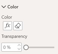
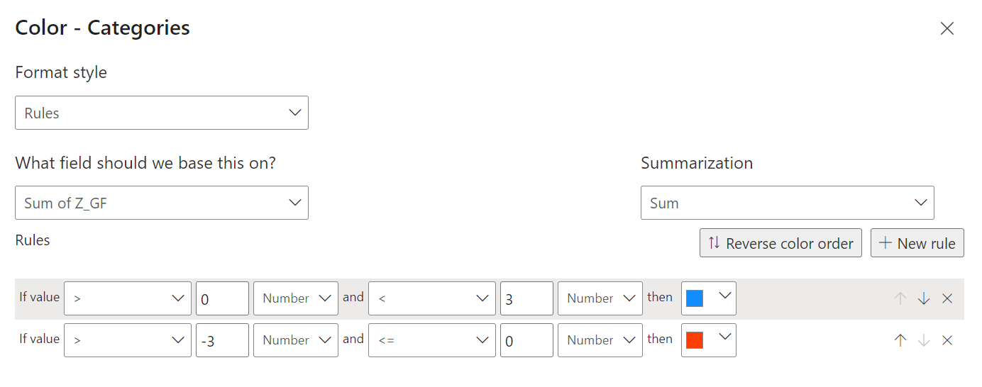
- Add conditional formatting to the bars – different colors for positive vs negative values. Click the function button under Color to configure.
- See below for the options to configure.
- Add horizontal constant lines at each standard deviation from the mean (representing the Z-Score values).
After you complete the above steps, you should have something similar to the below. With this visualization, you can see the potential outliers, positive vs negative Z-Scores, location of Z-Scores against the distribution, and what teams may have the potential for a better Goals For statistic.
Let's now move onto to using the PPM score in a Power BI report.
PPM Report
The final section describes a PPM Report, which features the Total PPM for the 16 teams we've been running throughout this edition.
You can continue to use the Power BI file/report you created in the previous section by adding a new tab. The new tab (the report) will be a 1-page report made up up three controls:
- A Slicer control to act as the filter for the teams
- A Clustered column chart, showing the Total PPM for each of the teams
- A Line and stacked column chart, showing Total PPM vs Goals For
The page also uses a custom background design, which we've uploaded here.
To map data to each of the controls:
- In the Slicer control, drag TEAM onto Field.
- In the Clustered column chart, drag TEAM to the X-axis and TOT_SCORE to the Y-axis.
- In the Line and stacked column chart, drag TEAM to the X-axis, TOT_SCORE to the Y-Axis and GF to the Line y-axis.
After you do this (and with a touch of formatting), you should have something similar to the below. Explore the report to see how your favorite teams in the playoffs might fare against one another!
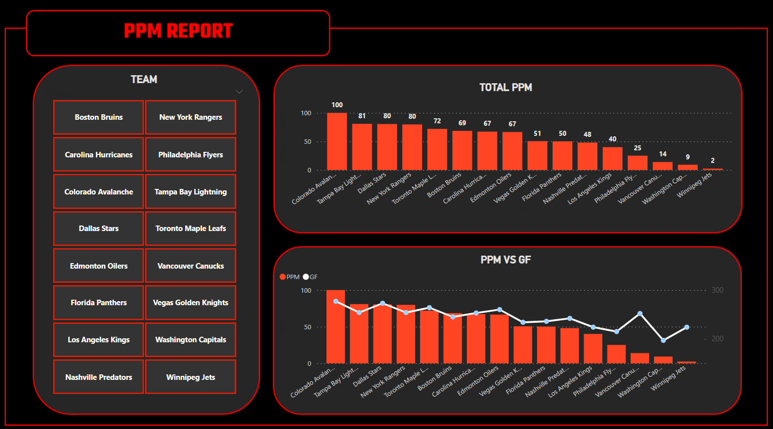
Be sure to explore different combinations of statistics and charts to create your own 1-page PPM Report.
Check out our quick-hit video tutorial on YouTube:
Summary
In this edition, we introduced you to a new, composite metric called the Playoff Preview Metric (PPM). PPM integrates offensive, defensive and goaltending statistics into a single metric. It does this by using the Z-Score to normalize each of the statistics, applying a weighting to each category and then normalizing the total PPM into a 0 to 1 score. The PPM can be used as a template for you to create your own composite metrics, but be sure to note any biases or integrity issues with your composite metric (e.g., missing statistics, over-/under-weighting, etc.).
We then reviewed the Z-Score in more detail. The Z-Score is a useful statistic to normalize different scales into a single scale that measures the distance from the mean. For PPM, we had total counts and percentages, so the Z-Score helped standardize these into one scale. Be aware of the pros and cons of using the Z-Score.
And lastly, we built two reports in Power BI. The first illustrated the Z-Scores of Goals For by plotting them using a Bar chart. This was useful to see outliers or differences across the sixteen teams. While we only did Goals For, it's an interesting exercise to plot all Z-Scores and see where specific teams may run strong or weak. And the last chart was a 1-page report for the PPM Score.
Subscribe to our newsletter to get the latest and greatest content on all things hockey analytics!
Member discussion