Chart 10: Multi-Line Plot to Compare Players

Creating a Multi-Line Plot using R & RStudio
In this tutorial, we'll create a multi-line plot to compare the performance of the top players across three seasons.
The question we'll be answering is: Who are the top point-producing players across the last three seasons?
What is a Multi-Line Plot?
A multi-line plot is a type of line chart that displays multiple data series, each represented by a different line, allowing for direct comparison across different groups or categories over time.
In a multi-line plot, expect to find multiple lines that represent a different category (e.g., players, teams, stock prices), an X axis representing time and a Y axis representing the variable being measured. The multi-line plot is useful for showing trends, patterns, and comparisons.
For hockey analytics, there are different use cases for a multi-line plot, such as:
- Compare player performance over time (e.g., goals, points, assists per season).
- Track team win percentages across seasons.
- Analyze expected vs. actual performance metrics (e.g., xG vs. goals in soccer/hockey).
Within these use cases, a multi-line plot is a great way to:
- Identify patterns and trends across multiple categories.
- Compare different groups or entities on the same scale.
- Detect anomalies or unusual spikes in data.
- Make data-driven decisions by spotting divergences in performance.
Getting the Resource Files
The resource files for this tutorial can be found below:
You'll need Excel and R/RStudio in this tutorial.
Let's get started!
Step 1: Download the Data
For this tutorial, download the data shown in the previous section into a new folder you create locally.
Step 2: Load the Data & Create the Visualization
The next step is to load the data and create the multi-line plot (we've already cleaned the data). You'll use R and RStudio to do this.
To load and transform the data:
- Open RStudio and create a new project in an existing folder (use the folder you created above).
- Create a new file for the project. (We use Markdown files so we can re-use the file for application documentation.)
- Add the following application code to the R Markdown file.
The first code snippet is the declaration of the libraries you'll need for this R application. We'll use the ggplot2 and RColorBrewer libraries for plotting and to configure the plot colors.
library(ggplot2)
library(RColorBrewer)
This next code snippet load the data frame from the external CSV, and then recasts the seasons as factors.
top_player_df <- read.csv("top_ten_players_v2.csv")

top_player_df$Season <- factor(top_player_df$Season, levels = c("2021_2022", "2022_2023", "2023_2024"))
This next code snippet is used for specifying the colors in the plot. Instead of manually specifying colors, the colorRampPalette() function dynamically generates enough colors based on the variable num_players. We will use RColorBrewer’s "Set1" color palette, which is visually distinct and readable.
num_players <- length(unique(top_player_df$Player))
palette_colors <- colorRampPalette(brewer.pal(9, "Set1"))(num_players)
The final code snippet plots the multi-line plot, using various configurations. You should feel free to tweak the configuration of the plot to your liking. Lastly, it prints out the plot and then saves it as a PNG file.
player_plot = ggplot(top_player_df, aes(x = Season, y = PTS, group = Player, color = Player)) +
  geom_line(size = 1.2, alpha = 0.8) +
  geom_point(size = 4, shape = 21, fill = "white", stroke = 1) +
  labs(
    title = "Top 10 Players' Points Across Seasons",
    subtitle = "A visualization of player performance over time",
    x = "Season",
    y = "Points (PTS)",
    color = "Player"
  ) +
  theme_minimal(base_size = 14) +
  theme(
    plot.title = element_text(hjust = 0.5, face = "bold", size = 18),
    plot.subtitle = element_text(hjust = 0.5, size = 14, color = "gray40"),
    axis.text.x = element_text(angle = 45, hjust = 1, size = 12),
    axis.text.y = element_text(size = 12),
    axis.title = element_text(face = "bold"),
    legend.position = "right",
    legend.title = element_text(face = "bold"),
    panel.grid.major = element_line(color = "gray80", linetype = "dotted"),
    panel.grid.minor = element_blank()
  ) +
  scale_color_manual(values = palette_colors) +
  scale_x_discrete(expand = expansion(mult = c(0.05, 0.05))) +
  scale_y_continuous(expand = expansion(mult = c(0.05, 0.05)))

player_plot

ggsave("player_points_plot.png", plot = player_plot, width = 10, height = 6, dpi = 300)
The result of the above R code is the below multi-line chart. You can use the chart to view the degree to which players improve their point production across the three seasons worth of data.
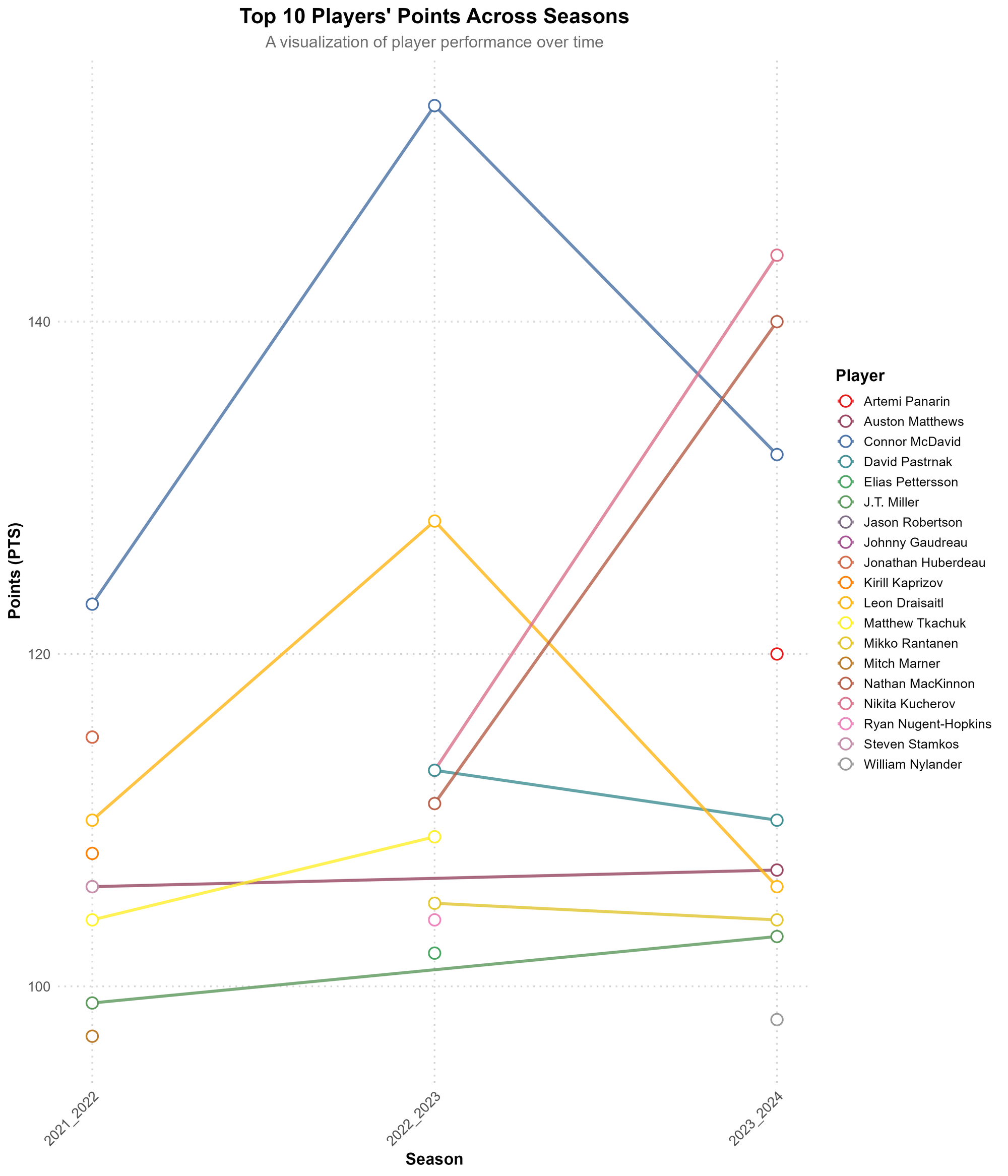
Note that the above chart has some players who only appear once in the top ten players across the three seasons of data. So, you can remove players where there is just one season's worth of data to only have trending players. The following R script shows you how to do this.
library(dplyr)

filtered_df <- top_player_df %>%
  group_by(Player) %>%
  filter(n_distinct(Season) >= 2) %>%
  ungroup()
If you do this, the following is the result of the multi-line plot. It's a bit cleaner with only those players with two or more years in the trending.
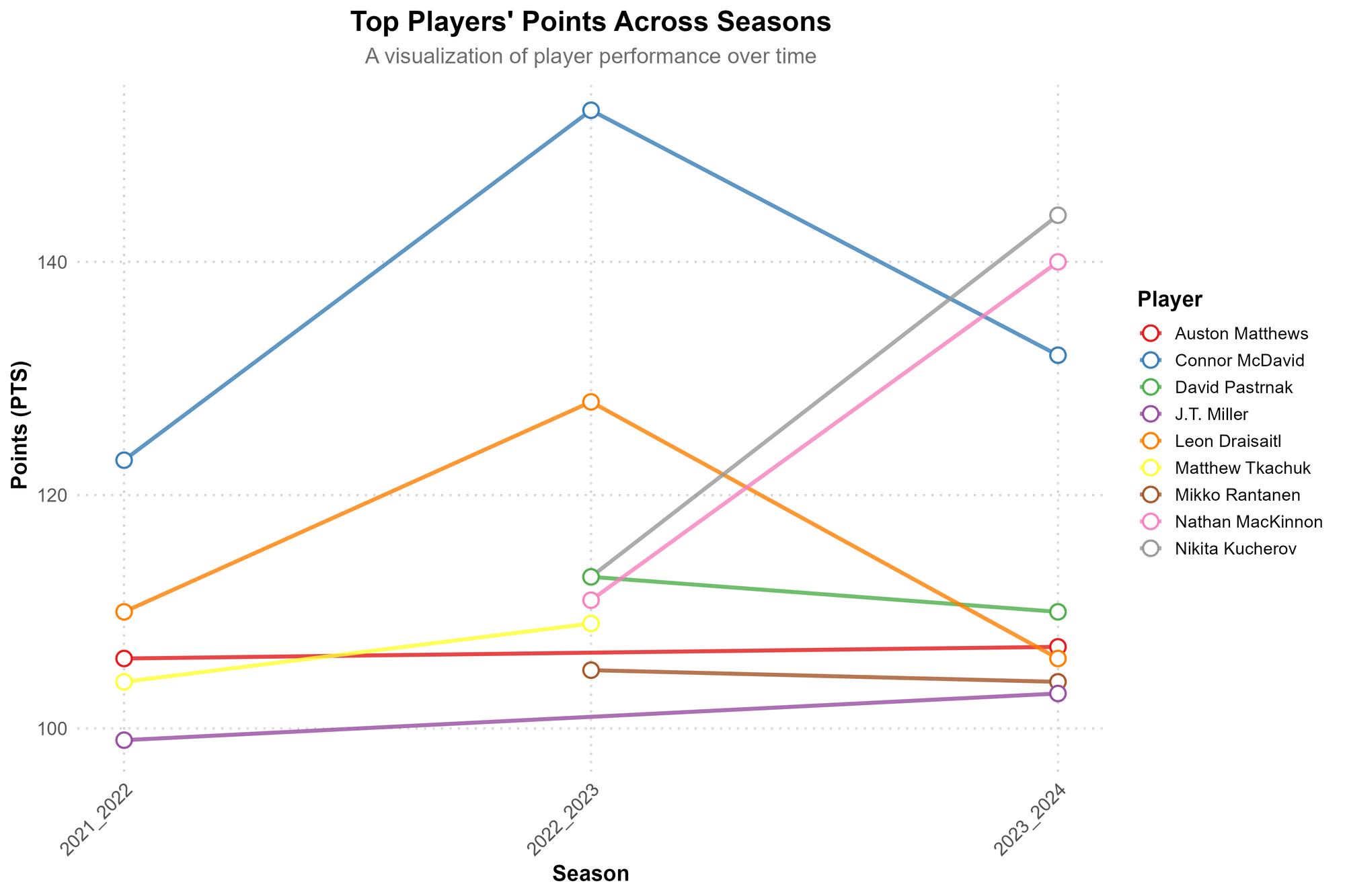
With this chart, it's more clear who the top-trending players are for point production and the nature of their trend: Nathan MacKinnon and Nikita Kucherov.
Looking for more resources and tutorials? Check out our Resources page!
Member discussion