Chart 11: Donut Chart to Visualize Shots that Lead to Goals
Creating a Donut Chart using DataWrapper
In this tutorial, we'll create a donut chart to visualize what shot types lead to goals being scored.
The question we'll be answering is: What types of shots in a hockey game lead to goals?
What is a Donut Chart?
A donut chart is a variation of a pie chart with a hole in the center. It represents categorical data as proportional slices, where the size of each segment corresponds to its share of the whole. The hole in the middle can be used to display additional information, like totals or key statistics.
A donut chart is useful when you want to show proportions or distribution of events across categories. In hockey analytics, to follow are three examples of how you might use a donut chart.
Shot Type Distribution
Breakdown of a player's shots on goal by type:
- Wrist shots
- Slap shots
- Backhand shots
- Tip-ins
- Deflections
- Wraparounds
In this use case, the chart helps visualize what types of shots a player relies on the most.
Goal Contributions by Situation
Proportion of goals scored in different game situations:
- Even Strength (5v5)
- Power Play (PP)
- Short-Handed (SH)
- Empty Net (EN)
In this case, the chart is useful for analyzing how effective a player is in special teams vs. even strength.
Time on Ice Breakdown
- How a defenseman or forward spends their ice time:
- Even strength
- Power play
- Penalty kill
In this case, the chart helps compare usage patterns across different players.
Getting the Resource Files
The resource files for this tutorial can be found below:
You'll need R/RStudio and DataWrapper in this tutorial.
Let's get started!
Step 1: Download the Data
For this tutorial, download the data shown in the previous section into a new folder you create locally. Download all files to this newly created folder.
Step 2: Load the Data & Create the Dataset
The next step is to load the data and create the dataset that you will upload into DataWrapper. You'll use R and RStudio to do this.
To load and transform the data:
- Open RStudio and create a new project in an existing folder (use the folder you created above).
- Create a new file for the project. (We use Markdown files so we can re-use the file for application documentation.)
- Add the following application code to the R Markdown file.
The first code snippet is the declaration of the library you'll need for this R application. We'll use the tidyverse to transform the data.
library(tidyverse)
We'll then load the single game worth of data. These are the recorded events and their metadata that were collected during a single NHL hockey game.
single_game_data_df <- read.csv("single_game_data.csv")
We now want to filter the data into a data frame containing only that data we want. We're then going to use the unique_events data frame to find the events that were recorded in close proximity to goals.
unique_events <- single_game_data_df %>%
  distinct(GAME_ID, EVENT, X, Y, .keep_all = TRUE)

unique_goals_data <- unique_events %>% filter(EVENT == "Goal")

unique_events_leading_to_goals <- unique_goals_data %>%
  group_by(SEC_EVENT) %>%
  summarise(FREQ_EVENTS = n()) %>%
  arrange(desc(FREQ_EVENTS))

write.csv(unique_events_leading_to_goals, "events_leading_to_goals.csv", row.names = FALSE)
We save the dataset as a file, which we can then use to create a donut chart in DataWrapper.
Step 3: Create a Donut Chart in DataWrapper
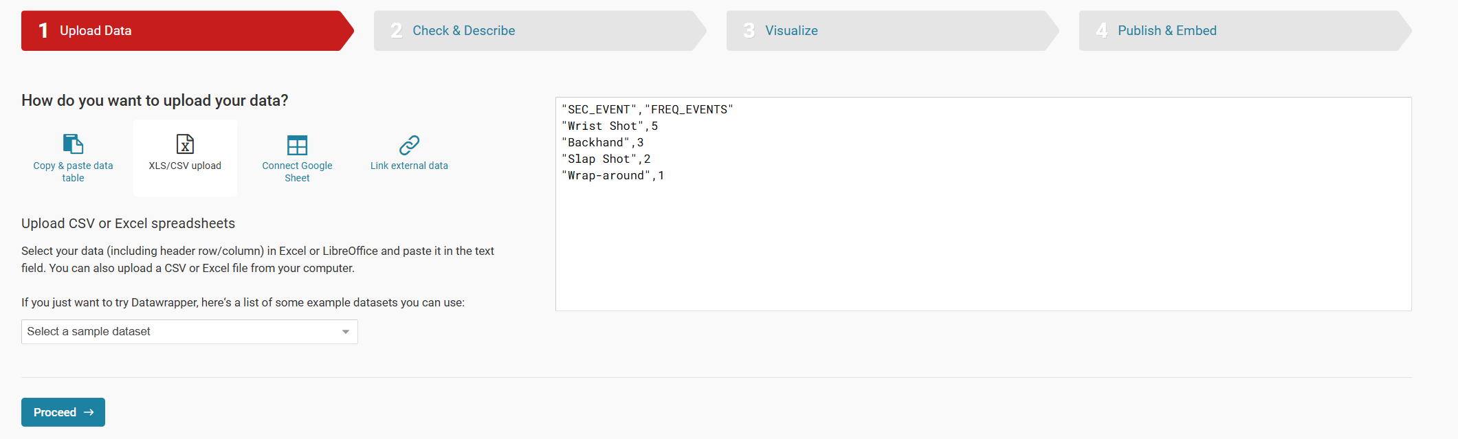
To create the visualization, we'll head over to Datawrapper and walk through the process of creating a new column chart. To do this:
- Click Create New in your dashboard.
- Click XLS/CSV upload, navigate to the data you saved in the last step, and make sure it appears correctly.
- When done, click Proceed.
You should see something similar to the below.
- Click Check & Describe.
Validate that the data in the view is what you expect to see.
- Click Visualize.
- Select Donut Chart.
The data should now load into an unconfigured chart, similar to the below.
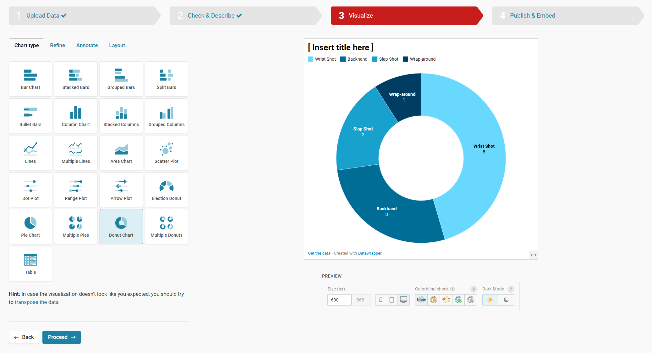
- You can now configure the color palette, title and other options be clicking each of the Refine, Annotate and Layout tabs.
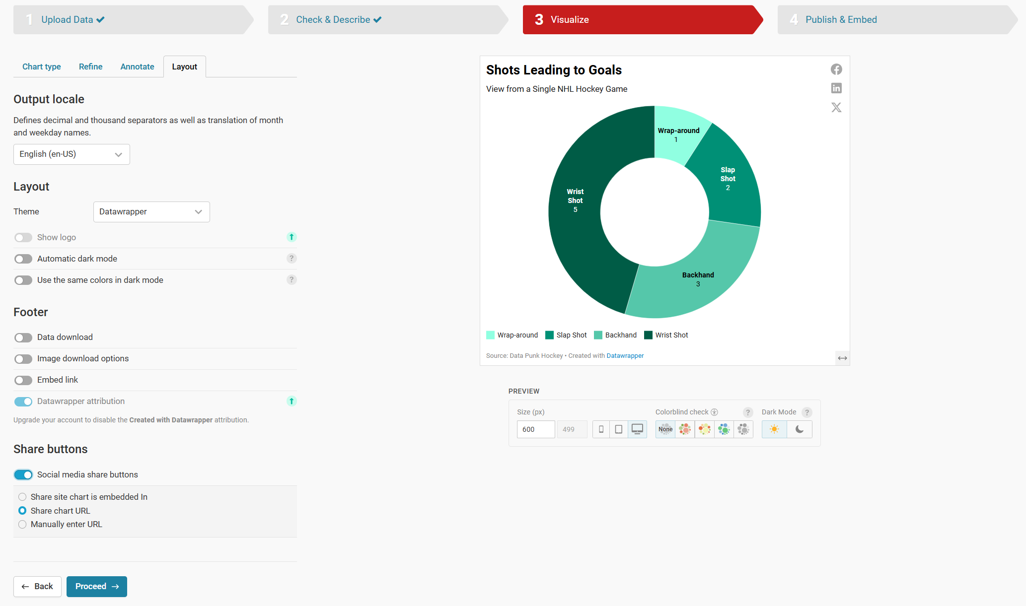
- When you're finished configuring your Donut Chart, click Publish & Embed to publish your chart.
At this point, you can share out the link, create a downloadable PNG image of the chart, duplicate the chart to fork it, or copy the embed code to use it in an article.
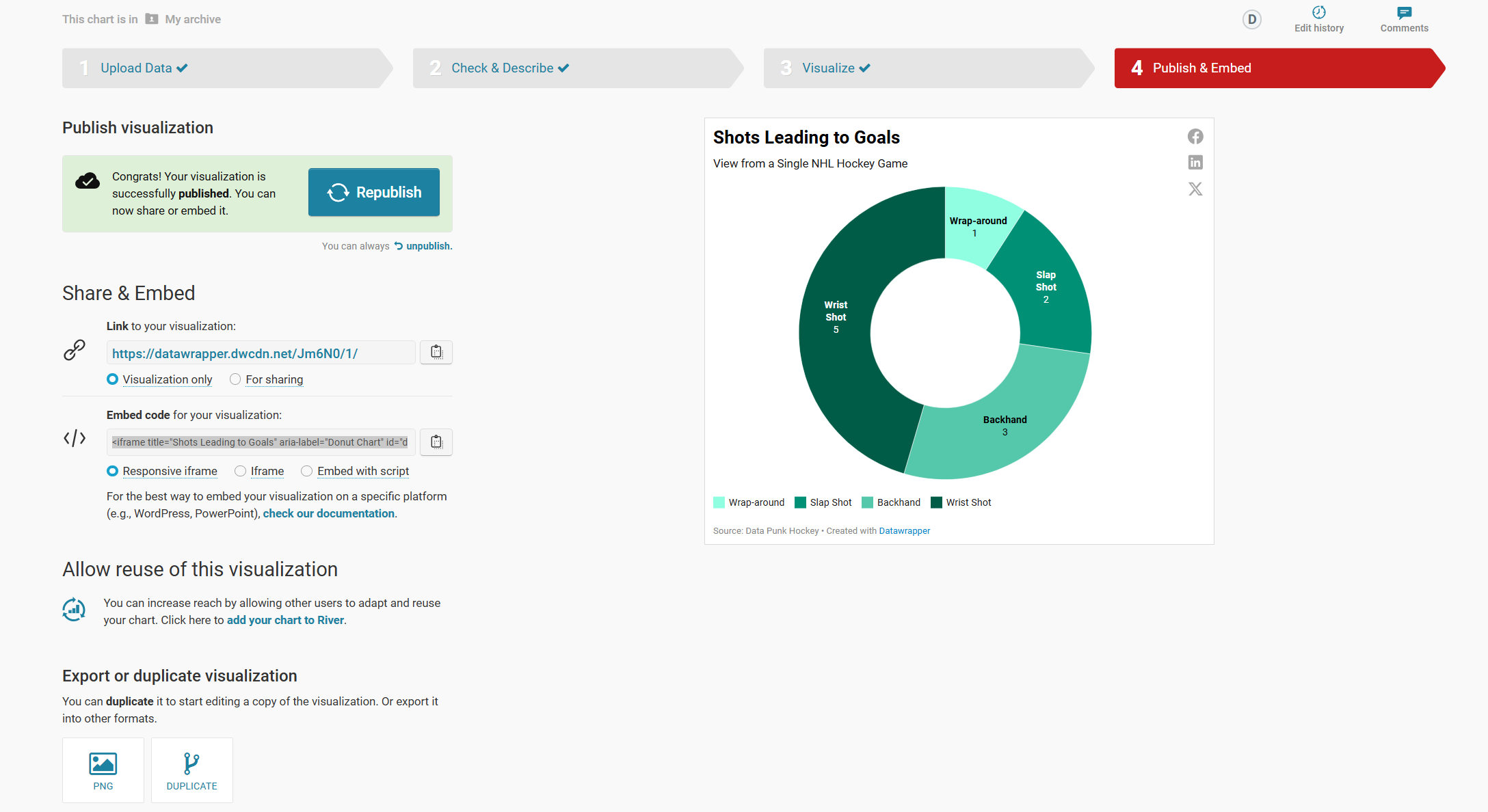
When you copy and embed the chart code into your favorite content editor (using an HTML container), you should see something similar to the below.
And that's it! Congrats, you now have created your first Donut Chart that visualizes the types of shots that led to goals in a (high-scoring) NHL game.
Looking for more datasets and tutorials? Check out our Resources page!
Member discussion