Chart 8: Density Plot for Point Production Distribution

Creating a Density Plot using R & RStudio
In this tutorial, we'll create a density plot to analyze the distribution of Total Points across players that make up the 4 Nations Face-Off tournament.
The question we'll be answering is: Which country has the best point production?
What is Density Plot?
A density plot is a visualization that shows the distribution of a numeric variable. It estimates and displays the "density" of data points across a continuous scale, making it easier to observe where the data is concentrated and how it is spread out. It’s similar to a histogram but provides a smoother representation by using a curve rather than discrete bins.
You use a density plot when you want to:
- Visualize the shape of a distribution (e.g., unimodal, bimodal, skewed).
- Identify areas of high or low concentration of data points.
- Compare distributions between groups (e.g., scores of players from different teams).
Some of the features of a density plot are as follows:
- Smoothed Curve: The plot uses a kernel density estimation (KDE) to generate a continuous curve that approximates the data's distribution.
- No Overlapping Bins: Unlike a histogram, which divides data into discrete bins, a density plot provides a continuous curve, making it easier to see overall patterns.
- Relative Scale: The area under the curve sums to 1, representing the probability density, rather than raw counts.
- Multiple Groups: It can compare distributions across multiple groups using different colors or styles.
Key ways to interpret a density plot are as follows:
- Peak: The highest point on the curve shows where data is most concentrated.
- Spread: A wider curve indicates more variability in the data, while a narrower curve indicates less variability.
- Overlap: When comparing groups, overlapping curves indicate similarity, while separate curves show differences.
With regard to the question we're trying to answer, the density plot will show:
- Which country has players scoring the most points (peaks in the curve).
- The spread of players' points for each country (width of the curve).
In this tutorial, we will create a density plot to compare the distribution of total points scored by players from Canada, USA, Sweden, and Finland. Peaks in the curves can show which country has a higher concentration of top-performing players.
Getting the Resource Files
The resource file for this tutorial can be found below:
You'll only need to use R/RStudio in this tutorial.
Let's get started!
Step 1: Download the Data
For this tutorial, download the player data into a new folder you create locally.
At this point, continue to Step 2.
Step 2: Load the Data & Create the Visualization
The next step is to load and transform the data. You'll use R and RStudio to do this.
To load and transform the data:
- Open RStudio and create a new project in an existing folder (use the folder you created above).
- Create a new file for the project. (We use Markdown files so we can re-use the file for application documentation.)
- Add the following application code to the R Markdown file.
The first code snippet loads the dplyr and ggplot2 libraries that you will use in the application. The dplyr library transforms and shapes data and the ggplot2 library is a plotting and visualization library.
library(dplyr)
library(ggplot2)
The next code snippet loads the CSV file into a data frame called four_nations_players.
four_nations_players <- read.csv("four_nations_players_and_goalies.csv")
We've cleaned and transformed the dataset, so there's no need to do that in this tutorial. So, all you need to do is create the density plot using the country (BIRTH_COUNTRY) and total points (POINTS). This next code snippet uses the ggplot() function to create the density plot.
ggplot(four_nations_players, aes(x = POINTS, fill = BIRTH_COUNTRY)) +
  geom_density(alpha = 0.6, color = "black", size = 0.5) +
  scale_fill_brewer(palette = "Set2") +
  labs(
    title = "Density Plot of Points by Country",
    subtitle = "Comparing Point Production across Four Nations",
    x = "Points",
    y = "Density",
    fill = "Country"
  ) +
  theme_minimal(base_size = 14) +
  theme(
    plot.title = element_text(hjust = 0.5, size = 18, face = "bold"),
    plot.subtitle = element_text(hjust = 0.5, size = 14, face = "italic"),
    axis.title = element_text(size = 16),
    axis.text = element_text(size = 12),
    legend.title = element_text(size = 14),
    legend.text = element_text(size = 12),
    legend.position = "top",
    panel.grid.major = element_line(size = 0.5, linetype = 'dotted', color = "gray80"),
    panel.grid.minor = element_blank()
  ) +
  geom_vline(aes(xintercept = mean(POINTS)), color = "black", linetype = "dashed", size = 1) +
  annotate(
    "text", x = mean(four_nations_players$POINTS), y = 0.02,
    label = "Mean Points", color = "black", angle = 90, vjust = -0.5, size = 4
  )
At this point, you can run the code and you should find the result is similar to the below.
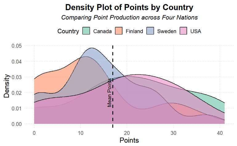
What this density plot says is that Finland and Sweden have a higher concentration of point-production players whereas Canada and the USA have a broader cohort of players who can produce above the average.
Note that this is a point-in-time snapshot of the data. And given this is for the 4 Nations Face-Off tournament, you'd want to re-run this analysis on a regular basis to see how the distribution changes. Or, build a separate trend analysis (e.g., multi-line chart) that shows Total Points over time by Country.
Looking for more datasets and tutorials? Check out our Resources page!
Member discussion