Chart 9: Correlation Plot to Predict Goals

Creating a Correlation Plot using R & RStudio
In this tutorial, we'll create a correlation plot to analyze the strength of the relationship between a sample of hockey statistics and goals.
The question we'll be answering is: What common hockey statistic more strongly correlates to goals?
What is a Correlation Plot?
A correlation plot is a visual representation of the relationship between one or more variables in a dataset (i.e., how a variable correlates to, or moves with, another variable). It helps to identify relationships, patterns, or trends between variables, often using a color-coded heatmap or scatterplot matrix. Correlation measures how closely two variables move together, typically using Pearson's correlation coefficient (r) or other metrics like Spearman or Kendall correlations.
When plotting the correlation, you'll often see color coding built into the plots that represent the strength and direction of the correlation. R does this natively and you can configure the colors as well. For example:
- Positive correlations are often shown in one color (e.g., blue).
- Negative correlations are in another (e.g., red).
- Stronger correlations have deeper shades; weaker ones are lighter.
Also, it's important to understand the concept of the correlation coefficient, which ranges from -1 to 1. When the correlation coefficient is +1, it is a perfect positive correlation (as one variable increases, the other increases). When the correlation coefficient is -1, it is a perfect negative correlation (as one variable increases, the other decreases). And when the correlation coefficient is 0, there is no correlation (variables are independent).
Some common uses of correlation plots are as follows:
- Sports Analytics: Analyzes relationships between performance metrics (e.g., shots, goals, assists).
- Finance: Studies correlations between stock prices, returns, or economic indicators.
- Healthcare: Examines relationships between medical variables (e.g., age, blood pressure, cholesterol).
- Marketing: Identifies trends in sales, pricing, and customer behaviors.
If you're analyzing hockey events, a correlation plot might show relationships like:
- Positive correlation: More shots on goal are associated with higher goals scored.
- Negative correlation: More giveaways may be linked to fewer goals scored.
Note that correlation doesn't mean causation, so we see correlation plots as a great first step to explore the nature of the potential relationship between or among variables. You should then follow up on the correlation analysis to more deeply explore these potential relationships.
Getting the Resource Files
The resource file for this tutorial can be found below:
You'll only need to use R/RStudio in this tutorial.
Let's get started!
Step 1: Download the Data
For this tutorial, download the team stats data into a new folder you create locally.
At this point, continue to Step 2.
Step 2: Load the Data & Create the Visualization
The next step is to load the data and create the correlation plot (we've already cleaned the data). You'll use R and RStudio to do this.
To load and transform the data:
- Open RStudio and create a new project in an existing folder (use the folder you created above).
- Create a new file for the project. (We use Markdown files so we can re-use the file for application documentation.)
- Add the following application code to the R Markdown file.
The first code snippet loads the tidyverse and corrplot packages that you will use in the application. The tidyverse library is a composite package that is great for data cleaning, transformation and charting. The corrplot library is specific to creating and visualizing your data in correlation plots.
library(tidyverse)
library(corrplot)
You will next load the data into a data frame called summary_team_shot_data_df and print out the head of the data frame.
summary_team_shot_data_df <- read.csv("combined_team_stats_file.csv")

print(head(summary_team_shot_data_df, 5))
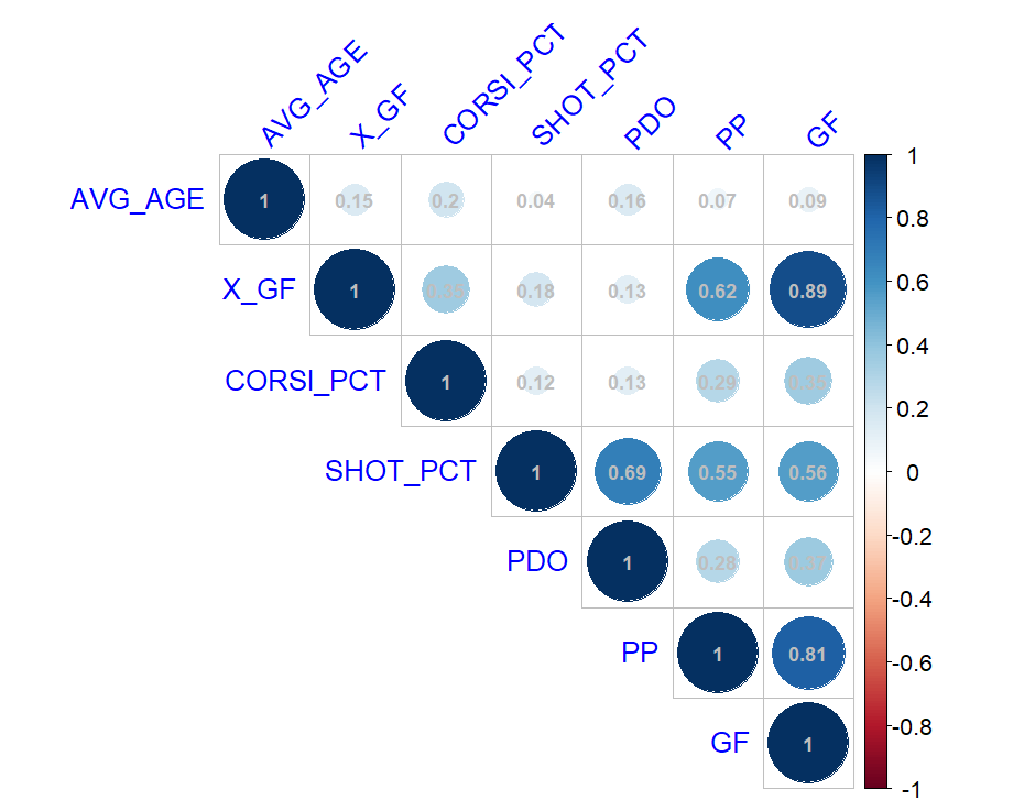
And lastly, you'll create a correlation plot using a subset of the data. You can create an array containing the data that you want or you can create a filtered data frame. We've used the former approach below (storing the data we want to include in the correlation in corr_model_data). Our goal is to visualize the strength (or weakness) of the relationships across these variables, ultimately trying to understand the correlation between the variables and goals (GF).
corr_model_data <- summary_team_shot_data_df[, c('AVG_AGE', 'X_GF', 'CORSI_PCT', 'SHOT_PCT', 'PDO', 'PP', 'GF')]

cor_matrix <- cor(corr_model_data, use = "complete.obs")

melted_cor_matrix <- melt(cor_matrix)

corrplot(cor_matrix, method = "circle", type = "upper",
         tl.col = "blue", tl.srt = 45,
         addCoef.col = "gray",
         number.cex = 0.7)
When you run the code, you will see the image below, which is the correlation plot. On the right-hand side, you see the color coding we mentioned earlier – with 1 shown as blue and -1 shown as red. You can then walk down the GF column to see the strength of the correlation with the other variables. In this plot, X_GF (or Expected Goals) has the strongest positive correlation to GF, followed by Power Plays (PP).
You can stop at this point if you're just trying to understand the strength of the correlations; however, this is often the first step in a multi-step process to create predictive models. For example, we might expand the footprint of variables and move to the next step of building a predictive model. Note that this step is increasingly becoming automated and the best correlations for the model are discovered for you, which makes the model-building process more straightforward.
Looking for more datasets and tutorials? Check out our Resources page!
Member discussion