How to Create a Playoff Preview Dashboard using the PPM Score

In this Tutorial
We'll show you how to create a Playoff Preview Dashboard using the Playoff Preview Metric (PPM) score we created in our last newsletter edition. We'll use R to shape and transform the data and Power BI to implement the dashboard, a common workflow for sports data analysts and data scientists.
We'll answer three questions with the dashboard:
- What teams appear to be most competitive?
- How do they compare across their offense, defense and goaltending?
- How does the PPM score relate to other hockey statistics?
Getting the Data and Code
For this tutorial, you can find the data and code links below:
- Snapshot of NHL team stats data
- Snapshot of NHL goalie stats data
- NHL team names and abbreviation mapping file
- R Tutorial Code (cleans and transforms data)
- Power BI Dashboard
Sourcing the Data
We used two different free hockey data sources for this tutorial. For the team stats, we used NHL, and for the goalie stats we used Hockey-Reference. Because we used two different sources, we had to join the two data sources in our R code. Typically, you'll join different hockey data sources using a unique ID such as Team ID or Player ID. However, given the nature and size of the data source, we decided to 'join' using the full team name and team abbreviation.
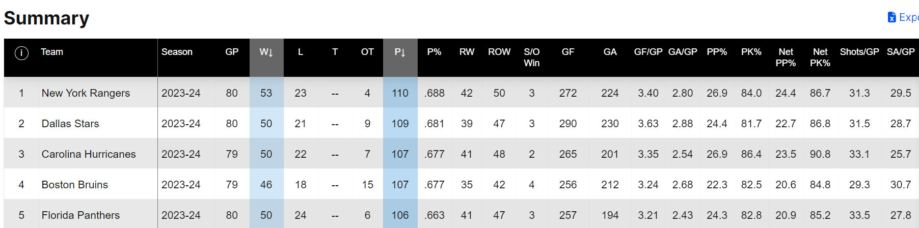
That is, team statistics on the NHL and Hockey-Reference web sites represent team differently. For example, in the image below, you can see that the NHL stats represent an NHL team through the full team name.
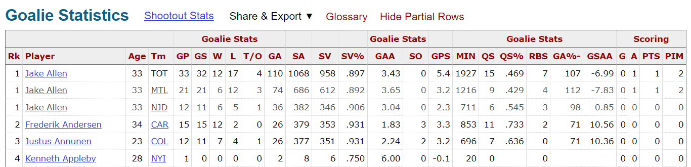
In the Hockey-Reference site, they represent team through the team abbreviation.
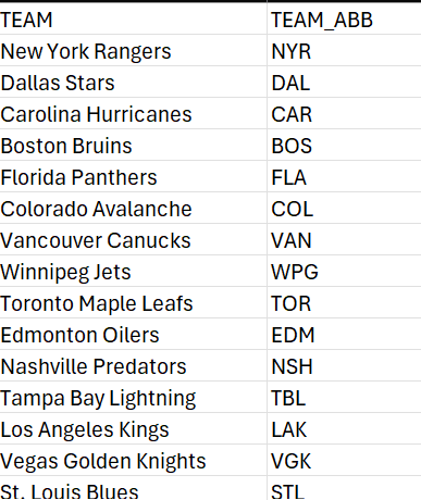
So, we created a mapping file (link included with the other datasets above) with two columns (TEAM and TEAM_ABB), one for the full team name and the other for the team abbreviation. You'll see us use this mapping file when we merge the different datasets in the R code.
If you've downloaded the two hockey datasets and the above team mapping file, you should now have three CSV files stored locally:
- NHL team stats downloaded from NHL.com
- NHL goalie stats downloaded from Hockey-Reference.com
- Mapping file with team names and abbreviations in it
If you have this, you are ready for the next step in the tutorial.
Cleaning and Transforming the Data
Cleaning and transforming the data is a multi-step process. We implemented this in R and RStudio.
The first step is to load the libraries you'll use.
library(dplyr)
library(ggplot2)
library(tidyverse)
The second step is to load the NHL team stats and the mapping file. We are particular when it comes to column headings, so it's standard practice for us to rename the headings in a more clean and consistent way. We then use the merge() function to merge the team stats file, so it includes both the full team names and team abbreviations. And lastly, we select the columns we are interested in using for the PPM score.
all_nhl_team_stats_data <- read.csv("nhl_stats_4_10_2024.csv")
nhl_team_mapping <- read.csv("nhl_team_and_abbreviations.csv")

colnames(all_nhl_team_stats_data) <- c("TEAM", "SEASON", "GP", "W", "L", "T",
                                       "OT", "PTS", "PT_PCT", "RW", "ROW","SOW",
                                       "GF", "GA", "GFPG", "GAPG", "PP_PCT",
                                       "PK_PCT", "NET_PP_PCT", "NET_PK_PCT",
                                       "SFPG", "SAPG", "FOW_PCT")

all_nhl_team_stats_data <- merge(all_nhl_team_stats_data, nhl_team_mapping, by = "TEAM")

ppm_nhl_team_stats_data <- all_nhl_team_stats_data %>%
  select(TEAM, TEAM_ABB, GP, PTS, PT_PCT, GF, GA, PP_PCT, PK_PCT, SFPG, SAPG) %>%
  arrange(desc(PTS))

ppm_nhl_team_stats_data
The result of the second step looks like the following, which is the view of the ppm_nhl_team_stats_data data frame in RStudio.
With the NHL team stats loaded and transformed, we'll now load the NHL goalie stats. We follow a similar pattern here, where we first load the data into a data frame using the read.csv() function, transform the column names to be more in line with our preferences, and then create a new data frame with a subset of the data. Note that the first file we downloaded from the NHL site was already represented at the team level; however, the goalie stats are represented at the goalie level. So, we used the group_by() function to group the goalie records by the team and then took the averages of the GAA and SAVE_PCT statistics.
hockey_ref_goalie_stats <- read.csv("hockey_ref_goalie_stats_4_10_2024.csv")

colnames(hockey_ref_goalie_stats) <- c("RANK", "PLAYER", "AGE", "TEAM_ABB",
                                         "GP", "GS", "W", "L", "TO", "GA",
                                         "SA", "SAVES", "SAVE_PCT", "GAA", "SO",
                                         "GPS", "MIN", "QS", "QS_PCT", "RBS", "GA_PCT",
                                       "GSAA", "G", "A", "PTS", "PIM")

ppm_goalie_stats_data <- hockey_ref_goalie_stats %>%
  select(PLAYER, TEAM_ABB, SAVE_PCT, GAA) %>%
  group_by(TEAM_ABB) %>%
  summarize(AVG_SAVE_PCT = round(mean(SAVE_PCT), 3), AVG_GAA = round(mean(GAA), 2)) %>%
  arrange(AVG_GAA)
The result was the following data frame, showing the averages for save percentage (AVG_SAVE_PCT) and goals against average (AVG_GAA) for each team.
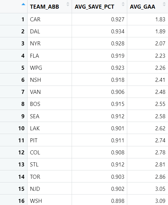
The next step was to use the merge() function again, but doing so using the team abbreviation field (TEM_ABB). You can see why the mapping file was important, as this was the field we used to join the two data frames. We could then select the columns we wanted for the data frame we'll use to create the Z-Scores.
combined_stats_data <- merge(ppm_nhl_team_stats_data, ppm_goalie_stats_data, by = "TEAM_ABB")
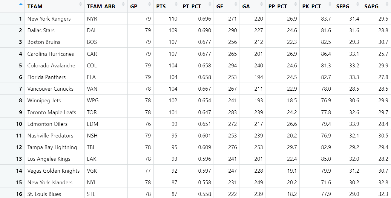
final_combined_stats_data <- combined_stats_data %>%
select(TEAM_ABB, PTS, GF, SFPG, PP_PCT, GA, SAPG, PK_PCT, AVG_GAA, AVG_SAVE_PCT) %>%
arrange(desc(PTS))
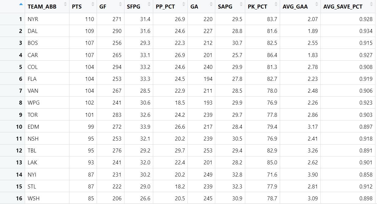
The resulting data frame (final_combined_stats_data) is as follows.
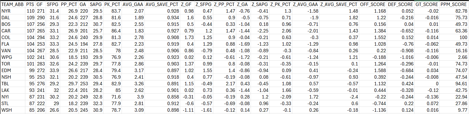
At this point, creating the PPM score requires you to standardize the scores (given the different units of measurement), add a weighting for the categories (offense, defense and goaltending) and then create a final PPM score between 0 and 100.
Below, we use the scale() function to transform the statistics represented in the metrics object into Z-Scores. We then round them to two decimal places.
metrics <- c('GF', 'SFPG', 'PP_PCT', 'GA', 'SAPG', 'PK_PCT', 'AVG_GAA', 'AVG_SAVE_PCT')
data_z_scores <- as.data.frame(scale(final_combined_stats_data[metrics]))

names(data_z_scores) <- paste("Z", names(data_z_scores), sep="_")

hockey_data_enhanced <- cbind(final_combined_stats_data, data_z_scores)

hockey_data_enhanced$Z_GF <- round(hockey_data_enhanced$Z_GF,2)
hockey_data_enhanced$Z_SFPG <- round(hockey_data_enhanced$Z_SFPG,2)
hockey_data_enhanced$Z_PP_PCT <- round(hockey_data_enhanced$Z_PP_PCT,2)
hockey_data_enhanced$Z_GA <- round(hockey_data_enhanced$Z_GA,2)
hockey_data_enhanced$Z_SAPG <- round(hockey_data_enhanced$Z_SAPG,2)
hockey_data_enhanced$Z_PK_PCT <- round(hockey_data_enhanced$Z_PK_PCT,2)
hockey_data_enhanced$Z_AVG_GAA <- round(hockey_data_enhanced$Z_AVG_GAA,2)
hockey_data_enhanced$Z_AVG_SAVE_PCT <- round(hockey_data_enhanced$Z_AVG_SAVE_PCT,2)
We then use those Z-Scores to calculate an offensive score (OFF_SCORE), defensive score (DEF_SCORE) and goaltending score (GT_SCORE). Note that each score has a weighting – which you can change to your preference. Finally, we added each category score into a final score (PPM_SCORE).
hockey_data_enhanced$OFF_SCORE = .4 * (hockey_data_enhanced$Z_GF + hockey_data_enhanced$Z_PP_PCT + hockey_data_enhanced$Z_SFPG)

hockey_data_enhanced$DEF_SCORE = .4 * (hockey_data_enhanced$Z_GA + hockey_data_enhanced$Z_PK_PCT + hockey_data_enhanced$Z_SAPG)

hockey_data_enhanced$GT_SCORE = .2 * (hockey_data_enhanced$Z_AVG_GAA + hockey_data_enhanced$Z_AVG_SAVE_PCT)

hockey_data_enhanced$PPM_SCORE = hockey_data_enhanced$OFF_SCORE + hockey_data_enhanced$DEF_SCORE + hockey_data_enhanced$GT_SCORE
The final step is to normalize the final PPM Score into a value between 0 to 100. This step is optional, but we prefer to convert scores into something that is generally more recognizable and meaningful to broader audiences. In this step, we implement a simple function to normalize the score and then round the result. The final line of code uses the write.csv() function to write the data to disk. We'll use this to create the Power BI dashboard.
normalize_to_100 <- function(x) {
  min_x <- min(x)
  max_x <- max(x)
  normalized_score <- (x - min_x) / (max_x - min_x) * 100
  return(normalized_score)
}

hockey_data_enhanced$PPM_SCORE <- normalize_to_100(hockey_data_enhanced$PPM_SCORE)

hockey_data_enhanced$PPM_SCORE <- round(hockey_data_enhanced$PPM_SCORE, 2)

write.csv(hockey_data_enhanced, "ppm_score_w_z_scores.csv", row.names = FALSE)
The final data frame (hockey_data_enhanced) is written to file and is also shown below.
At this point, you are now ready to create the Power BI dashboard.
Creating the Power BI Dashboard
If you've followed our other Power BI dashboard tutorials, you'll know that we start with a structured design for the background of the dashboard. You can do this in any number of ways, but we use a simple approach:
- Create a design in PowerPoint, using shapes and color formatting
- Save the slide as a PNG image file
- Import into Power BI to set the background of the report canvas
Below is one of the background designs, where the left-hand area is designated for the Slicer control (to act as the team filter), and the two areas to the right are for visualization controls. Note that we included the title of the report in the background, so you don't have edit control for the report titles in Power BI.

We also wanted to give our dashboard a little bit of design texture, so we created a cover page with an image as the background - which, again, we created in PowerPoint.

The PPM dashboard is composed of five reports, each of which we'll cover below.
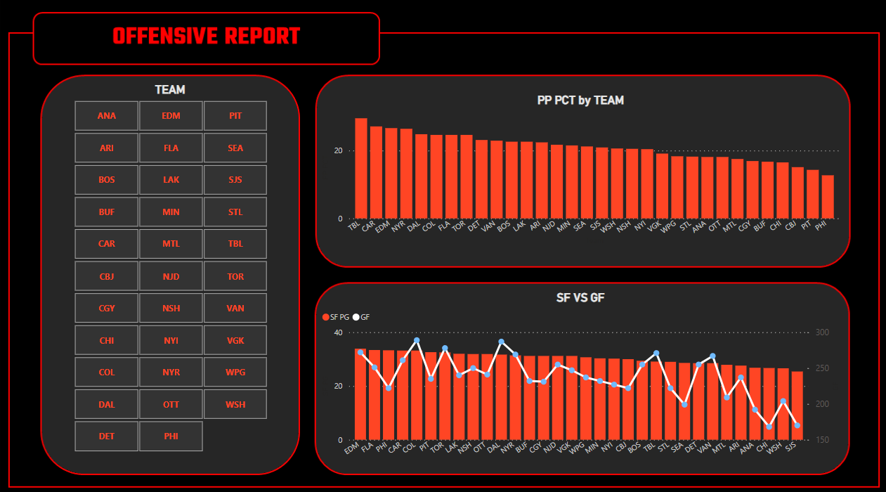
The first report, the Offensive Report, has three controls configured as follows:
- 1 Slicer control, mapped to TEAM_ABB.
- 1 Clustered column chart, mapped to TEAM_ABB (X-axis) and PP_PCT (Y-axis).
- 1 Line and stacked column chart, mapped to TEAM_ABB (X-axis), SFPG (Column Y-axis) and GF (Line Y-axis).
The resulting report is below. Here you can see, for example, where teams are stronger or weaker on the power play and which teams are more effective at scoring through the lens of total shots for.
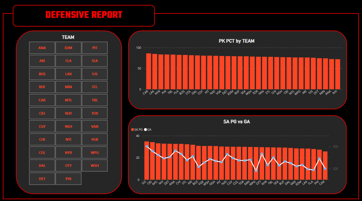
The second report, the Defensive Report, has three controls configured as follows:
- 1 Slicer control, mapped to TEAM_ABB.
- 1 Clustered column chart, mapped to TEAM_ABB (X-axis) and PK_PCT (Y-axis).
- 1 Line and stacked column chart, mapped to TEAM_ABB (X-axis), SAPG (Column Y-axis) and GA (Line Y-axis).
The resulting report is below. Here you can see, for example, where teams are stronger or weaker on the penalty kill and which teams are letting more goals in through the lens of total shots against.
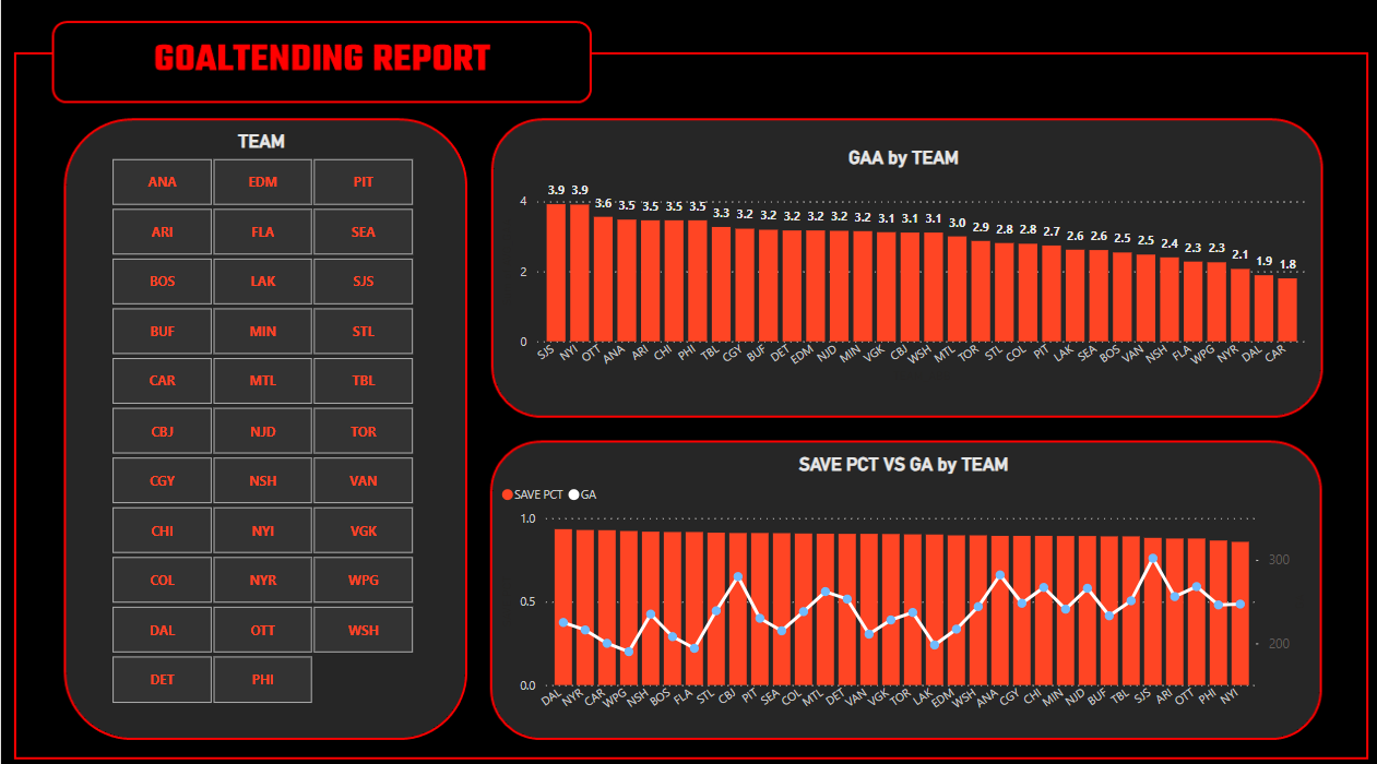
The third report, the Goaltending Report, has three controls configured as follows:
- 1 Slicer control, mapped to TEAM_ABB.
- 1 Clustered column chart, mapped to TEAM_ABB (X-axis) and AVG_GAA (Y-axis).
- 1 Line and stacked column chart, mapped to TEAM_ABB (X-axis), AVG_SAVE_PCT (Column Y-axis) and GA (Line Y-axis).
The resulting report is below. Here you can see, for example, where teams are stronger or weaker for goals against and save percentage – with goals against as an overlay.
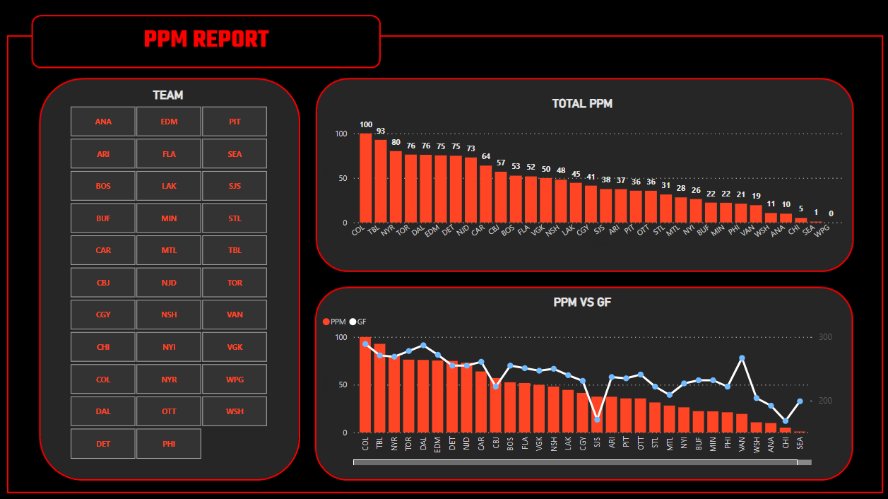
The fourth report, the PPM Report, has three controls configured as follows:
- 1 Slicer control, mapped to TEAM_ABB.
- 1 Clustered column chart, mapped to TEAM_ABB (X-axis) and PPM_SCORE (Y-axis)
- 1 Line and stacked column chart, mapped to TEAM_ABB (X-axis), PPM_SCORE (Column Y-axis) and GF (Line Y-axis).
The resulting report is below. Here you can see, for example, where teams are stronger or weaker across the aggregate PPM score and how team's PPM score relates to goals scored.
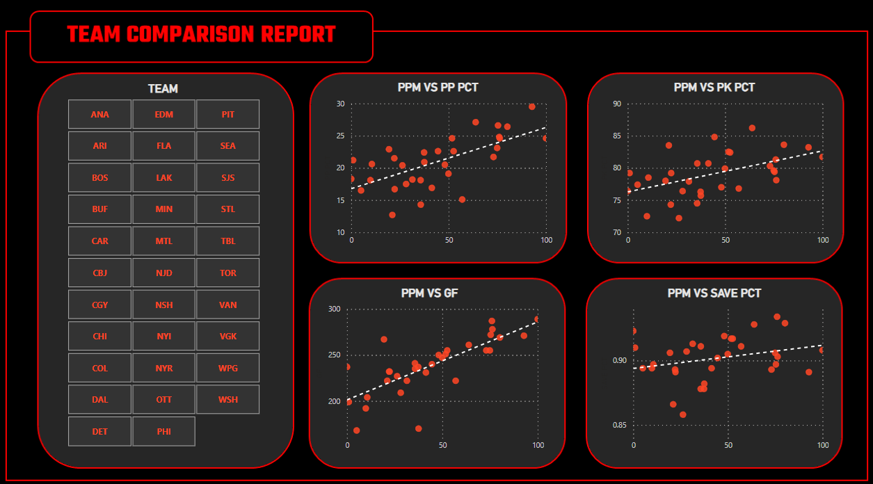
The final report, the Team Comparison Report, has five controls configured as follows:
- 1 Slicer control, mapped to TEAM_ABB
- 4 Scatter charts:
- 1 mapped to TEAM_ABB (Values), PPM_SCORE (X-axis) and PP_PCT (Y-axis)
- 1 mapped to TEAM_ABB (Values), PPM_SCORE (X-axis) and PK_PCT (Y-axis)
- 1 mapped to TEAM_ABB (Values), PPM_SCORE (X-axis) and GF (Y-axis)
- 1 mapped to TEAM_ABB (Values), PPM_SCORE (X-axis) and AVG_SAVE_PCT (Y-axis)
The resulting report is below. Here you can see, for example, where different hockey statistics relate to the PPM score.
Note that we took a snapshot of the hockey data on 04/10/24 with 8 days left in the regular season. So, we included all of the teams in the combined dataset and in the report. You can filter the teams using the Slicer control in each of the reports, or once the playoffs hit, you can re-create the report (or per our earlier comments automate the data collection and storage of the data so hit refresh and have an updated report each morning) and only include those teams in the playoffs. This reduces the complexity of the report and only includes relevant teams in the playoffs.
Check out our quick-hit video tutorial on YouTube:
Summary
In this tutorial, we created a dashboard in Power BI using the Playoff Preview Metric (PPM) – and overview of this metric can be found in an earlier edition here. The dashboard comprises five reports, primarily covering offense, defense and goaltending, but also including a report that explores the relationship between the PPM score and different hockey statistics.
The PPM is hopefully fun and somewhat useful in its current form. You can use it as an aggregate score to compare teams at a summary level across offense, defense and goaltending. You can extend the code in this tutorial to create your own aggregate metric.
The goal of the reports is to give you a detailed picture of the three different categories and then an aggregate view through the PPM score. Thus, you can, for example, see why a team may be lower in PPM score compared to other teams and be able to use the filtering capabilities in Power BI to do cross-team comparisons. While we've labelled it "Playoff Preview" you can also use it throughout the season.
Note that in our earlier newsletter edition, we created a quick and dirty heatmap in Excel. It doesn't have all of the fancy bells and whistles that you get in Power BI, but it does give you a pretty effective visual comparison to see precisely where a team may run strong or weak across your chosen hockey statistics.
Subscribe to our newsletter to get the latest and greatest content on all things hockey analytics!
Member discussion