Bringing It All Home: Your Go-To Dashboard for DFS Fantasy Hockey Success

In this Edition
- DFS Fantasy Hockey Series Recap
- Overview of the DFS Fantasy Hockey Dashboard
- Sourcing the Data
- Putting it all Together
DFS Fantasy Hockey Series Recap
This is the sixth and final week in our newsletter series on Winning in DFS Fantasy Hockey using Analytics. To date, we've covered the following topics:
- Week 1: DFS Fantasy Hockey 101: Your Ultimate Kickoff Guide!
- Week 2: Winning DFS Strategies & Stats to Crush Fantasy Hockey
- Week 3: More Winning Strategies & Statistics for DFS Hockey
- Week 4: Building your First Winning DFS Report using Microsoft Excel
- Week 5: Predict like a Pro: More Winning Fantasy Hockey Strategies
In this week's edition, we'll take the final step in the series and create a Power BI dashboard that you can use to craft your own analytics system to win at DFS fantasy hockey. We'll use the system and reports we've covered in the previous newsletters and create one place that integrates three of the winning strategies: High Shot Volume Player, Line Stacking and Winning Goalies.
Overview of the DFS Fantasy Hockey Dashboard
We've covered several winning strategies over the course of this series that have been recommended by various DFS experts. The goal of this coverage was to demonstrate different ways to improve your odds of winning in DFS fantasy hockey – specifically for DraftKings.
Data Punk Hockey is about hockey analytics, so winning strategies is one thing; however, mapping analytics to these strategies is altogether another thing. Hence, this final newsletter in the series focuses on a DFS Fantasy Hockey dashboard – where analytics meets DFS strategy using Power BI.
The DFS Fantasy Hockey dashboard comprises two main reports, one for players and another for goalies. We've also added a bonus report for game trends. Through these reports you can explore and discover:
- Players that have higher shots on goals and goals;
- Goalies that have better save and goals against averages; and
- Teams that have better trending.
We've also added DFS points (using the DraftKings scoring system), which calculates potential DFS points based on player/goalie statistics.
The three reports that make up the DFS Fantasy Hockey dashboard are:
- Top Players & Lines (mapping to High Shot Volume Players and Line Stacking strategies)
- Winning Goalies (mapping to the Winning Goalies strategy)
- Game Trends (which doesn't map to any specific strategy, but gives you some insights into how teams might perform against one another)
Below are screenshots of each report, along with a description of the controls and visualizations in the reports.
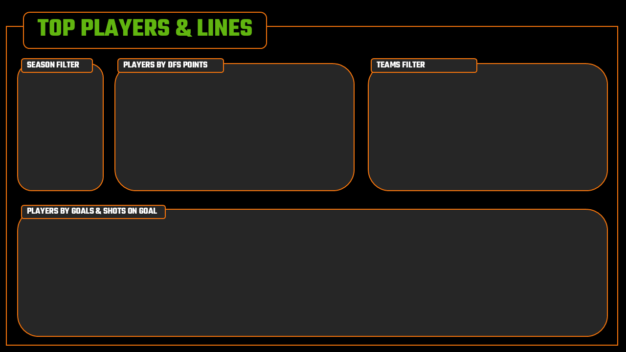
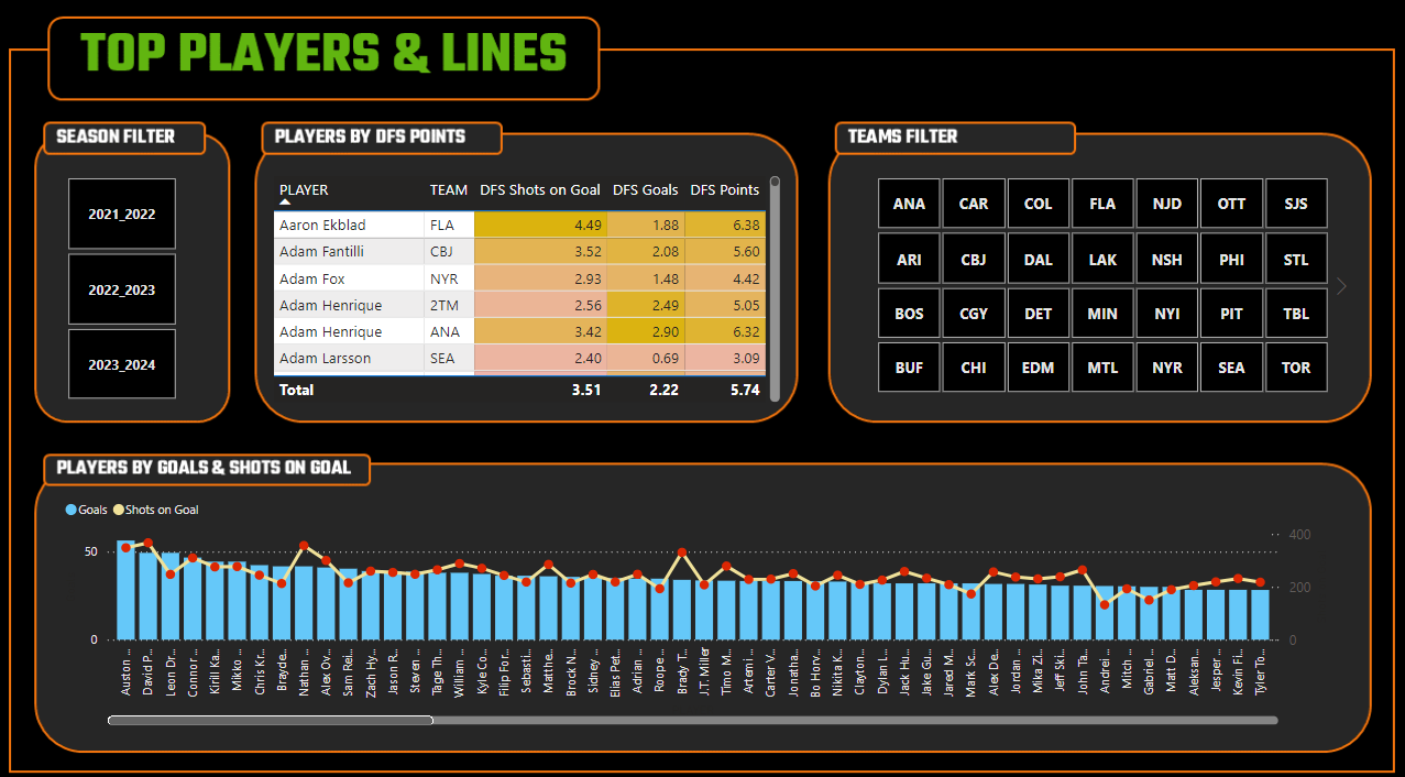
Top Players & Lines
This report comprises four components:
- Slicer control for the Season
- Table view that shows players and their respect DFS points (using the DraftKings point system)
- Slicer control for Team
- Line and stacked column chart for Goals and Shots on Goal by Player
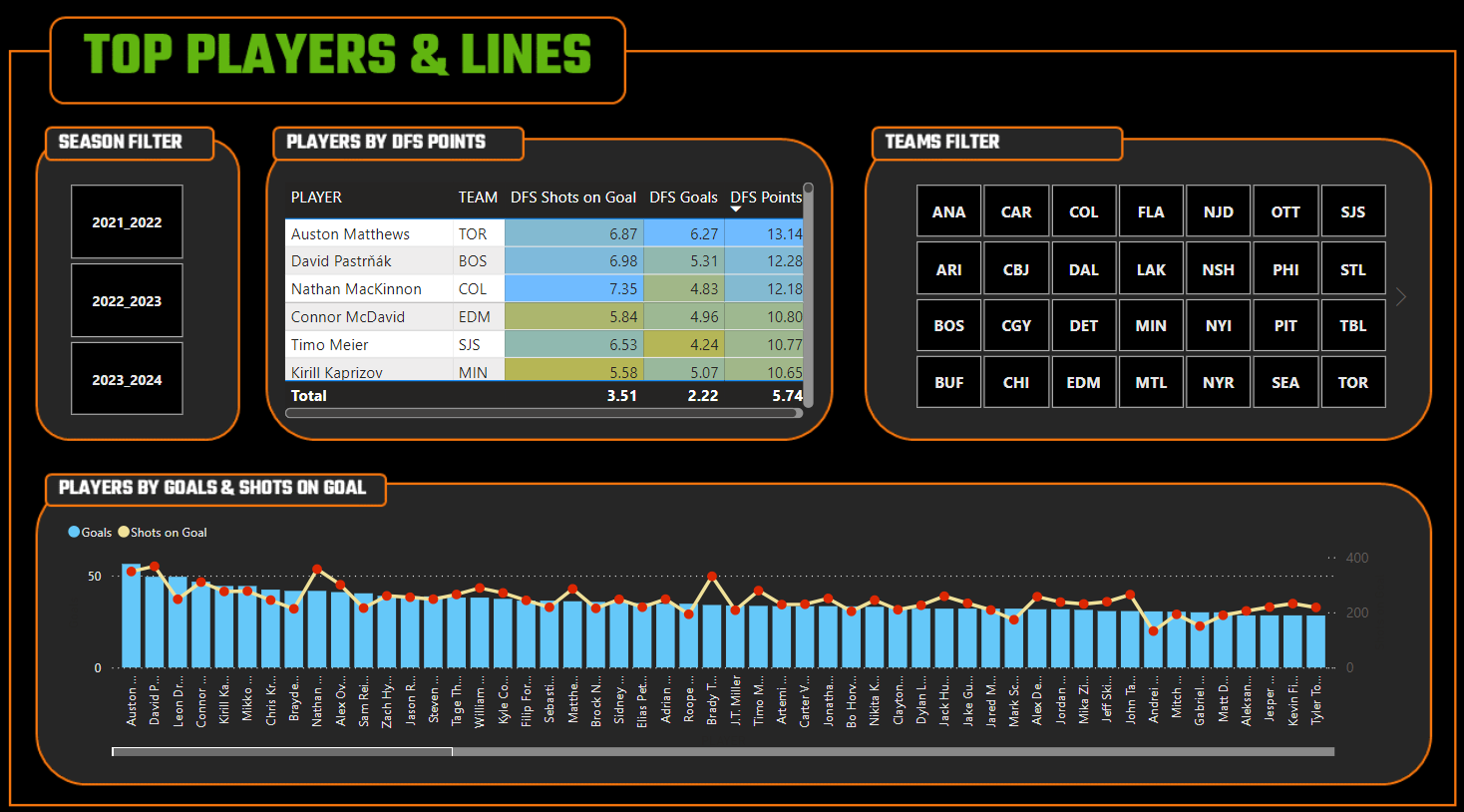
The report has a custom background, created in PowerPoint and saved as a PNG file, and allows you to filter by Season and Team, sort on DFS points and get to a short-list of players that could be high point producers within the High Shot Volume Players strategy. You can filter on Team to then see which players are higher-ranked in terms of DFS points that may be on the same line.
Winning Goalies
This report also comprises four components:
- Slicer control for the Season
- Table view that shows goalies and their respect DFS points (using the DraftKings point system)
- Line and stacked column chart for Wins and Goals Against by Goalie
- Line and stacked column chart for DFS Wins and DFS Saves (using the DraftKings point system) by Goalie
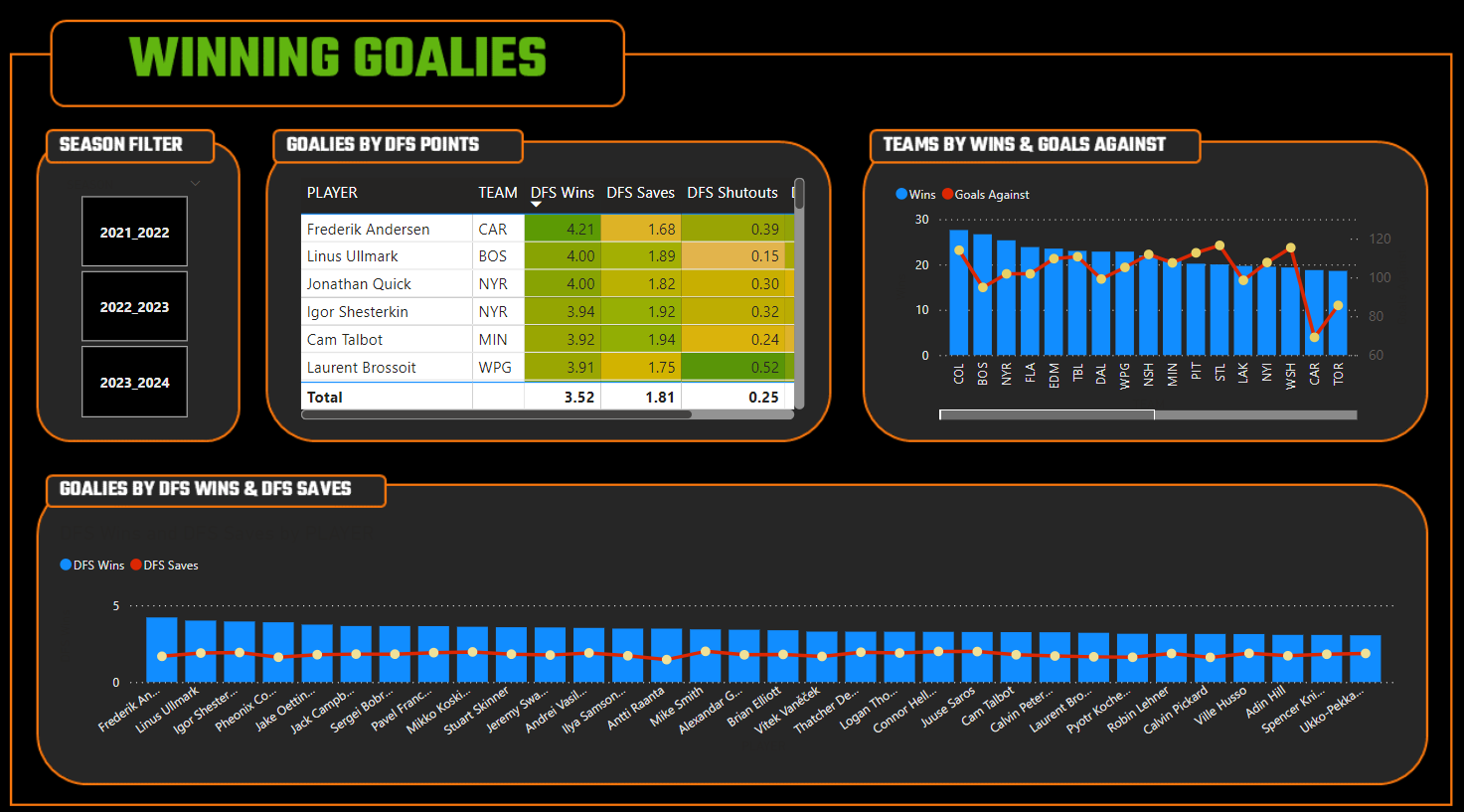
The report also has a custom background and allows you to filter by Season, sort on DFS points and get to a short-list of goalies that could be good picks for your lineup, and gives you more performance data for that goalie (both raw statistics and DFS point system) within the Winning Goalies strategy.
Game Trends
This report comprises three components:
- Slicer control for the Team
- Line and stacked column chart for Wins, Losses and Goals For by Team
- Line and stacked column chart for Goals For, Goals Against and Shots by Team
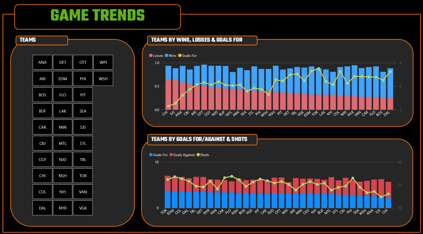
The report also has a custom background and allows you to filter by Team and explore how two teams would perform against one another using an aggregated view (by average) of their game match-up data.
Once you download the source data and reports, you can further customize and extend the reports to suit your own DFS fantasy hockey needs.
Sourcing the Data
You can download the datasets for the DFS Fantasy Hockey report as follows:
If you want to build the report from scratch to practice how to import and clean the data, then download and save the above CSV files into a local directory. If you want to start with the completed Power BI report and customize from there, you can download the report from the following link:
Either way, we encourage you to use the above files to explore and create your own dashboard that can act as your own analytics-driven, winning DFS system.
Putting it all Together
We've cleaned and transformed the data so you shouldn't need to do much on your end. Also, we used Excel to calculate the DFS points before importing into Power BI; however, you could also do this in Power BI by creating new columns and using DAX.
Before we even open Power BI, we typically spend some time sketching out what we want the reports to look like. You can use different applications for this, but a pen and paper works fine and should include:
- Stating the goal(s) of the reports;
- Sketching out the visualizations (and how they might interact); and
- Noting the data you include within each of the visualizations.
After you've done this, you're ready to open Power BI and get started on the report-building workflow.
Our Power BI report workflow follows a straightforward pattern:
- Import the data files into Power BI.
- Create pages for the specific reports we want to build.
- Create the reports on each page.
- Clean up the look and feel of the visualizations and reports.
Let's dive into each of these steps.
Import the Data Files into Power BI
Importing data into Power BI is the first step in building your report. Power BI has many options when it comes to importing or connecting to data. For this dashboard, we simply imported all of the data into Power BI as follows:
- Open Power BI and create a new blank report.
- Click the Home tab and select Get data.
- Select Text/CSV and click Connect and then navigate to the file you want to import – per the screenshot below.
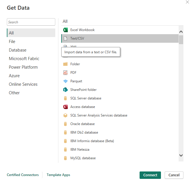
- You can choose to load as is or do some on-the-fly transformation. Given the data is pretty clean, you can click Load to import it directly into Power BI.
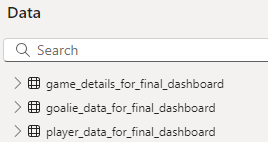
Do this for all of the files you want to import into Power BI.
After importing the files, verify that the data has loaded correctly by exploring the datasets in the Data pane.
After all of the data has been imported, you are ready for the next step.
Create Pages for the Reports
For our project, we wanted to have a cover page (Cover) and a table of contents page (Reports TOC) that describes the reports, along with the three reports (Top Players & Lines, Winning Goalies and Game Trends). So, the page navigation in Power BI looks like the following.

To create the pages you want for your report, you click the + button and give the new page a name.
Create a Report on Each New Page
The way in which we created each report followed a similar path:
- Add the controls to the report canvas; and
- Drag the relevant data fields to the controls.
For example, if we take the Top Players and Lines report, after creating and renaming the page, we:
- Clicked the Slicer control and dragged the SEASON data to Field.
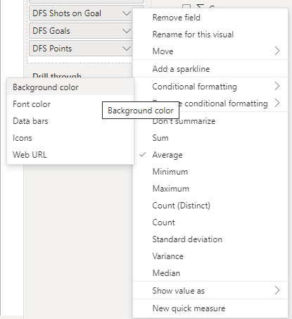
- Clicked the Table control and dragged PLAYER, TEAM, DFS_SOG, DFS_GOALS and DFS_PTS to Columns.
- Added conditional formatting to each DFS point column by clicking the down arrowhead in the fields and selecting Conditional Formatting and Background color. You can then configure the colors you want for that metric.
- Clicked the Slicer control and dragged the TEAM data to Field.
- Clicked Line and stacked column chart and dragged PLAYER to X-axis, G to Column y-axis and SOG to Line y-axis.
We followed this same process for each of the reports we built.
Clean Up the Look and Feel
We often see this stage overlooked in our daily work or when we work with customers. This could be because of the pressures of time, report developers or data analysts are close to the data so they assume others know what it is, or people haven't been taught good report design practices. Whatever the reason, we have a few rules of thumb we like to live by when it comes to report design:
- Visualizations should be simple, useful and intuitive.
- De-clutter visualizations and remove all that is unnecessary.
- Use good design contrast and logical placement when building your reports.
- Visualization labels should be legible and understandable.
- Generally, map one goal to a report (it's better to have multiple reports than a cluttered report that only you can decipher).
- Reports should be able to stand on their own.
These are just a few, but there is an entire industry that is built on building awesome and readable visualizations and reports.
To put the above rules of thumb into practice, here's what we did for our project:
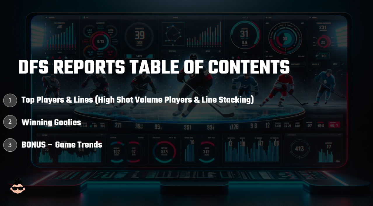
- Created a Cover page and a Reports TOC page.
This gave the dashboard a bit more life and if someone opens the report file, they know what reports are there. (Note that you can add more detail to the TOC page to improve the page even more.) The TOC page is below, which we created in PowerPoint and then imported into Power BI as a PNG file.
- Created a design that included a title, labels and a report structure as a background image, which we then imported into Power BI.
This is how the background image looked in PowerPoint, which we saved as a PNG file and imported into Power BI. Note that we did the bare minimum here to get a decent-looking background. PowerPoint has a ton of features that can give you a better design – or you can use other applications to create amazing looking backgrounds.
We've found that taking a bit of time to create a nice design for your report is worth it. This is especially the case if you work for a team, league or other organization. You can create a background using the brand, colors and logo for that team or organization and really make it pop.
- Arranged the visualizations in a logical way (for the consumer of the report).
For example, on the Top Players & Lines report, the Season filter is at the left so the consumer can decide the timeframe; the table view is next so the consumer can explore the DFS points and sort on a specific one; the Teams filter is next so the consumer can sort on a specific team (to see those players that are on the same team and/or line); and the final visualization gives context to the DFS points through broader hockey stats.
If you think about a logical and simple path for someone to consume your report (e.g., follows the goal of the report, reads left to right, etc.), you can make very powerful reports that are both easy to navigate and super useful.
- Cleaned up the labels and formatting of the visualizations.
The column names of a dataset may not translate well to the untrained eye. For example, "BL" as a column name may not be intuitive, but when changed to "Blocked Shots" is much more intuitive. When you're taught to model data, you're not always taught to think about the people throughout the BI development process that may not have subject-matter expertise on the data. Thus, try and use descriptive column headers when developing the data so those down the line can accurately translate those headers into something consumable.
- Arranged the report in a logical way.
There's a bit of "in the eye of the beholder" here, but try and create a flow to the reports – especially where you have multiple reports that should flow together somehow. For example, we are trying to create a winning DFS system using analytics that map to three strategies: 1) High Shot Volume Players, 2) Line Stacking and 3) Winning Goalies. However, if you put yourself in the shoes of someone who will consume the report, they're likely going to think about which players first would be in their lineup (players make up more of the lineup, so you'll spend more time here), then goalies (fewer goalies, but you have to be careful with the DraftKings point system) and then games to think through higher-level match-ups. Thus, we placed Top Players & Lines first in the flow, then Winning Goalies and then Game Trends.
You may find more steps to add in your own process, but we find the above helps us when creating reports for a wide range of audiences.
For a quick-hit walkthrough, check out the following video on YouTube.
Summary
This was the final newsletter in our six-part series on DFS Fantasy Hockey, specifically introducing how you can create a winning DFS system using analytics. A more data-driven system should help you with your pre-game lineup decisions so the goal is that you can improve your odds of winning by virtue of introducing a more analytics-driven approach to your decision making.
In the series, we covered different strategies and introduced a simple winning DFS system that maps strategies to scores to statistics. We also demonstrated different ways you could create a report for specific strategies using Microsoft Excel and freely available data, and then in this final newsletter we demonstrated how you can build an integrated dashboard with multiple reports that supported three strategies: 1) High Shot Volume Players, 2) Stacking Lines, and 3) Winning Goalies.
We hope you found this series useful and will use the data, tools and resources we provided within the series to build your own winning DFS system!
Subscribe to our newsletter to get the latest and greatest content on all things hockey analytics!
Member discussion