From Static Stats to Living Dashboards
A metric means little until you can see the relationship it has with other data. That’s why connecting TBI to a dashboard is a necessary way to test out this novelty metric.
Using Power BI or Tableau, you can hook your daily NHL data feed into an auto-refreshing dashboard that tracks balance across the season. Every morning, TBI updates automatically — and suddenly, analytics become a real-time story.
Want to know which team’s balance jumped overnight? Add a trend chart.
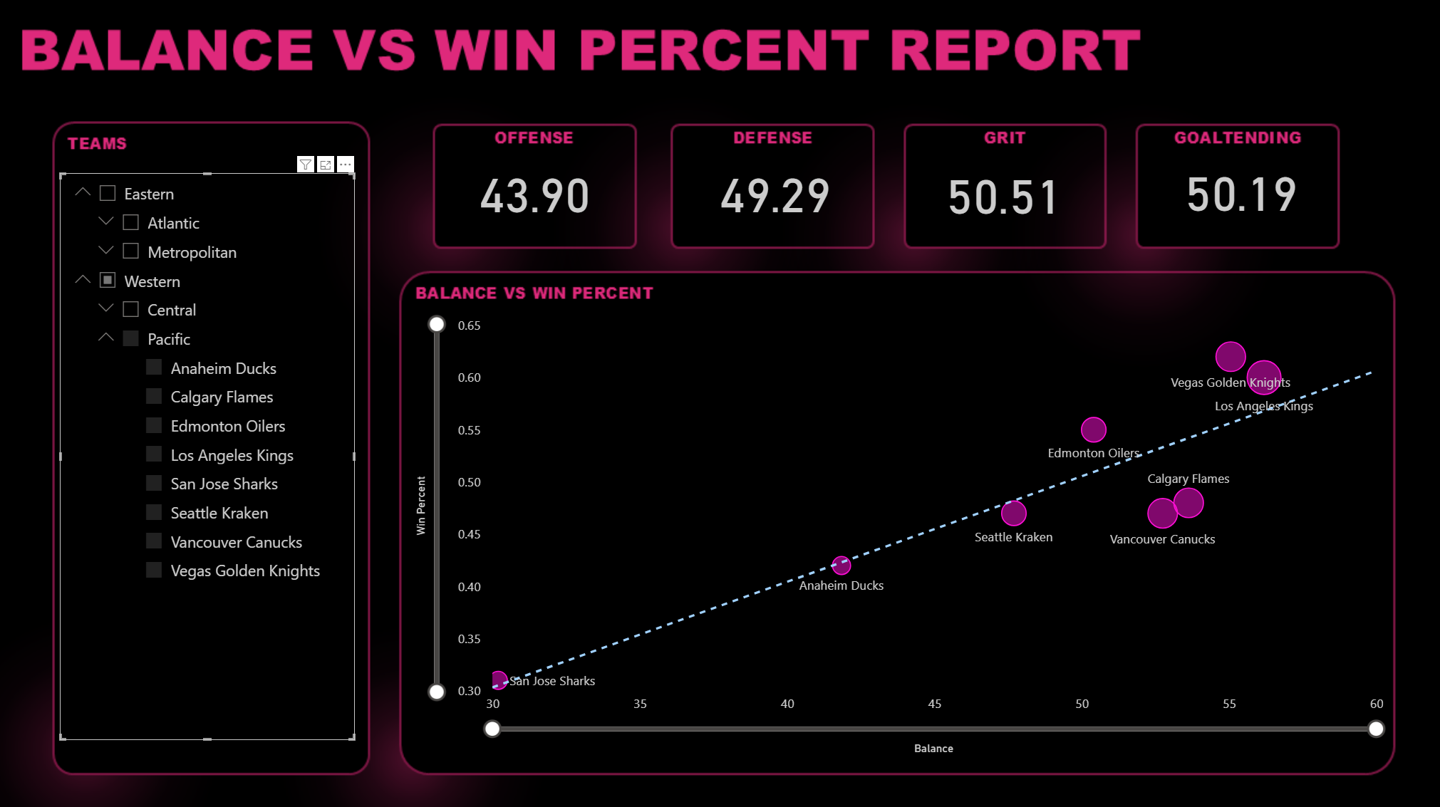
Curious whether balance correlates with wins? Drop in a scatterplot.
Need to highlight your “balanced-but-underperforming” teams? Add conditional color.
Not a member? Join Data Punk Hockey today to level up your hockey analytics skills!
Think of it this way: spreadsheets describe what was. Dashboards show what is becoming. Here's an example of TBI in action with a filter on the Pacific division and showing the distance between LA and San Jose.
The goal isn’t just to visualize data — it’s to create a living report that helps you feel the season’s rhythm.
Sign up to get free access to more weekly content and courseware on all things Hockey Analytics.
Member discussion