How to Create a No-Code Playoff Dashboard

In this Tutorial
The playoffs are underway, so we recently created a new Playoff page to track various stats throughout the 2023-2024 NHL playoffs. However, while having a playoff stats page is good, we wanted to re-use the data behind our new Playoff page to create a playoff dashboard. So, the goal of this tutorial is to provide you with the resources and steps to create your own no-code 2023-2024 Playoff Dashboard using Microsoft Power BI.
The dashboard we create in this tutorial will answer six questions:
- How do teams compare across special teams and scoring?
- What teams are more likely to win?
- How strong is a team's offensive and defensive game?
- What team has the most injuries?
- What position is incurring the most injuries?
- What teams have the strongest goaltending statistics?
Note that we will use only the 2023-2024 playoff data to create the dashboard and answer the above questions.
Getting the Resources
For this tutorial, you can find the resources below, including data, background designs for the Power BI reports, and a completed sample Power BI dashboard.
Datasets
- Summary Statistics
- Winning Percentage
- Offensive and Defensive Metrics
- Injury Data
- Goaltending Data
Background Designs
Sample Dashboard
Using the Data Sources for the Dashboard
The datasets above will be refreshed daily during the 2023-2024 playoffs. So, if you use these data sources and build out the report using the tutorial below, then you will have your own playoff dashboard!
We created the sample playoff dashboard using four reports, but there are plenty of statistics in the downloadable datasets that you can use to expand your dashboard.
To import the data into Power BI:
- Open Power BI
- Click Get Data, Text/CSV and Connect.
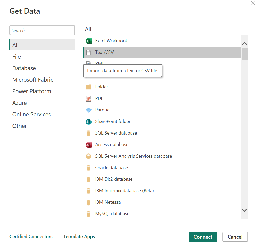
- Navigate to the CSV file and click Open and Load. Note that you copy and paste the URL to the file (which you can get from the above link) in the File name field.
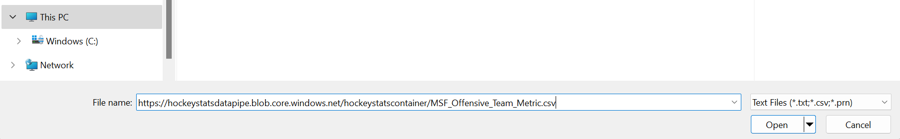
Repeat for each of the files that you want to use to build your playoff dashboard.
Automating the Daily Data Refresh
While manually referencing or downloading the files works fine, you can also automate the process of downloading and saving the CSV files to your local machine. After you do this once and then add the CSV files to Power BI, you can run the below script once a day and then click Refresh in Power BI and you'll have an updated dashboard.
The sample Python code to this this is below.
# Library required for loading data from cloud.
import pandas as pd

# Load CSV from Cloud.
cloud_url = "https://hockeystatsdatapipe.blob.core.windows.net/hockeystatscontainer/MSF_Defensive_Team_Metric.csv"
playoff_goalie_stats = pd.read_csv(cloud_url)
print(playoff_goalie_stats)

# Save file loaded from Cloud locally.
file_prefix = "c:/Demos/"
file_name_goalie_stats = file_prefix + "Daily_Goaltending_Stats.csv"
playoff_goalie_stats.to_csv(file_name_goalie_stats, encoding='utf-8', index=False)
Creating the Playoff Dashboard
The dashboard creation process comprises two main steps:
- Creating the background design for the dashboard; and
- Creating the different reports that will make up the dashboard.
Let's walk through each of these steps.
Creating the Background Design
You can use the different background designs we created for your own dashboard. To create a different design, use PowerPoint to create your background design, save as a PNG file and then import into Power BI.
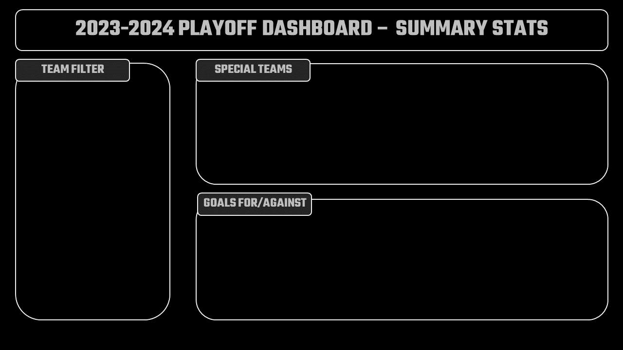
Note that we created the background design in PowerPoint, but also included the title text and visualization titles in the background design. We did this to minimize the number of controls to add to the canvas in Power BI and to have more consistent placement and design of the text across our reports. Below is an example of one of the background designs.
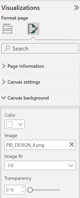
After you create your backgrounds, you then import them into Power BI. To do this:
- Open Power BI
- Navigate to the canvas you want to customize
- In the Visualizations pane, expand Canvas background and in the Image field browse to and load your background design.
After you have your background designs loaded, you are ready to create the reports and your dashboard.
Creating the Playoff Dashboard
The Playoff dashboard comprises five pages:
- Title page
- Summary Report
- Winning Percentage & Offense/Defense Report
- Injury Report
- Goaltending Report
Let's walk through how to create each of these.
Title Page
The title page is basically a design that you load. We also added a Power BI logo for good measure.

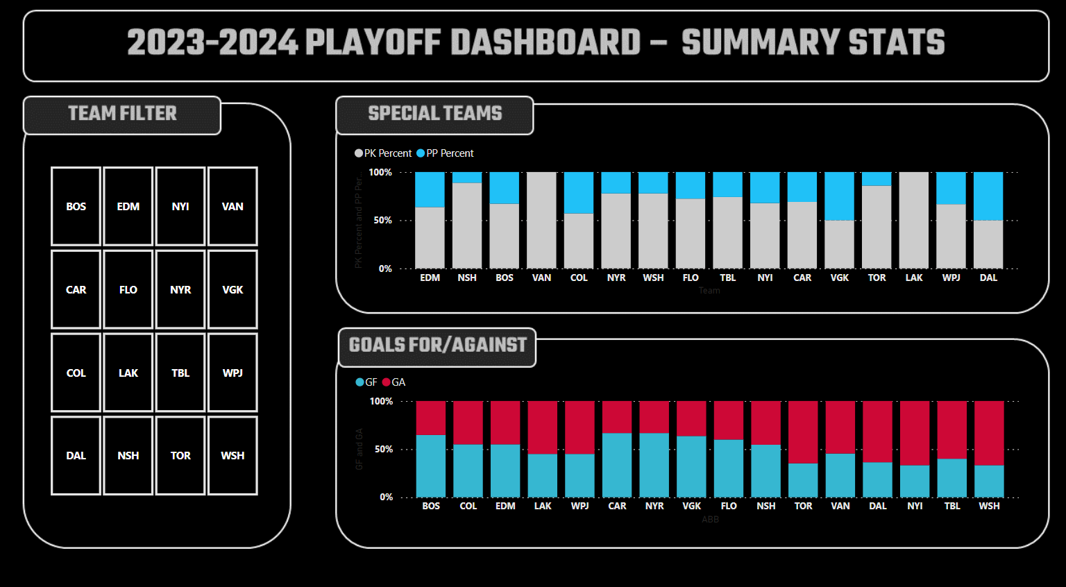
Summary Report
Three controls make up the Summary Report:
- A Slicer control that acts as a filter for the playoff teams.
- Configured to ABB.
- A 100% Stacked column chart.
- The X-axis is configured to ABB.
- The Y-axis is configured for PK_PCT and PP_PCT.
- Another 100% Stacked column chart.
- The X-axis is configured to ABB.
- The Y-axis is configured for GF and GA.
After you add and customize the above controls, your report should look something similar to the below.
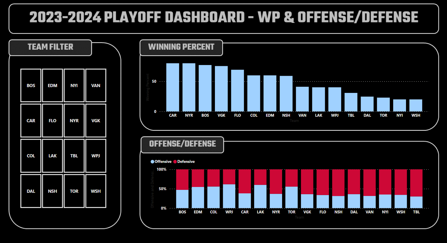
Winning Percentage & Offense/Defense Report
Three controls make up the Winning Percentage & Offense/Defense Report:
- A Slicer control that acts as a filter for the playoff teams.
- Configured to ABB.
- A Clustered column chart.
- The X-axis is configured to ABB.
- The Y-axis is configured to WIN_PCT.
- A 100% Stacked column charts.
- The X-axis is configured to ABB.
- The Y-axis is configured to OFF_METRIC and DEF_METRIC.
After you add and customize the above controls, your report should look something similar to the below.
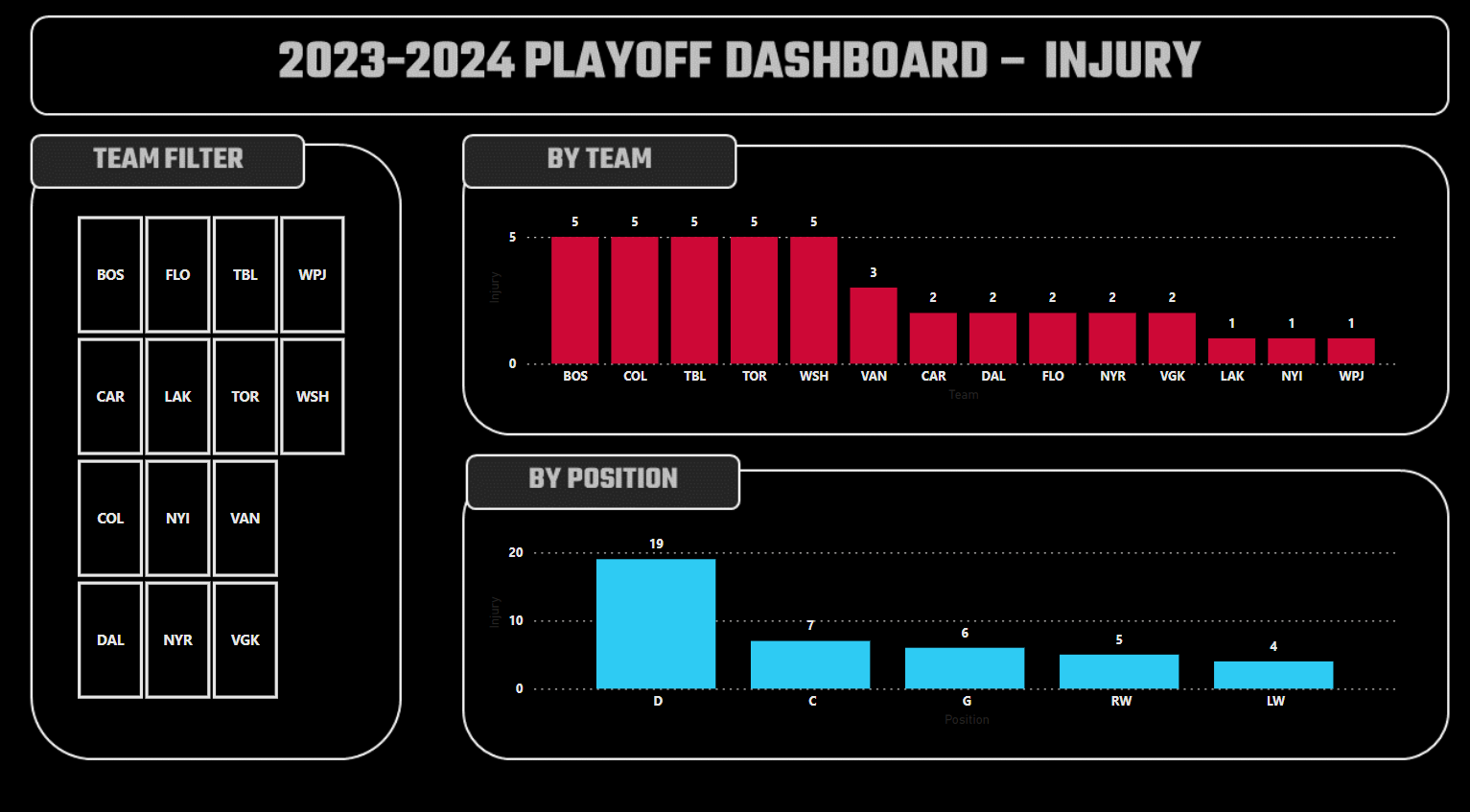
Injury Report
Three controls make up the Injury Report:
- A Slicer control that acts as a filter for the playoff teams.
- Configured to TEAM_ABB.
- A Clustered column chart.
- The X-axis is configured to TEAM_ABB.
- The Y-axis is configured to INJURY.
- Another Clustered column chart.
- The X-axis is configured to POSITION.
- The Y-axis is configured to INJURY.
After you add and customize the above controls, your report should look something similar to the below.
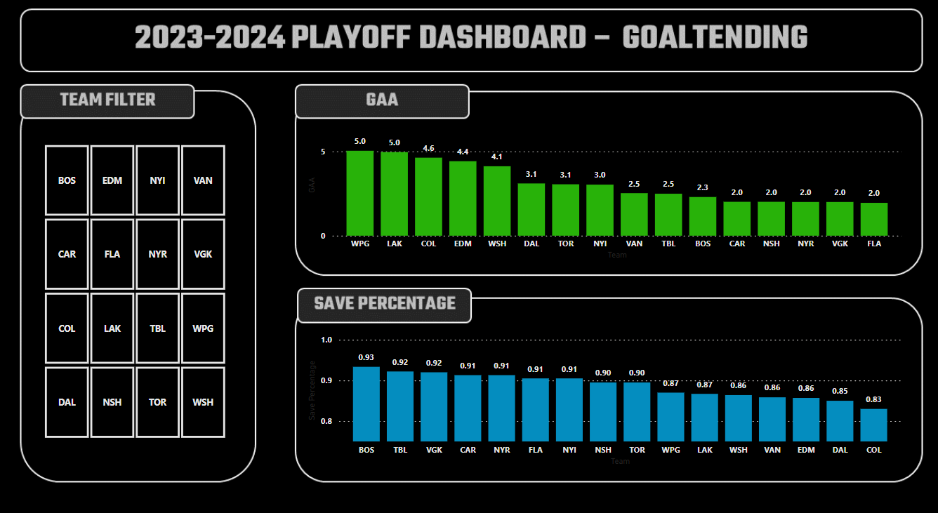
Goaltending Report
Three controls make up the Goaltending Report:
- A Slicer control that acts as a filter for the playoff teams.
- Configured to Team.
- A Clustered column chart.
- The X-axis is configured to Team.
- The Y-axis is configured to GAA.
- Another Clustered column chart.
- The X-axis is configured to Team.
- The Y-axis is configured to Sv%.
After you add and customize the above controls, your report should look something similar to the below.
If you've followed along, you should now have an interactive dashboard where you can compare all teams or select your favorite teams to see how they compare across the various playoff statistics. You can also extend the sample dashboard to create more reports using other playoff stats.
Check out our quick-hit video tutorial on YouTube:
Summary
The goal of this tutorial was to give you a quick and no-code way to create your own NHL Playoff dashboard for the 2023-2024 playoffs. It takes the data we're using for our newly published Playoff page and exposes this data for you to create your own dashboard (with the data being updated daily during the playoffs).
The tutorial comes with multiple datasets, background designs and a sample playoff dashboard for you to use as a starting point. We cover how to load the background designs and walk through each report and show how to configure the various controls in each report.
We would encourage you to use the sample dashboard and build out your own reports (or further configure the existing ones). And most importantly, enjoy the playoffs!
Subscribe to our newsletter to get the latest and greatest content on all things hockey analytics!
Member discussion