How to Create an Injury Report with Production Cost

In this Tutorial
We'll show you how to expand a daily injury report to include other factors, such as points per game, so you can gauge which injuries are more "expensive".
We'll answer five questions using this report:
- What injuries are the most pervasive?
- What team has the most injuries?
- Which position has the most injuries?
- Which injuries are the most expensive (from a production perspective)?
- What team is incurring the highest production cost?
Getting the Data and Code
For this tutorial, you can find the data and code links below:
Sourcing & Shaping the Data
The original source for the injury data for this tutorial is our sports data provider, My Sports Feeds. However, we created a dataset for this tutorial that curated injury data for one day and then integrated player and goalie statistics. This starting file (final_player_injury_impact_dataset.csv) can be downloaded from here.
With the data downloaded, open RStudio and create a new project. Add the following libraries into the project.
library(dplyr)
library(tidyverse)
library(ggplot2)
...
Next, load the curated injury and stats dataset, rename the columns and implement a small amount of data cleaning and transformation.
...

injury_data_current_df <- read.csv("final_player_injury_impact_dataset.csv")

colnames(injury_data_current_df) <- c("DATE", "PLAYER_ID", "LNAME", "FNAME",
                                      "JNUM", "POSITION", "TEAM_ID", "TEAM_ABBR",
                                      "TEAM_CITY", "TEAM_NAME", "INJURY",
                                      "GP", "G", "A", "PTS", "TOI", "PTS_PG",
                                      "GAA", "SAVE_PCT")

injury_data_current_df$PLAYER_NAME <- paste(injury_data_current_df$FNAME,
                                      injury_data_current_df$LNAME, sep = " ")
injury_data_current_df$TEAM <- paste(injury_data_current_df$TEAM_CITY,
                                  injury_data_current_df$TEAM_NAME, sep = " ")

injury_data_current_df$PTS_PG <- round(injury_data_current_df$PTS_PG, 2)
injury_data_current_df$TOI <- round(injury_data_current_df$TOI, 2)
...
An optional step here is to load a daily snapshot of player stats summary, which you can use to calculate the average points per game. For the date we pulled the data, this was 0.342, so you can either use the MSF Player Stats Summary dataset and implement the following R code or assign 0.342 to the avg_points_per_game variable.
...
nhl_player_data_df <- read.csv("MSF_Player_Stats_Summary.csv")

nhl_player_data_df$PTS_P_G  = nhl_player_data_df$POINTS / nhl_player_data_df$GAMES_PLAYED

avg_points_per_game = mean(nhl_player_data_df$PTS_P_G)

avg_points_per_game
...
You will now create a data frame called sub_injury_dataset to use throughout the tutorial. Note that we've omitted the NAs in the dataset and written the data frame to file – so you can use the data in other tools/platforms should you want to.
...
sub_injury_dataset <- injury_data_current_df %>%
  select(PLAYER_ID, PLAYER_NAME, TEAM_ID, TEAM_ABBR, TEAM, JNUM, POSITION,
         INJURY, GP, G, A, PTS, PTS_PG, TOI, GAA, SAVE_PCT) %>%
  arrange(desc(PTS_PG))

sub_injury_dataset$PTSPG_DIFF = round(sub_injury_dataset$PTS_PG - avg_points_per_game, 2)

rows_with_na <- sum(apply(sub_injury_dataset, 1, function(x) any(is.na(x))))

clean_df <- na.omit(sub_injury_dataset)

write.csv(clean_df, "injury_summary_data_w_cost.csv", row.names = FALSE)
...
What Injuries are the Most Pervasive?
The first question to answer is what are the most pervasive injuries for the dataset. This is answered by grouping the data by INJURY and getting a count of each injury across the grouping.
total_injuries_df <- sub_injury_dataset %>%
  group_by(INJURY) %>%
  summarize(COUNT = n()) %>%
  arrange(desc(COUNT))

ggplot(total_injuries_df, aes(x = reorder(INJURY, COUNT), y = COUNT)) +
  geom_bar(stat = "identity", fill = "#549490") +
  theme_combmatrix(combmatrix.label.make_space = TRUE) +
  geom_text(aes(label = COUNT), vjust = -.5, size = 3, color = "#549490") +
  theme_minimal() +
  theme(panel.grid = element_blank()) +
  labs(x = "Injury Type", y = "Count",
       title = "Count of Types of Injuries",
       caption = "Data Source: My Sports Feeds") +
  theme(plot.title = element_text(face = "bold", size = 12),
        axis.title = element_text(size = 8),
        axis.text.x = element_text(angle = 45, size = 8, hjust = 1),
        axis.text.y = element_blank(),
        panel.grid.major.y = element_blank(),
        panel.grid.minor.y = element_blank(),
        legend.position = "none")
The result of the above code is a relatively clean R chart that shows upper body with the highest incidence of injury (n = 25).
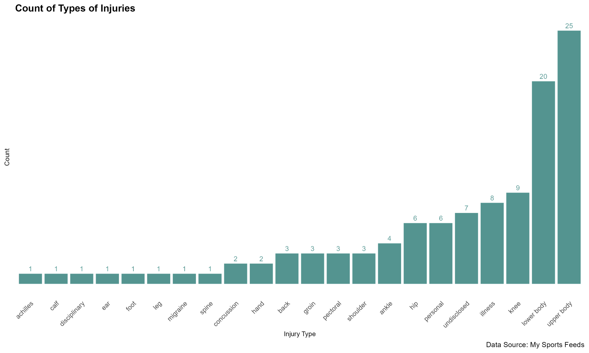
While this is somewhat interesting, it's general and doesn't quantify impact or production costs.
What Team has the Most Injuries?
Our first impact metric is the count of injuries by TEAM. Here we'll see what teams have the most injuries for that day we pulled the data.
injuries_by_team <- sub_injury_dataset %>%
  group_by(TEAM)  %>%
  summarize(COUNT = n()) %>%
  arrange(desc(COUNT))

write.csv(injuries_by_team, "injuries_by_team.csv", row.names = FALSE)
Note that here again we wrote the data frame to file so we could use in DataWrapper, an online data tool.
With this chart, we're starting to see some impact, but it's still not where we want it to be.
What Positions have the Most Injuries?
As a third general chart, this one informs which position is more vulnerable to injuries for the time period. To create this view, we now group by POSITION and take the count.
total_injuries_by_position_df <- sub_injury_dataset %>%
  group_by(POSITION) %>%
  summarize(COUNT = n()) %>%
  arrange(desc(COUNT))

write.csv(total_injuries_by_position_df, "total_injuries_by_position.csv", row.names = FALSE)
Here again, we save as a local file and use DataWrapper to display the results. The results are that D is the position with the most injuries.
Which Injuries are the Most Expensive?
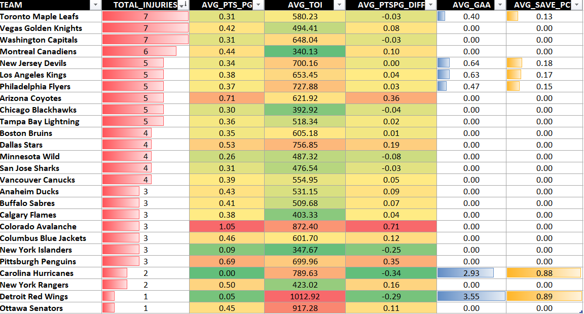
It's this next chart that starts to show the cost of the injuries. Here, we again group by TEAM, but also add some summary statistics to see how injuries would impact a team. For example, we have included the calculated average points per game (AVG_PTS_PG), which is the average points per game obtained by the players in the injury dataset. Thus, the higher this number, the more higher-production players are injured. We've also included some other metrics, for example, average time on ice (AVG_TOI), average points per game difference with league average (AVG_PTSPG_DIFF), etc.
grouped_data <- sub_injury_dataset %>%
  group_by(TEAM) %>%
  summarize(
    TOTAL_INJURIES = n_distinct(PLAYER_ID),
    AVG_PTS_PG = round(mean(PTS_PG, na.rm = TRUE), 2),
    AVG_TOI = round(mean(TOI, na.rm = TRUE), 2),
    AVG_PTSPG_DIFF = round(mean(PTSPG_DIFF, na.rm = TRUE), 2),
    AVG_GAA = round(mean(GAA, na.rm = TRUE), 2),
    AVG_SAVE_PCT = round(mean(SAVE_PCT, na.rm = TRUE), 2),
  )

write.csv(grouped_data, "grouped_injury_data.csv", row.names = FALSE)
For this dataset, we saved it and then used Microsoft Excel to create a heatmap. This gives you a team-level view where you can begin to see how the total injuries incurred for that snapshot could impact production. For example, Toronto have 7 injuries with an AVG_PTS_PG of 0.31 (below the league average for impact) whereas Colorado have 3 injuries with an AVG_PTS_PG of 1.05 (three times the league average for impact).
What Team is Incurring the Highest Production Cost?
Here, we again group by TEAM but only include the average points per game metric.
injury_cost_by_team <- sub_injury_dataset %>%
  group_by(TEAM)  %>%
  summarize(AVG_PTS_P_GAME = round(mean(PTS_PG), 2)) %>%
  arrange(desc(AVG_PTS_P_GAME))

injury_cost_by_team = na.omit(injury_cost_by_team)

ggplot(injury_cost_by_team, aes(x = reorder(TEAM, AVG_PTS_P_GAME), y = AVG_PTS_P_GAME)) +
  geom_bar(stat = "identity", fill = "#6A4C93") +
  coord_flip() +
  labs(x = "Team", y = "Average Points per Game",
       title = "Cost of Injury per Team",
       subtitle = "Average points lost per game due to injuries",
       caption = "Data Source: My Sports Feeds") +
  theme_bw() +
  theme(plot.title = element_text(face = "bold", size = 14),
        axis.title = element_text(size = 12),
        axis.text = element_text(size = 10)) +
  scale_fill_brewer(palette = "Purples")
And here, irrespective of the number of injuries, we see that Pittsburgh has the highest impact cost with an average points per game of 0.69.
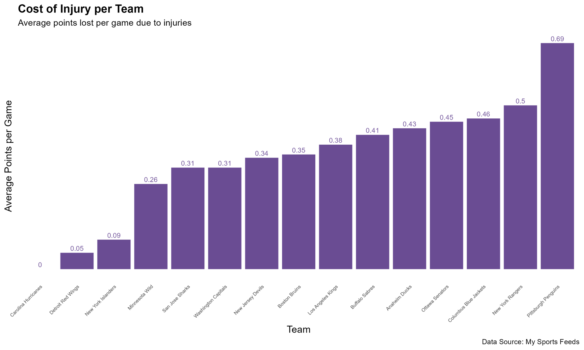
For a simple chart, the above informs what teams are impacted more by higher-production players being injured.
Summary
In this tutorial, we walked through how to create different views that begin to show the impact of injuries. The first three charts were more general in nature; they showed totals at the team level, counts by injury and counts by position. The fourth and fifth charts introduced more metrics that indicate potential impact. For example, teams with higher average points per game and time on ice metrics translated into higher-production players on the injured list.
As follow-on exercises, you could create your own impact metrics and build a comparative view where you can compare two teams playing one another to see whether injuries could be a potential factor in the game.
Subscribe to our newsletter to get the latest and greatest content on all things hockey analytics!
Member discussion