Lesson 10: Creating Your Data Story Using Video

At a Glance
- How Did We Get Here?
- Why Video?
- Creating a Script
- Producing the Video
- What's Next?
How Did We Get Here?
To date, we've released nine lessons in our email course on Data Storytelling for Sports:
- Lesson 1: Introduction to Data Storytelling for Sports
- Lesson 2: Exploring Data for the Narrative
- Lesson 3: Data Analysis & Modeling
- Lesson 4: Developing Your Data Story
- Lesson 5: Translating Data Story Outline to Content
- Lesson 6: Using AI for Your Content Creation
- Lesson 7: Creating Your Data Story using Socials
- Lesson 8: Creating Your Data Story using Infographics
- Lesson 9: Creating Your Data Story using Power BI
In this final lesson, we'll create our data story using video.
Feeling lazy? Check out our video accompaniment to this newsletter below.
Why Video?
Video is one of the most powerful formats for telling a data story, especially when you want to move people from information to insight. Video is a great way to tell a data story because it combines narrative with visuals, which can have a dramatic impact on your audience.
Video combines motion, sound, visuals, and voiceover — ideal for walking viewers through complex information step by step. You can control pacing and emphasize key moments with zooms, highlights, or animations. Further, you can pair data visuals with music, tone, or real-world footage, which adds emotional weight to numbers. And this helps your audience connect why the data matters in a real-world setting.
What's also great about video is that it leads to high engagement and retention. According to Forbes, viewers retain 95% of a message when they watch it in a video vs only 10% when reading it. Further, it's good for explaining difficult concepts like models, simulations, or time-based comparisons. And lastly, it's reusable across platforms; that is, you can edit one long video into shorts, reels, carousels, or animated GIFs for socials and presentations.
The following table illustrates how video differs from social media posts and infographics.
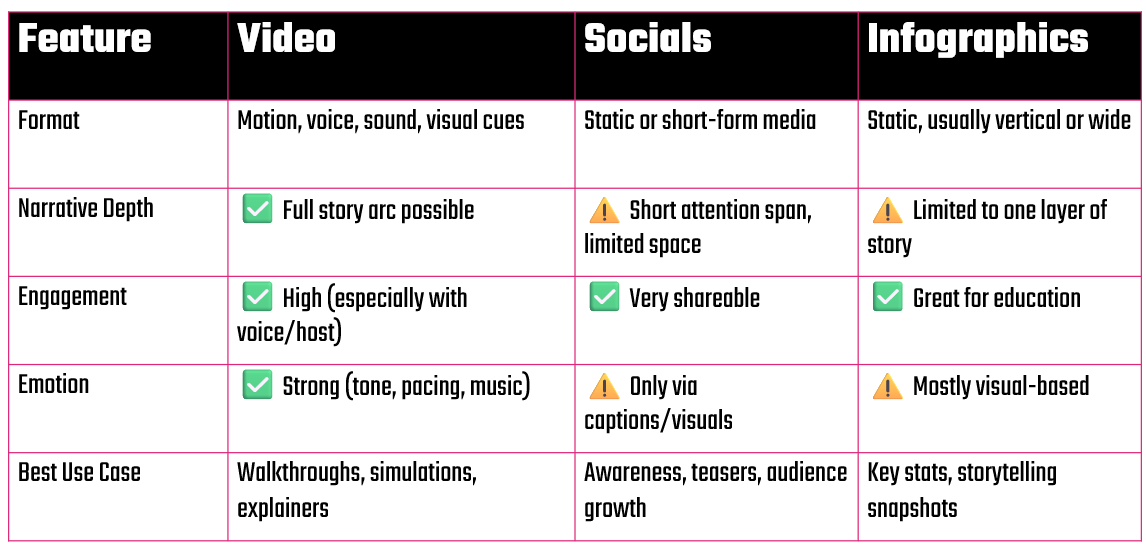
In summary:
- Use video when you want to combine data, context, and emotion into a story that flows.
- Use infographics when you want to explain a snapshot or static comparison.
- Use social posts to tease or share parts of a larger story to build engagement.
Creating a Script
Depending on the type of video you're creating, your script may take on a slightly different flavor. For example, if you're writing a documentary or have actors, then you'll use a more formal script. Our videos are often tutorials, so we write our weekly newsletters first and then use that as the input into the script for the video. Thus, the video follows a similar structure to the newsletter and acts much like a tutorial – and they can cross-reference one another.
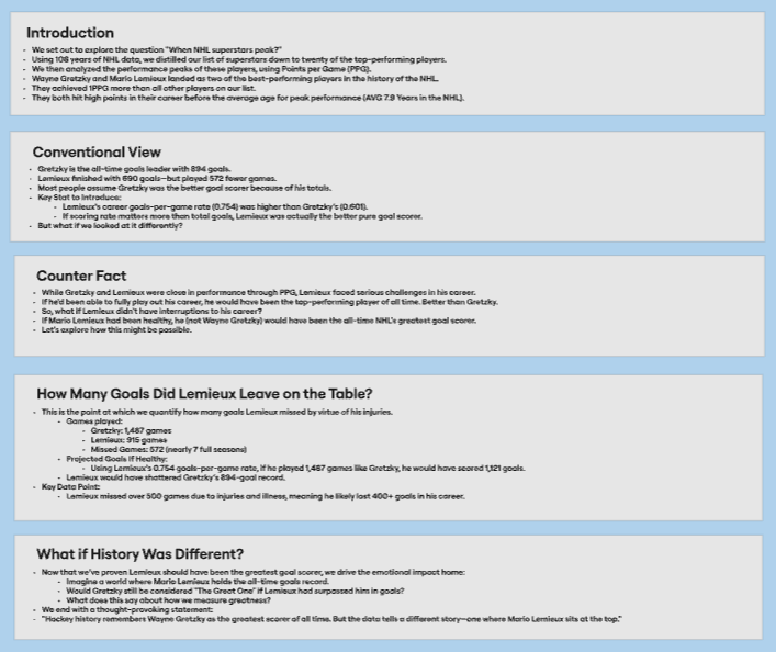
If we take the data story outline we've been working on throughout this course and build a script from that, we'll first need to revisit the final data story outline. Recall that the data story outline included five elements, per below.
You're likely not going to use all of the specific pieces of the story outline. So, our first step is to review the data story outline and select the elements that would be best represented in a video. We'll then fashion those elements into a script.
Creating a compelling video script from our data story outline means blending narrative storytelling with data insights in a way that’s engaging, visual, and easy to follow. Here's a step-by-step process you can use to go from the data story outline to a script — whether you’re building a YouTube essay, TikTok breakdown, or a narrated reel.
1. Start with the Hook
You only have a few seconds to grab attention, so begin with a big question, surprising stat, or emotional “what if?” For example, “what if I told you Mario Lemieux should have been the NHL’s all-time leading goal scorer?”
The hook should spark an immediate sense of curiosity. In our data story outline, we're jumping to our Counter Fact section and pulling this into the front part of the video.
2. Introduce the Premise & Context
Now that you’ve grabbed the audience's attention, explain what the story is about and why it matters. For this part, we're going to take a step back and reference Gretzky and Lemieux to compare their career statistics. It is here where you give basic context (e.g., who, what, where, when) and reference key actors and statistics.
At this point, your goal is to give the viewer a reason to care, but also show them that you're going to throw them a curve ball.
3. Present the Data & Analysis
Break down the data visually and narratively. You've seen this before in the Socials and Infographics, but for this one we'll leverage the line chart and statistical comparison of Gretzky's and Lemieux's career. We're going to also show actuals and projected; this brings our hook out a bit.
The goal at this stage is for us to use analytics and statistics to support our hook.
4. Build the Narrative Arc
This is the core of the story — where you present conflict, surprise, or contrast. For our data story, this is where you build on Lemieux being a better player than Gretzky. You can build the narrative with additional facts, for example, the fact that he was plagued with illness and injury, yet still had the ability to score .75 goals per game; the fact that he was the only player to own a franchise; and the fact that he played 17 seasons with one team and won 2 Stanley Cups as a player (and 3 more as an owner).
5. Deliver the Takeaway (Arc & Resolution)
The last part of the video reinforces what the data says. It answers the question of what does it mean for the viewer? For our data story, we'll reinforce the projected statistics here. And close with a final question to spark reflection or debate. Also, it's a good opportunity to engage with the audience – for example, do they agree, would they offer another player, etc. This is where we'll finish strong and offer a call to action (CTA). For example: “So if Lemieux really was the better goal scorer, are we ready to rewrite hockey history?”
6. End with a CTA
On the heels of the last step, driving engagement is important; else, people won't care. If you bring your audience into the data story, then you can drive more engagement and interest in your video. For example:
- Like, comment, subscribe if it's YouTube
- “Drop a 🏒 if Lemieux > Gretzky” if it’s Instagram or TikTok
- Prompt them to share or debate in the comments
Building Out the Script
Let's take all of the steps and build out a sample script: “What If Mario Hadn’t Missed Any Games?”
[Hook – 0:00–0:08]
VO:
“What if I told you that the greatest goal scorer in NHL history… wasn’t Wayne Gretzky?”
Visual:
- Video replays of Lemieux and Gretzky playing in big games.
- Text overlay: “What If Mario Hadn’t Missed Any Games?”
[Setup – 0:09–0:20]
VO:
“Wayne Gretzky holds the record with 894 goals.
Mario Lemieux? Just 690. But here’s the thing—Mario played 572 fewer games.”
Visual:
- Line chart: Games played – Gretzky: 1,487 vs. Lemieux: 915
- Cut to: Lemieux injury highlight / headline montage
[Data Insight – 0:21–0:38]
VO:
“When he was on the ice, Lemieux scored at a higher rate than Gretzky —
0.754 goals per game compared to Gretzky’s 0.601.
That’s like scoring 3 goals every 4 games.”
Visual:
- Line graph: GPG comparison (with Lemieux's projected statistics)
- Photo overlay: Lemieux in Penguins jersey
[What If Scenario – 0:39–0:54]
VO:
“Now imagine this:
If Lemieux had played as many games as Gretzky —
he would have scored 1,121 goals.
That’s over 200 more than The Great One.”
Visual:
- Projected line chart (comparing Gretzky and Lemieux):
- Gretzky: 894
- Lemieux (Actual): 690
- Lemieux (Projected): 1,121
[Takeaway – 0:55–1:05]
VO:
“Injuries and cancer kept Mario off the ice —
but the numbers suggest:
If he stayed healthy…
he’d be the greatest goal scorer the NHL has ever seen.”
Visual:
- Fade to black-and-white Lemieux photo
- Overlay quote: “Hockey remembers Gretzky. But the data remembers Lemieux.”
[Call to Action – 1:06–1:10]
VO:
“Think Lemieux was the real GOAT?
Drop a 🏒 in the comments.”
Visual:
- Like and Comment icons
Producing the Video
We use a process and an array of tools to produce our videos. Keep in mind most of our videos are tutorials or walkthroughs, so we tend to build the video scripts from the newsletters. That said, our high-level process is as follows (assume this is all post creation of data story outline):
- We draft the newsletter
- Use the newsletter as the script for the video (this can be us doing it live or us using ElevenLabs to create a narration of the script)
- Find appropriate B-roll, music and images for the video
- Create new images or animated videos (if needed)
- Create a deck that organizes the video into at least three sections
After we have completed the above, we'll then create the skeleton video file in either Camtasia or Premier Pro. Camtasia is useful if you're going to screen capture a walkthrough demo, and Premier Pro has more advanced features for video editing, effects, transitions, etc. We sometimes build first in Camtasia (because we have to screen capture part of a walkthrough) and then export to Premier Pro where we complete the project using more advanced features.
We produce the video in a specific order:
- Add the section placeholders
- Add the audio/voiceover segments
- Map images, slides and B-roll footage to the audio
- Add music and sound effects
We'll then run through the video a few times to make sure it flows and try and edit down for brevity. We target five to six minutes for a weekly video. And after it's complete, we upload to our YouTube channel and then use parts of the video to promote out to other social channels.
What's Next?
At this point, you should now be familiar with how to create a sports data story from end-to-end. We focused on a specific data story ("What if Mario Hadn't Missed Any Games?") that compared Lemieux with Gretzky – and ironically witnessed Alex Ovechkin surpass Gretzky's goal-scoring record a week ago. So, while we kept with the Lemieux/Gretzky comparison, the approach to researching, analyzing, structuring and creating your data story is what matters.
What's next is for you to take on your own project now. And if you are looking for more inspiration for data storytelling, then follow us at www.datapunk.media as we'll be publishing regular data story projects to help you tell data-driven stories. And here on www.datapunkhockey.com, we'll continue to publish data, AI and hockey content.
Summary
This newsletter was the final email in our Data Storytelling for Sports course. We covered how to create a data story using video. In this week's lesson, we answered the question of why video, walked through how to create a script and then discussed our process to produce and publish videos.
After you publish your videos, be sure to track people's engagement with your content. Explore the comments, likes/dislikes, and track views. You'll want to optimize your efforts to reach a quality audience, so be sure the amazing content you create is reaching its target audience.
Subscribe to our newsletter to get the latest and greatest content on all things Data, Hockey & AI!
Member discussion