Lesson 2: Exploring Data for the Narrative

At a Glance
- Developing a Narrative from the Question
- What are the Insights that Matter?
- Exploring the Data
- What is the Narrative?
Developing a Narrative from the Question
Welcome back to our Data Storytelling for Sports email course. In the last lesson, we introduced the idea of data storytelling in sports and ended on the introduction of a case study that we'll carry through the course, which focuses on the following question: When do NHL Superstars Peak?
Today, we’re going to take that question and show you how to explore data to find a compelling narrative.
Feeling lazy? Check out our quick-hit video below.
What is a Narrative?
A narrative is a structured way of telling a story – whether through words, visuals, or data. In the context of data storytelling, a narrative is the broader insight or theme that emerges from exploring the data.
For our question, a narrative isn’t just answering the question and stating when NHL superstars peak at a certain age. That’s a fact. A narrative weaves that fact into a broader, engaging story that provides context, meaning, and insight. For example, instead of saying most NHL superstars peak between the ages of 23 to 27, your narrative might read as follows:
- The modern NHL is a young player’s league. While past generations saw superstars thrive well into their 30s, today’s game is faster, younger, and favors peak performance in the mid-20s.
Key Elements of a Narrative
The following represent key elements of a typical narrative.
First, there should be a central question that we're trying to answer – e.g., when do NHL superstars peak? The question should guide the discovery of facts and development of insights – of course using your data.
Second, we should have data-driven insights, such as player production measured through Goals per Game peaks between the ages of 23 to 26, so goal scorers peak earlier than playmakers.
Third, a narrative requires context and potential comparisons – e.g., what is unique about the specific time (or era) within which the event took place, how does that time compare to the here and now, etc.
And lastly, the narrative should provide a takeaway or conclusion; that is, something that the audience walks away with from the story. For example, today's NHL rewards younger, faster players more than ever before.
How to Develop a Narrative?
Developing a narrative can be a chicken and egg problem; does the data analysis come first or the story? We've found that it can be a mix of both (one can evolve from the other), but first spending some time exploring the data can give you some initial indicators towards what is interesting about the data, thus what might be a compelling narrative.
Also, a narrative will lead to a story, which can have its own construct and layers. For example, if the narrative of the story focuses on a superstar that peaked late, then a secondary layer may be a life lesson in working hard, excelling at a particular skill and then being rewarded for it – in short, keep at it!
So, think of this initial data exploration process as follows:
- Source and clean the data
- Explore the data with some simple techniques – e.g., filtering, sorting, PivotTables, etc.
- Take notes as you go on early insights – e.g., who has the highest average, interesting trends, outliers, etc.
- Brainstorm and sketch out potential narratives (questions, insights, storyline, etc.) from your early insights
Try and sketch out as many options as you can, and then think about what your audience might enjoy. Ultimately, your audience are the ones who will (or won't) consume your data story, so if the narrative is weak or boring then they're moving on with their day.
Also, be careful not to rush past this stage – especially the brainstorming part. There is a ton of work that will hang off of your early decisions, so be sure to think through what would be a good narrative. If you have a trusted advocate, talk through the ideas to get their reaction and feedback.
What Are the Insights That Matter?
Insights are the key takeaways or meaningful patterns that emerge from analyzing data. They go beyond just reporting numbers—they provide understanding, context, and implications that help shape a narrative. In data storytelling, insights answer the question: What does the data tell us that we didn’t already know, and why does it matter?
For every data story, you'll determine which insights matter the most – to you and for the story. If you're more familiar with the subject matter, then insights may be easier to either spot or create. For example, we do a lot of hockey projects, so understanding existing hockey metrics (or creating new ones) is germane to our skills and knowledge. However, if we were to create a data story around climate anomalies in the Antarctica, we'd need to do some research to create sensible and interesting insights.
How Insights Differ from Data & Facts
Insights derive from data and facts. And while not always linear, data lead to facts which lead to the generation of insights. For example:
- Data are raw numbers and statistics, e.g., Player X scored 40 goals at age 24.
- Facts are statements based on data, e.g., Most NHL goal scorers peak between ages 23-25.
- Insights are the deeper meaning or trend behind the facts, e.g., Younger players are dominating the NHL more than in past decades due to faster play styles and evolving training methods.
Examples of Insights in Our Lesson
When exploring the question When do NHL superstars peak?, potential insights might include exploring peak performance, differences across eras and types of players.
Peak Performance
Use a metric such as Goals, Assists or Points and determine when each NHL superstar hits their prime. Then compare the age of each top superstar when they hit their peak performance.
Era-Based Differences
Define eras and then explore how players in different eras may have different performance peaks or differences. For example, was there a higher propensity of scoring in the 80s as opposed to the modern era, which is faster and more competitive.
Type of Superstar
Use Goals, Assists and Points (to create calculated metrics) to classify a superstar's performance as more goal-scoring versus playmaking. For example, are there superstars that are more focused on one or the other or do they have balance?
You'll likely develop more, but these are examples that will get you started. And once you discover how to arrive at these insights, you'll pattern out your own insights and how to get them – and turn them into an interesting narrative.
Exploring the Data
For this email course, we've created a public GitHub repository where we'll add data and code that you can use for the hands-on portions of the lessons.
To start the data exploration, we've created a dataset that includes statistics for the top twenty superstars in the NHL. You can find the dataset entitled nhl_superstars.csv in this folder.
So, now that you have a starting point for the dataset, it's time to explore it!
Understanding the Dataset
The first thing you should do with any data story project is understand the data. You may find that there is a data definition file that comes with the dataset or is built into the existing data file(s). If so, be sure to review the file and understand the data. The data definition file provides a description of each of the columns in the file. For example, we've included a file named DataDefinition.txt as the data definition, also in this folder.
After you read the data definition file (or research the data), you are now ready to explore the data.
Exploring the Data
Our first goal when exploring the data is to look for any patterns or issues with the data (that could make downstream analyses more difficult). For example, when you open the nhl_superstars.csv file, do you notice anything weird?
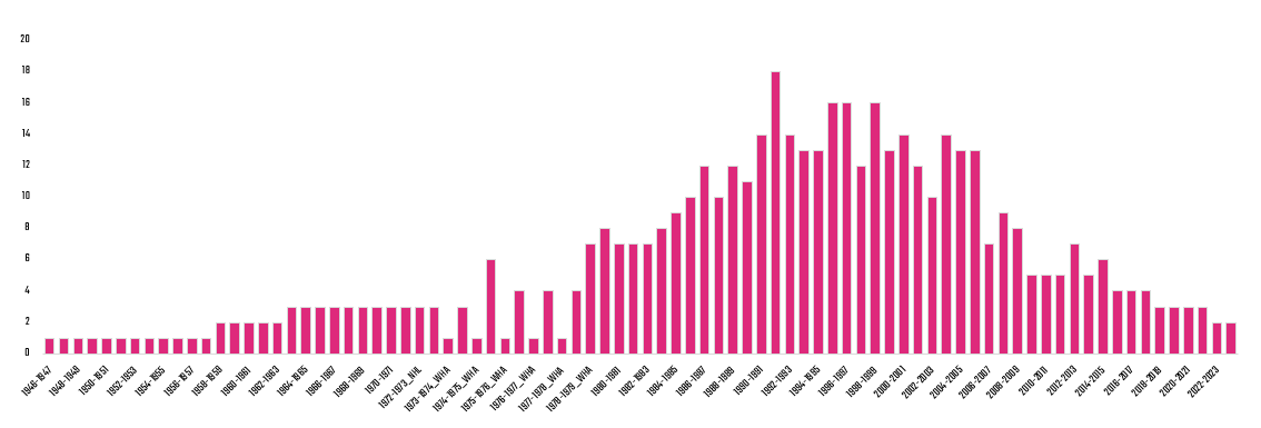
You should immediately notice that there is a lot of zero values in the data. At first glance, this may seem odd. But, if you look at the SEASON column, you'll realize this is the history of hockey statistics playing out in the dataset. That is, as the game of hockey evolved, so too did the collection of statistics. You'll find this parallels other sports as well.
Does this limit your data analysis? Sure. But this is where you can be creative towards calculated statistics. For example, in the dataset we have GP and PTS for every player, so we can create a calculated metric called Points per Game (PPG) by Season, which gives you an average performance metric by game. There is also the combination of PIM and PTS, so you could create a Gritty Goals metric.
This begs your first question during the data exploration: what is the usable data in my dataset that will result in a complete analysis? For us, complete means having all columns for all superstars. So, we'll remove the columns with zeros. We'll also take this opportunity, though, to think of creative metrics that we might calculate for all players – potentially metrics that can lead to insights.
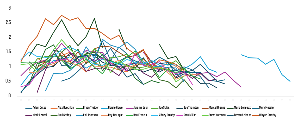
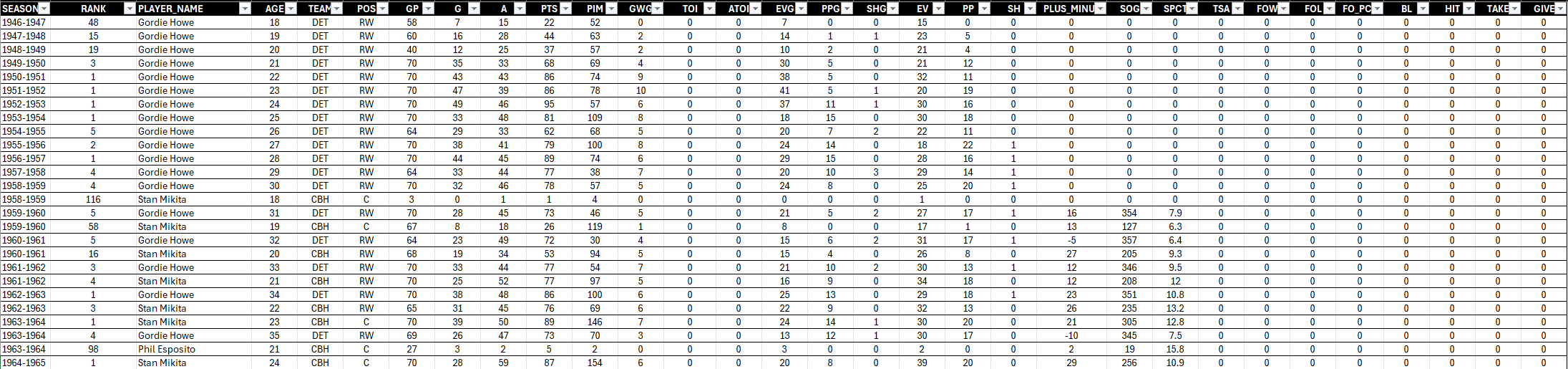
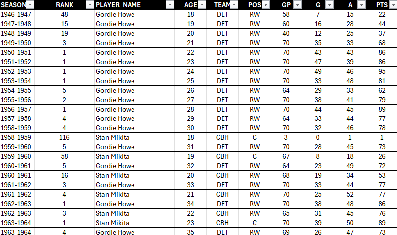
After you create a new file, create a new tab with a subset of the data. We're going to create metrics that are calculated "per game" for G, A and PTS. Before we calculate those rows, this is what the data looks like.
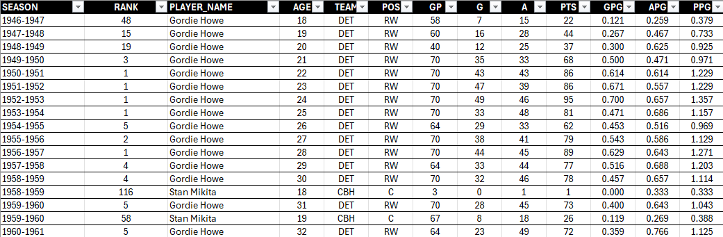
At this point, you can sort and filter, which gives you more indicators, but for this dataset, it's better to create the calculated fields and then use the PivotTable functionality. We've created three new columns: GPG (Goals per Game), APG (Assists per Game) and PPG (Points per Game). GPG gives us a sense for the goal-scoring prowess of the player; APG gives us a sense for their playmaking ability; and the Points per Game gives us their overall performance. You will also be able to see a player's balance across goal-scoring and playmaking once you create summary views of these stats.
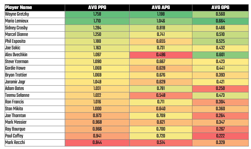
Using this new view, click Home, Insert and PivotTable and click a new sheet for the PivotTable. Explore with different combinations of the data, and then when you find something interesting create a new tab, copy the data into that tab and use conditional formatting and/or charts to further explore the data. For example, below is the extract from the PivotTable that shows the player and their average PPG, APG and GPG. The view is ranked from largest to smallest PPG with conditional formatting added to create a heatmap.
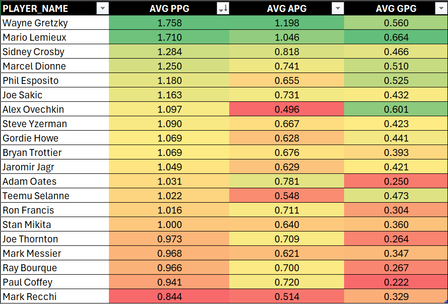
And with a pivot of the data with conditional formatting, you can already see some potential stories emerge. For example:
- Two of the top superstars, Wayne Gretzky and Mario Lemieux, playing in roughly the same era were top goal-scorers and playmakers. They arguably significantly impacted the game at that time.
- Alex Ovechkin, who's on track to beat Gretzky's goal-scoring record, is less a playmaker and more of a goal-scorer. Does this make him less balanced as a player?
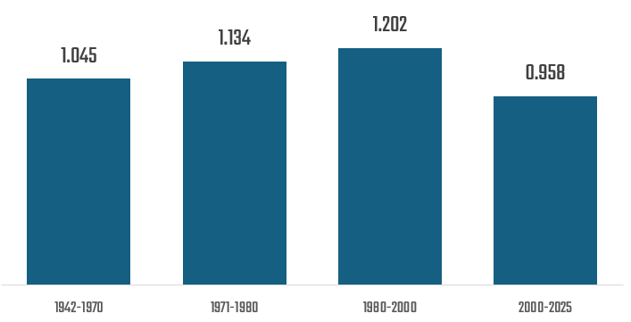
Further, when you pivot the average PPG by Era, you see that the high point for point-producing superstars was 1980-2000, a time that witnessed the likes of Wayne Gretzky and Mario Lemieux and enforcers, such as Bob Probert and Keith Tkachuk.
For this dataset, we might also explore the data by, for example:
- Pivoting GPG and APG to find the top goal-scorers and playmakers.
- Evaluating PIM versus PTS to explore which of these superstars has some grit to them.
- Calculating an even-strength to special teams ratio to see which of these superstars excelled in special teams scenarios.
Eventually, you'll get to a place where you better understand the top players, the metrics you might use, and potential insights that come from the data. From this dataset, our conclusions might be as follows:
- PPG represents a good, overall performance metric for us to use for peak performance.
- GPG and APG gives us secondary metrics to describe the type of superstar – i.e., goal-scorer versus playmaker.
- We can classify and differentiate styles of play and performance across eras or generations by using SEASON.
- And we'll use AGE and SEASON as a way to plot a trend for each of the superstars.
Further, you may want to reduce the number of superstars that you include in your analysis. Including the top twenty superstars might "crowd" your data story; however, focusing on the top players within a specific era gives you an interesting narrative as well.
At this point, we'd embark in a deeper analysis and conduct, for example, an exploratory data analysis along with other analyses that helps us with our story. (This is our next lesson in this course.) But, before we get there, let's tease out what might be our narrative based on what we've found so far from the data exploration.
What Is the Narrative?
The beautiful part about a data story is that the data typically has more than one potential narrative in it. For example, from our short data exploration, we found several potential narratives.
- Two superstars stand above the rest, Wayne Gretzky and Mario Lemieux. They had significantly different styles that were both effective and they were revered players in their era.
- Era plays a significant role. The 1980s to 2ooo saw higher point-production superstars. The nature of the game was different in this era, expanding for goal scoring and for on-ice enforcement.
- There are different classes of superstars: goal-scorers versus playmakers. For example, Alex Ovechkin is lower in playmaking skills than other players on the list. Does this say something about his game?
- Most NHL superstars peak between 23-28 years old, with slight variations based on position and play style.
- Goal scorers tend to peak earlier (around 24-25), while playmakers and two-way players can sustain elite performance into their late 20s and early 30s.
- Longevity is more common in modern NHL stars due to improved conditioning, sports science, and offensive-friendly rule changes.
You may find other narratives – and ones that resonate personally with you or your audience. And we hope that you were able to explore the dataset and potentially find a narrative that was meaningful to you!
Summary
Now that we've explored how to find a narrative in sports data, the next step is refining our analysis with structured methods.
In the next lesson, we’ll break down the basics of data analysis and modeling—learning how to structure datasets, run basic statistical analyses, and build simple models to validate our findings.
To do this, we're going to carry forward our preferred narrative from this lesson, which is the following: "Two superstars stand above the rest, Wayne Gretzky and Mario Lemieux. They had significantly different styles that were both effective and they were revered players in their era." We'll of course have to explore the idea of NHL superstars peaking through this narrative, which we'll do through our analyses.
Subscribe to our newsletter to get the latest and greatest content on all things Data, AI and Hockey!
Member discussion