Lesson 5: Translating Data Story Outline to Content

At a Glance
- From Data Story Structure to Creating Content
- Considerations across Modalities
- Translating the Data Story Outline into Socials
- What's Next?
From Data Story Structure to Creating Content
In our previous lesson, we developed a data story using a four-step process (Narrative, Analysis & Modeling, Unique Characteristics, and Hook, Plot & Arc). The goal of that lesson was to bring the ingredients of the data story pre-work together into a structure that included 1) the elements of the data story broken down and arranged in a logical sequence and 2) data and visualizations that bring it analytically to life.
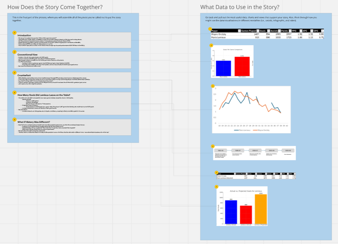
If you remember, this is how we finished Lesson 4 with regard to the outline (or structure) of our data story. The left shows the structural elements of the story, and the right shows the main data points and visualizations to use in the final story.
The next challenge is to translate this outline into content that can be published and shared across different platforms. This will different depending on the modality, audience and data and visualizations you use and the type of story you want to create. For example, an infographic might manifest as a sequential story (e.g., bound to time) and then call out specific events along a timeline. Conversely, socials may be more "single instance" because you have less real estate for imagery and design.
In this lesson, we'll explore some of the characteristics of different modalities and then create a single social post (e.g., targeting Instagram and Bluesky) to get you started.
Before we jump in, though, let's take a quick look at some of the considerations for each of the modalities.
Feeling lazy? Don't want to read? Check out our video accompaniment to this newsletter below.
Considerations across Modalities
The data story outline is the foundation, but content creation requires adapting it to different formats, audiences, and modalities. How you present and publish your data story changes depending on whether you're crafting a social media post, an infographic, a long-form article, or a video.
Let's take a look at how four major content types differ from one another.
Social Media Post
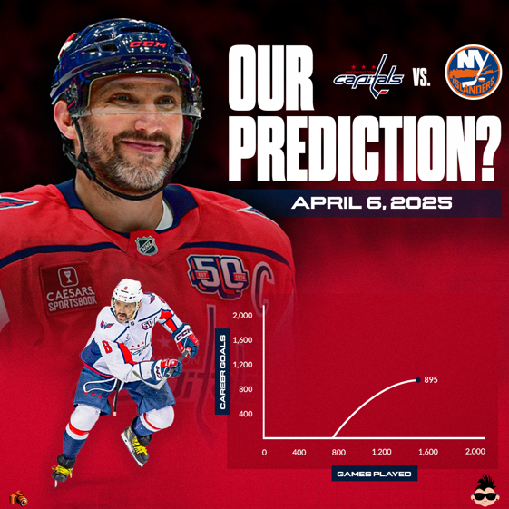
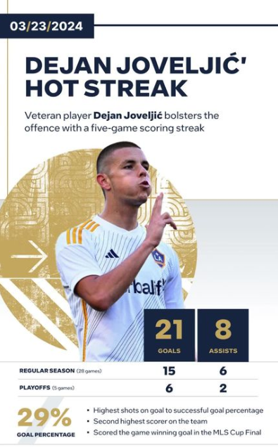
Social media posts (or socials) are best for capturing attention quickly, engaging audiences, and delivering bite-sized insights that encourage interaction. The format typically includes text, data-driven visuals, carousels, and threads, making complex information more accessible. For example, the below shows a recent social we built that predicts the game when Alex Ovechkin will beat Wayne Gretzky's goal-scoring record.
The limited space of socials forces you to design for a more limited space. This means thinking carefully about the text, images, color and font, and so on. This can be difficult because you lose real estate, yet need to convey the same message as, say, an infographic – which has more space for text, visualization and design.
Infographics
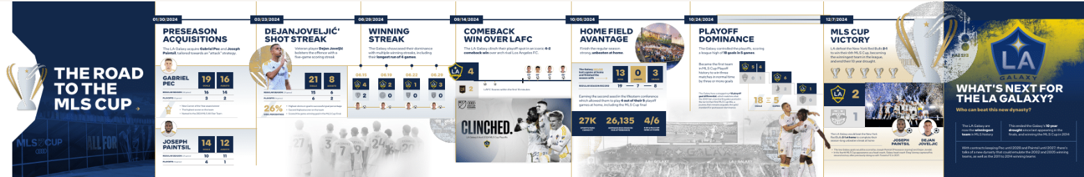
Infographics summarize complex data in a visually engaging and easy-to-read format. They use static images, data visualizations, heatmaps, and comparison charts to highlight key insights at a glance. Infographics can be very aesthetic, readable and unique – depending on how you design the visualizations. For example, here's a recent demo data story we built that celebrates how the LA Galaxy achieved their run to the MLS Cup. The data story was called "The Road to the MLS Cup."
The main challenge lies in balancing visual appeal with statistical accuracy, ensuring that the design enhances understanding rather than distorting the data. For example, a timeline infographic illustrating how scoring trends have evolved over decades can effectively convey historical shifts in gameplay, making complex trends more digestible for the audience.
Long-Form Articles
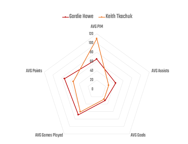
Long-form articles are best for providing full context, detailed breakdowns, and thorough analyses, allowing for a deep exploration of complex topics. Typically presented as blog posts, newsletters, or reports, this format enables creators to build a compelling narrative supported by data. For example, we regularly publish newsletters that are, in essence, long-form articles; one example is The Howes and Tkachuks: Grace vs Grit. At the core of this newsletter was a spider chart comparing Keith Tkachuk to Gordie Howe.
The primary challenge for long-form articles is maintaining audience engagement while presenting dense information, requiring a balance of storytelling, visuals, and clear explanations. And given the nature of how content is consumed, long-form articles compete heavily with the attention of consumers with those who want to digest content more quickly.
Videos
Video content is best for demonstrating movement, analyzing gameplay, and enhancing storytelling through visuals, making it a powerful tool for engaging audiences. This format includes explainer videos, highlight breakdowns, and narrated stories, which allow for a dynamic presentation of data and insights. For example, below is a view of the demo data story (video modality) entitled "Road to the MLS Cup."
However, video production requires more effort in scripting, editing, and visual execution, ensuring that the final product is both informative and visually compelling.
Translating the Data Story Outline into Socials
You might think about socials through two contexts: 1) a single, independent piece of content and/or 2) a series of connected pieces of content (e.g., designing for both single use and in an infographic). And they can be both. In the data story "The Road to the MLS Cup," our data story outline allowed us to build the socials to be individual components that would also ladder into the infographic.
For this section, we'll assume that we're going to translate our data story into content, and that content will be a single-use social. We're going to publish to Instagram and Bluesky and include some descriptive text and useful hashtags with the post.
In our final data story structure, there were five main elements, so the key question is how might we translate this data story and adapt for a social post. For a single social, the answer is not so cut and dry. For example, you can see the different elements of the data story outline represented below. So, we already know that we can't possibly include all of the text below on the face of a social. So, what do we use?
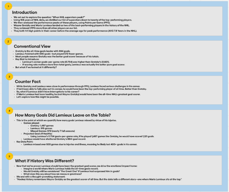
Real estate is precious on socials. For this example, we wanted to capture that Gretzky is the current record holder, but at the same time introduce the possibility that Lemieux could have beaten him needs to come through with fewer words and visualizations. In short, a theoretical contradiction of fact. That said, according to our data story outline, what we need is in the first three elements (Introduction, Conventional View and Counter Fact).
So, we might translate the outline as follows:
- Create a visualization that compares the performance arc of Gretzky's and Lemieux's career, but represents Lemieux as if his career had gone uninterrupted.
- Call out the total goals scored in the graph, showing that if Lemieux's career had not been interrupted, he would have scored more goals than Gretzky.
- Pose the question "What if Mario Hadn't Missed Any Games?" at the top of the content. This introduces the counter fact.
The above accomplishes showing that Gretzky and Lemieux were two of the best players and had great careers, but introduces our hook and counter fact at the same time and provides a projection for Lemieux's uninterrupted career.
If we look at the data portion of our data story outline, we can cherry pick the most useful data and visualizations from our data analysis. And for this social content example, we landed on leveraging two elements from the data and visualizations.
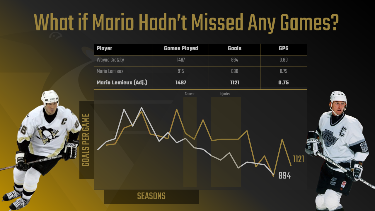
The first was the summary data – and one that also included a projected view. That is, you have the summary stats for Games Played, Goals and Goals per Game (GPG). Note that we use GPG as our metric for performance (where in our analysis we were favoring PPG). We did this because when modeling for the same games, Lemieux beat Gretzky on GPG, but not PPG.
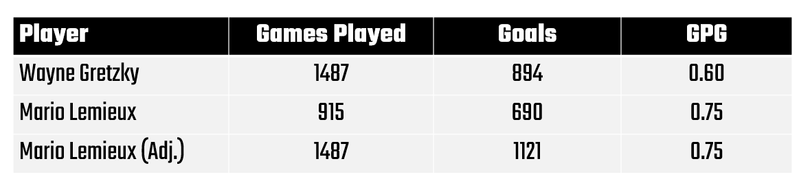
Then, we used the career GPG for Gretzky and the adjusted GPG for Lemieux through the arc of an uninterrupted career. We also used the line chart for both Gretzky and Lemieux (using adjusted values). Below, you can see Gretzky's true career arc (culminating in 894 goals) and a projected career arc for Lemieux (culminating in a projected 1121 goals). We've called out in shading where Lemieux's career was put on hold by cancer and injuries.
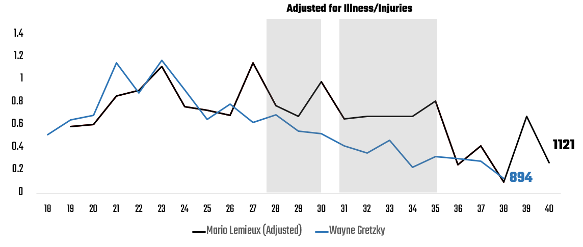
Interestingly, if Lemieux had played those years, you can see that the arc of his career would have taken a much different shape – one that both puts him ahead for scoring goals and with a significant delta as compared to Gretzky.
So, yes, he got cheated by illness and injury.
Let's now take the ingredients we distilled from our data analysis and research and translate this into a social post.
An Example Social Post
In the example below, we take the data story outline and the three points we call out above and translate these ingredients into a social post. In the post, we use a consistent font and the background design/branding favors the Pittsburgh Penguins and gives the social some texture. We also have a summary view of their data in the table and a comparative career arc in the line chart – actual for Gretzky and adjusted for Lemieux.
We took a few runs at this and settled pretty quickly on the above. You could imagine that a few more iterations would have evolved the design even more.
Now you're going to have better design skills than us, so your social content is going to look amazing. Also, in future lessons we'll walk through how to use our templates such that you can accelerate your data story development.
What's Next?
It's always good to iterate on design – using different combinations of text, imagery and branding (e.g., colors and font), and background design and texture. Also, there's a lot of data and information in the data story structure, so you could use different data or structure the social around a different question and set of images.
In our next lesson, we'll explore how you can optimize and automate the process of generating your content by using AI. There are a ton of tools and services out there, and we'll walk through a few of our favorites. We'll also describe where AI can really benefit the data story development process and where AI is just not there today.
Summary
In this lesson, we picked up where we left off from our Lesson 4, the completion of the data story structure. The goal of this lesson was to translate the data story outline into content. To hit that goal, we walked through some of the differences across modalities, reviewed where we ended up with the data story structure, and applied a derivative of the data, visualization and information to a social post.
The outcome of today's lesson was a sample of a social post which targets Bluesky and Instagram and poses the question of "What if Mario Hadn't Missed Any Games?"
Subscribe to our newsletter to get the latest and greatest content on all things Data, AI and Hockey!
Member discussion