Lesson 7: Creating Your Data Story using Socials

At a Glance
- How'd We Get Here?
- Creating a Data Story Social using PowerPoint
- Creating a Data Story Social using Canva
- What's Next?
How'd We Get Here?
To date, we've released six lessons in our email course on Data Storytelling for Sports:
- Lesson 1: Introduction to Data Storytelling for Sports
- Lesson 2: Exploring Data for the Narrative
- Lesson 3: Data Analysis & Modeling
- Lesson 4: Developing Your Data Story
- Lesson 5: Translating Data Story Outline to Content
- Lesson 6: Using AI for Your Content Creation
In this lesson, we'll create a data story through a social post (or Social) using PowerPoint and Canva.
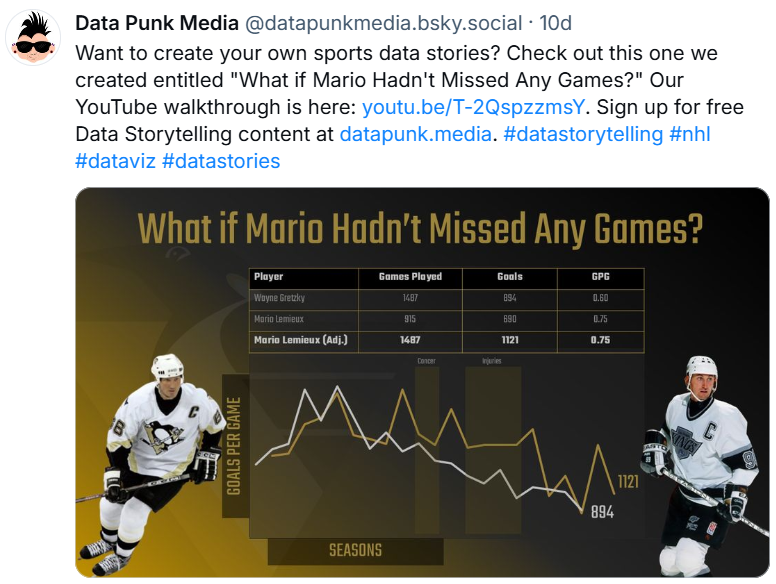
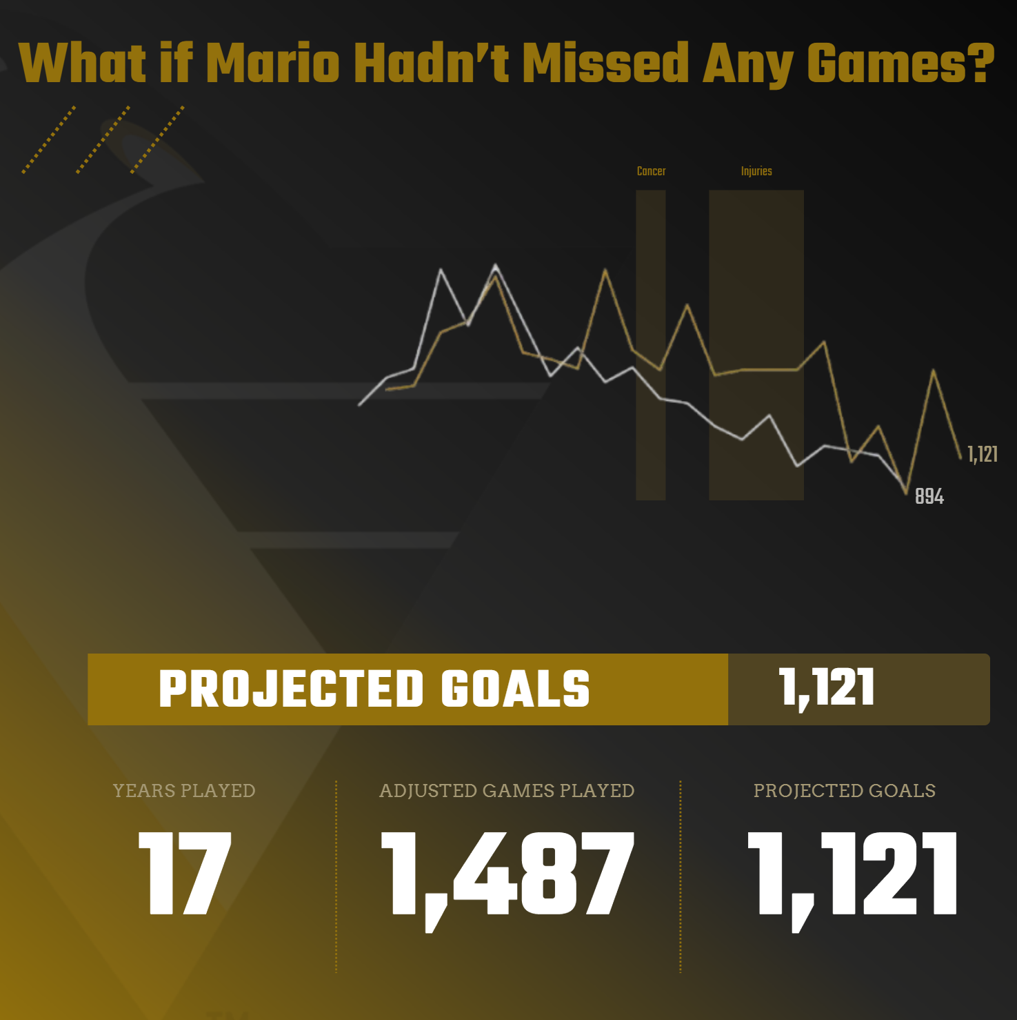
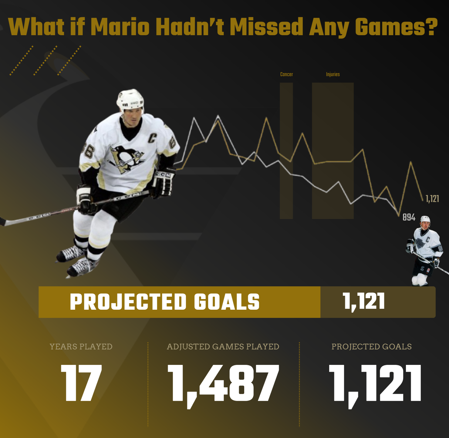
The question behind our data story was "When do NHL superstars peak?" If you've followed along so far, you'll have seen different potential stories stemming from this original question. One of the stories compared the career peaks of Wayne Gretzky and Mario Lemieux, which led us to the following hook: "What if Mario Hadn't Missed Any Games?"
To create the social post, you'll need the following resources:
- One image of Lemieux and one image of Gretzky
- Actual career data for Gretzky and Lemieux and a projection for Lemieux assuming he played the missing games from illness and injuries
- A line chart comparing Gretzky's and Lemieux's career (using Goals)
- An image of the Pittsburgh Penguins logo
With these ingredients, we'll create our data story, first with PowerPoint and then with Canva.
Feeling lazy? Don't want to read? Check out our video accompaniment to this newsletter below.
Creating a Data Story Social using PowerPoint
Most people have access to PowerPoint (or a tool like it), so let's walk through each step to create the social post.
Step 1: Create a new slide and format the background
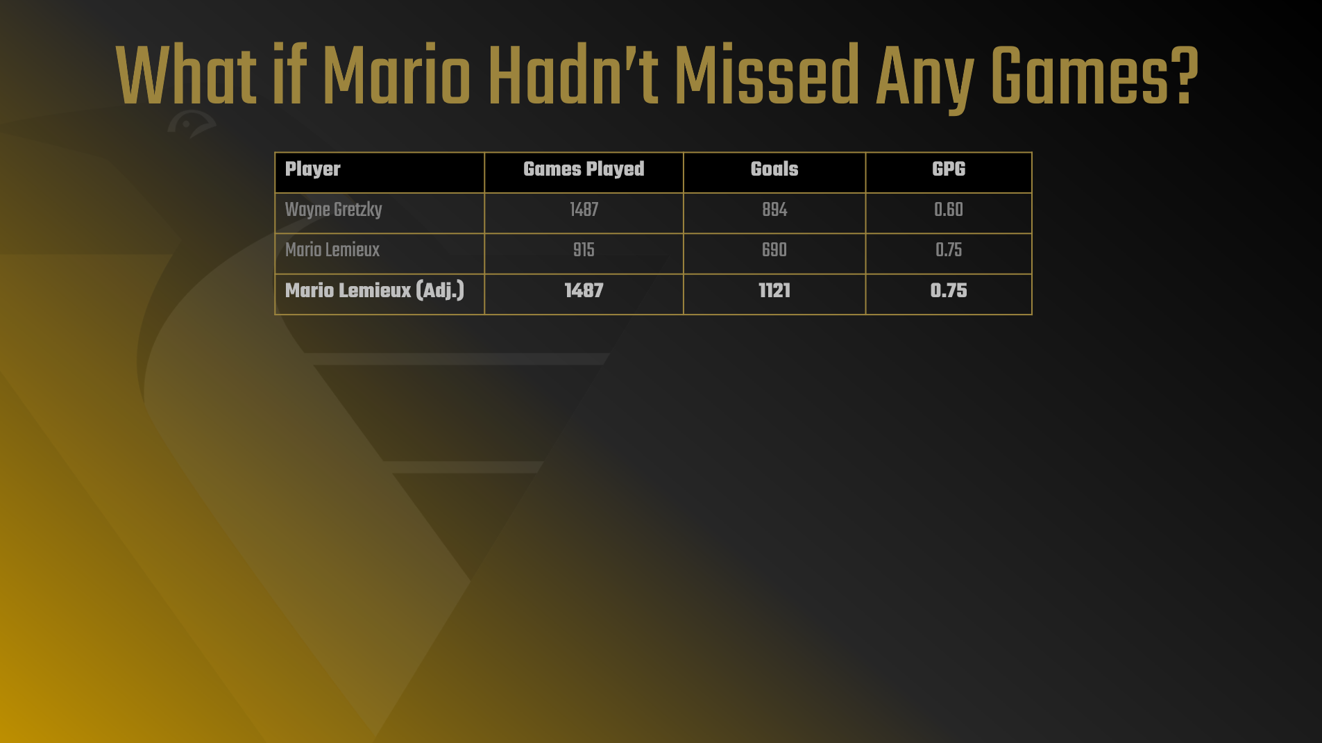
The first step is to create a new slide and format the background similar to the below. We used a gradient and then added the title: "What if Mario Hadn't Missed Any Games?"

Step 2: Add the Penguins logo and blend with the background
The next step is to add the Penguins logo. PowerPoint provides some modest picture formatting tools, such as Picture Transparency Options. You can use these options to help blend the logo into the background of the slide.
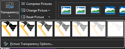
We selected one of the higher levels of transparency, so you get some branding texture. Because the hook focuses on Lemieux, we wanted the social to be designed more prominently around the Pittsburgh Penguins.

Step 3: Add the statistics data
Next, we added in a table of actual Goals and projected Goals for Lemieux if he had played all his games – or the same amount of games as Gretzky. Note that we used different colors for the text to highlight the projected stats for Lemieux.
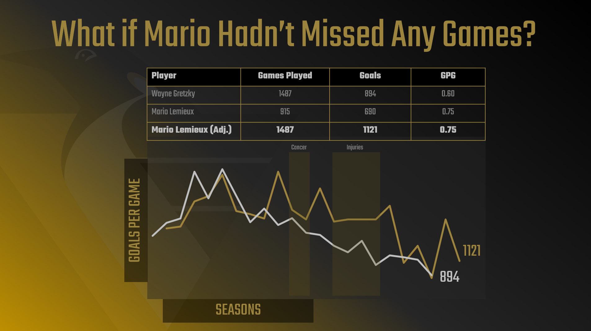
Step 4: Add the comparative line chart
We then added a chart from Excel (adjusting the colors for the slide branding), shading where Lemieux had missed games, the total and projected goals, and labels and background shading to the chart.
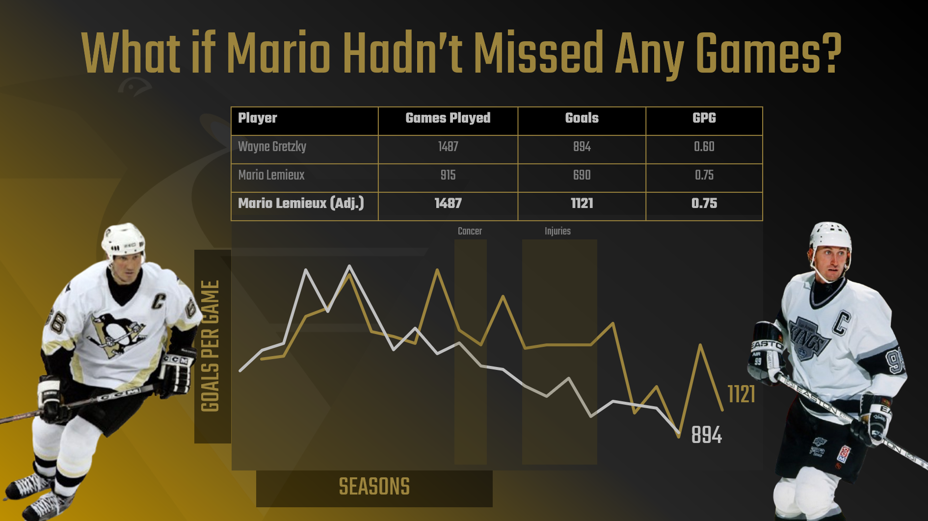
Step 5: Add images of Gretzky and Lemieux
And lastly, we added two images into the post, such that we have visual context of Lemieux and Gretzky.
The final step is to save the slide as an image file (File, Save As, give the file a name and select PNG) and post to your social media platform of choice. You can now publish your image file, which in our case was to Bluesky.
And that was it! A lot of the work we'd already done in the data collection and analysis phase, so creating this social content was more about how we wanted to arrange the ingredients on a slide.
Creating a Data Story Social using Canva
Canva is a popular platform for designing and creating. It has different options than PowerPoint, but is effective in creating and publishing social media content. Canva is also a great platform if you're just starting out in design – and there is a free version to get started!
We'll start with our social media templates that we're making available to free members via our sister site: Data Punk Media. We have several templates available, and we chose to use this template as a starting point.
Let's walk through the steps to create the Social using Canva.
Step 1: Open the template in Canva
Click the Use template for new design button beneath the template to open this in Canva.

You should now see the template open in Canva ready to edit.
Step 2: Upload the background
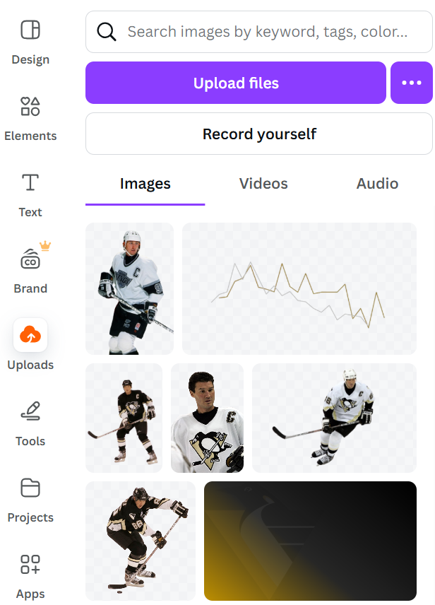
We re-used the background that we created in PowerPoint by saving that slides as a PNG file and then uploading this (and the other images) to Canva.

To upload the file, click the Upload files button. After it's successfully uploaded, you can make that image the background of the template.

You can see here where we've uploaded a few key resources to use in the design process.
Step 3: Edit the template components
You'll now want to edit (or discard) the template components. We edited the title and kept some of the design and text near the bottom of the image. Note that we also formatted the color to be a similar branding and contrast to the Social we created in PowerPoint.
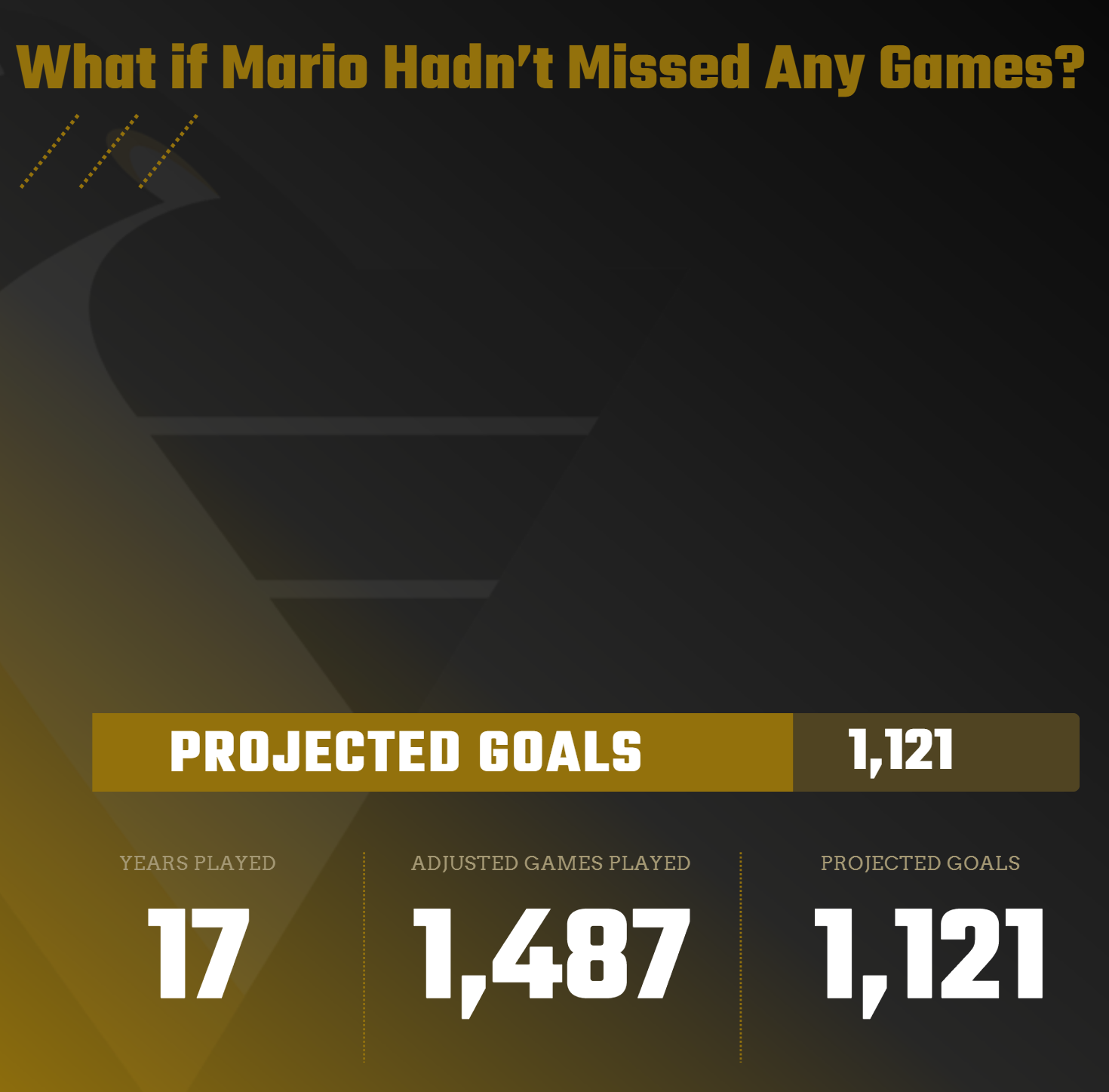
Step 4: Add the line chart
Next, we added the line chart along with the illness and injury call-outs and total goals for Gretzky and Lemieux.
Step 5: Add the images of Gretzky and Lemieux
We then added the player images, but this time re-sized them to make Lemieux bigger.
After you've finished with the design, click Share and Download, select PNG, and click Download. You'll then have a local copy of the image, which you can post to your preferred social media platform.
What's Next?
We used PowerPoint and Canva to create social posts for the data story that we've been working on throughout this email course. However, you can take the resources and steps we followed here and apply it to other tools with which you may be more familiar. If you're a professional designer, you likely have a broader skillset that includes Adobe or Figma, so we'd recommend exploring the creation of this same data story with other tools and platforms.
Also, we'd recommend trying out different designs, whether formal design patterns or from your own imagination. Create different versions of the posts that are, perhaps, more visual or less cluttered with information. The goal is to build out this social post and the data story and try different approaches until you have something you're proud to publish.
Summary
In this seventh lesson in our email course on Data Storytelling for Sports, we covered how to create a social post using PowerPoint and Canva. The assumption here would be that you are a more junior designer/creator and are using easily-accessible tools. We also introduced you to our design templates, which you can use as a quick way to get started on creating your social posts.
In our next lesson, we'll continue with the data story creation, but this time we'll focus on the creation of an infographic. To do this, we'll be re-evaluating the data and information in our data story outline as we'll need to paint a narrative along a timeline.
Subscribe to our newsletter to get the latest and greatest content on all things Data, AI and Hockey
Member discussion