Lesson 8: Creating Your Data Story using Infographics

At a Glance
- How Did We Get Here?
- What is an Infographic?
- Structuring the Infographic
- Building the Infographic
- What's Next?
How'd We Get Here?
To date, we've released seven lessons in our email course on Data Storytelling for Sports:
- Lesson 1: Introduction to Data Storytelling for Sports
- Lesson 2: Exploring Data for the Narrative
- Lesson 3: Data Analysis & Modeling
- Lesson 4: Developing Your Data Story
- Lesson 5: Translating Data Story Outline to Content
- Lesson 6: Using AI for Your Content Creation
- Lesson 7: Creating Your Data Story using Socials
In this lesson, we'll create a data story through an infographic.
Feeling lazy? Don't want to read? Check out our video accompaniment to this newsletter below.
What is an Infographic?
An infographic is a visual representation of information, data, or knowledge designed to present complex information quickly and clearly. Compared to a social post, or Social, infographics can be trickier to design and implement. For example, you may need to think along a timeline and create a connected narrative and then back this up with data and design. That said, a well-designed infographic is an amazing way to tell a data story.
Several characteristics are representative of an infographic. For example, it's highly visual. Think charts, timelines, icons, illustrations, and color-coded data. And it grabs attention quickly — especially useful on social media or in articles. It's also informed by real data, facts, or a narrative. And it often answers a question or explains a concept. And it does this by telling a story. A good infographic has a flow — from setup, through data, to a conclusion. It might show change over time, compare things side by side, or reimagine an alternate history.
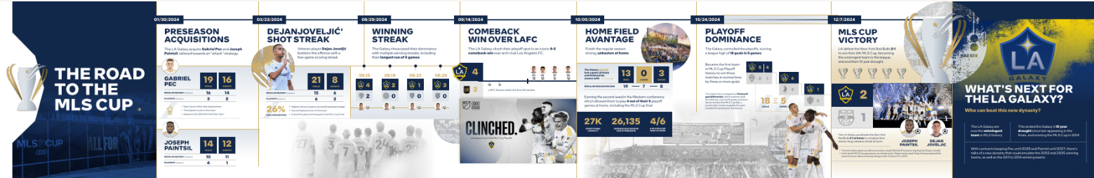
Below is a recent infographic we created as a sample data story (illustrates the art of the possible for creators) called the "Road to the MLS Cup," which charts the course of the LA Galaxy in last year's MLS Cup win.
For our data story ("What if Mario Hadn't Missed Any Games?"), we're going to re-evaluate our research, analysis and data story outline to see if there's a natural flow that we can build into an infographic. We'll try and build the following into the infographic using these types of elements:
- Real stats (e.g., actual goals)
- Lost opportunities (e.g., games missed and estimated lost goals)
- A reimagined projection (how many goals he could have scored)
- A visual journey (e.g., comparative career arc)
So, let's get started!
Structuring the Infographic
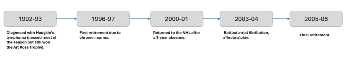
There are a few possible ways to lay out the infographic. For example, one angle could exclusively focus on illness and injury and build missed (or what would be projected) stats around this. However, this might be a bit dark.
Instead, we wanted to focus more on the "What If?" question and include the comparison with Gretzky – to highlight how good of a player Lemieux actually was.
So, our approach was as follows:
- Define the central narrative, e.g., what is the adjusted path that would have led Mario to beat Gretzky.
- Gather the core stats for the infographic, such as Actual Goals, Games Missed, Career Games Played (if healthy), Projected Goals, and Gretzky's Goals.
- And create a visual storyboard for the infographic, e.g., reimagine how Lemieux could have become the NHL's greatest goal scorer.
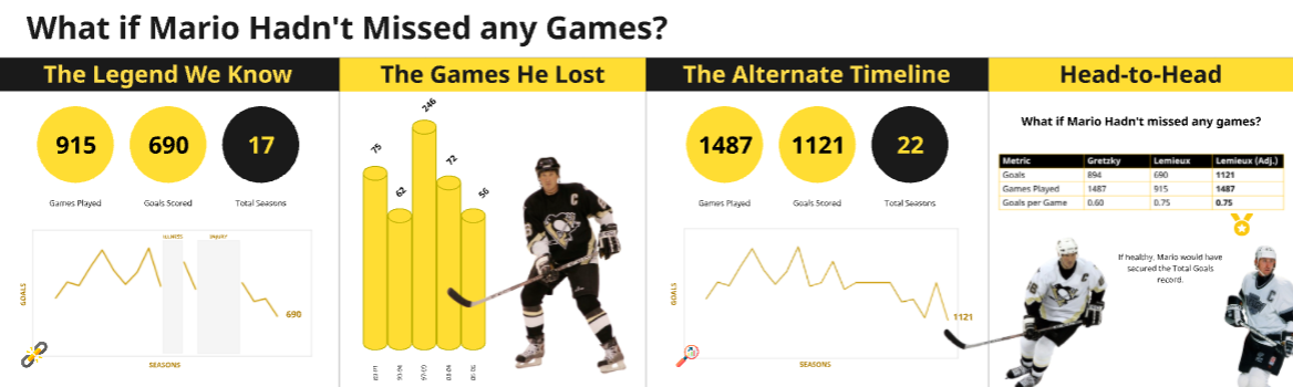
Through the above, we decided on four sections for the infographic.
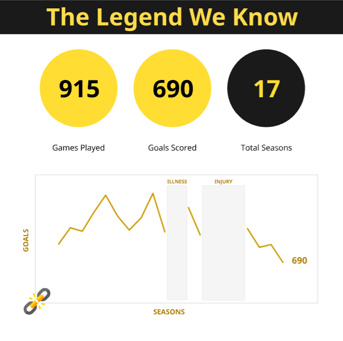
Section 1: “The Legend We Know”
In this section, we'll present Lemieux's actual career stats. We'll include Total Games Played, Total Goals and Total Seasons. We'll also show his career arc, illustrating the peaks and gaps (due to illness and injury).
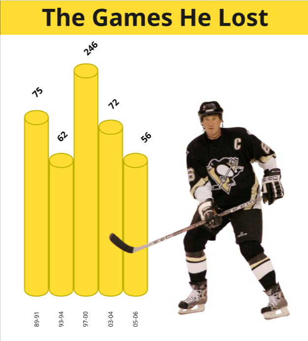
Section 2: “The Games He Lost”
We'll then take the career arc we used in the last section and illustrate the games he lost during the gaps in his career. We'll call out the total games he lost across various dates and seasons.
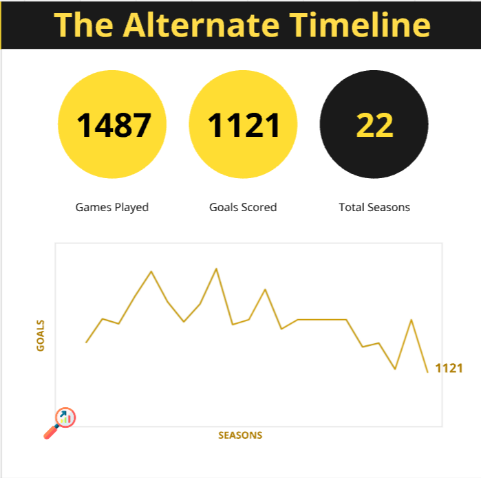
Section 3: “The Alternate Timeline”
In this section, we'll introduce the alternate reality and address the hook in our title (the "What if" question). To do this, we'll have a completed career arc that includes Lemieux's projected statistics. In this line graph, we'll show Lemieux scoring 1,211 goals.
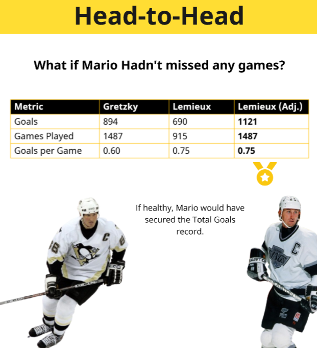
Section 4: “Head-to-Head”
The alternate reality segues into a clean side-by-side view of Gretzky and Lemieux, which will include the following statistics:
| Gretzky | Lemieux | Lemieux (Projected) | |
|---|---|---|---|
| Goals | 894 | 690 | 1,121 |
| Games Played | 1,487 | 915 | 1,487 |
| Goals per Games Played | 0.60 | 0.754 | 0.754 |
We'll call out here, through an icon or in writing, the fact that if Mario hadn't missed any games, he would have secured the Total Goals record. And in a full career, he wouldn’t just be a contender — he’d be the king.
Building the Infographic
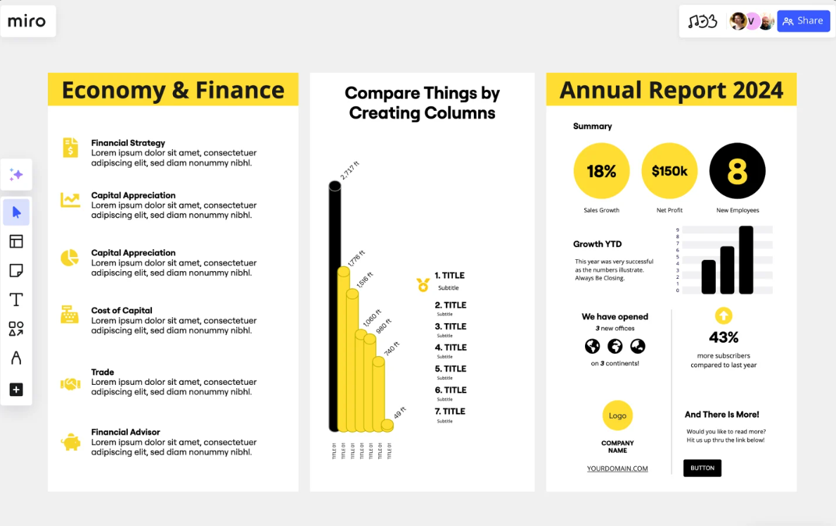
There are many different tools out there to build infographics, such as Canva, Venngage and Figma. We use Miro a ton in our day-to-day collaboration, so we thought we'd give it a go. There is an Infographic Template, which we decided to use. We liked the color combinations, it's super clean and it had a lot of icons that would save us time. (We also didn't have a professional designer helping us on this project, so we needed more design out-of-the-box.)
Next we uploaded the images and charts that we used in the Social, which we walked through in our last lesson. We then created four different sections, based on our earlier descriptions and built out each one.
In the first section, we used circular call-outs for Lemieux's stats and included the line chart for his career. We also called out where he had missed games due to illness and injury. Here's what the section looked like.
In the second section, we used vertical bars to show where he had missed games and added an image of him for some style. Here's what the second section looked like.
In the third section, we again used call-outs, but this time we added his adjusted statistics. We included a line chart that showed his fully adjusted career arc (with his adjusted goals called out). Here's what the third section looked like.
And lastly, we included a comparative view with Gretzky. Here's what this final section looked like.
We then stitched the sections together, with the goal of creating a narrative and flow across the four sections. The final infographic is shown below.
All told, the above infographic took a couple of hours to create. Yes, it definitely lacks the magical touch of a professional designer, but for a quick and dirty infographic it did the trick.
With an out-of-the-box template and our data story outline and analyses, it didn't take too long to create a first pass at an infographic. We'd be curious how you'd make this better? What tool would you use, and how would your story flow be different?
What's Next?
We used Miro in this lesson to create an infographic for the data story that we've been working on throughout this email course. However, similar to the social post, you can take the resources and steps we followed here and apply it to other tools with which you may be more familiar.
If you're a professional designer, you likely have a broader skillset that includes Canva, Adobe, Figma or even a broader set of tools, so we'd recommend exploring the creation of this same data story as an infographic with other tools and platforms.
Also, we'd recommend trying out different designs, whether formal design patterns or from your own imagination. If you're new to design, using templates is a great way to get started. However, at some point you'll hit an inflection point and start in with original designs.
Summary
In this eighth lesson in our email course on Data Storytelling for Sports, we covered how to create an infographic using Miro. The assumption here would be that you are a more junior designer/creator and are using easily-accessible tools. We pointed you to the Miro infographic template, which you can use as a quick way to get started.
In our next lesson, we'll continue with the data story creation, but this time we'll focus on the creation of dashboard. We'll use Power BI to do this, so the focus will be less on content for social platforms and more for professional presentations.
Subscribe to our newsletter to get the latest and greatest content on all things Data, AI and Hockey!
Member discussion