Lesson 9: Creating Your Data Story using Power BI

At a Glance
- How Did We Get Here?
- Why Power BI?
- Building the Report
- What's Next?
How Did We Get Here?
To date, we've released eight lessons in our email course on Data Storytelling for Sports:
- Lesson 1: Introduction to Data Storytelling for Sports
- Lesson 2: Exploring Data for the Narrative
- Lesson 3: Data Analysis & Modeling
- Lesson 4: Developing Your Data Story
- Lesson 5: Translating Data Story Outline to Content
- Lesson 6: Using AI for Your Content Creation
- Lesson 7: Creating Your Data Story using Socials
- Lesson 8: Creating Your Data Story using Infographics
In this lesson, we'll create our data story using Power BI.
Feeling lazy? Check out our video accompaniment to this newsletter below.
Why Power BI?
Power BI is a data visualization and business intelligence tool created by Microsoft. It enables you to connect various data sources, create interactive dashboards and reports, and share those insights through the web, mobile, or embedded in apps.
Power BI is a different way to publish your data story than what we've covered so far, but it's still an important way to tell your data story. We've covered Socials and Infographics, so creating your data story through a report or dashboard is a shift away from these other forms of content.
Where Power BI can excel for your data story is as follows:
- Interactivity: Viewers can filter, explore, and personalize the story (e.g., compare their team to others).
- Real-Time Data: You can plug in live or regularly updated data sources.
- Depth: Readers can dig into multiple layers of context — hover, drill down, select time periods.
- Shareable: Publish to the web, embed in sites, or share as a secure report link.
In short, Power BI is great for internal dashboards and reports, long-form analytics or stakeholder reporting.
How Is Power BI Different from Socials or Infographics?
You typically use Socials or Infographics when you want to tell a quick, punchy visual story to a broad or public audience or you want to emphasize style, virality, or education. You use Power BI when you want interactive, explorable data storytelling, you’re publishing to an audience that wants to explore trends, filters, or scenarios, or you're working with dynamic or complex data.
Power BI is different from Socials and Infographics in several ways, which we illustrate in the following table.
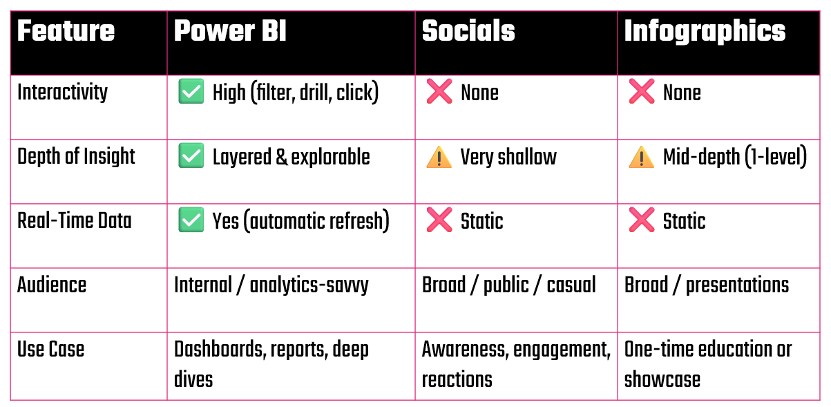
The process of creating your data story outline (which we explored in Lesson 2 and Lesson 3) for reports and dashboards is generally similar for Power BI reports. A key difference for Power BI, though, is 1) cleaning the data and shaping it for consumption in the Power BI environment and 2) spending time sketching out how you tell the story through visualizations in Power BI. Where you use a mix of images, text, color/branding and data in Socials, you shape the story in Power BI through reports and dashboards.
Structuring the Report
To structure the Power BI report, let's take a step back and look at where we ended up in our data story outline. If you remember, we landed on five potential parts to the original story which asked "When do NHL superstars peak?" These five components to the data story outline are below.
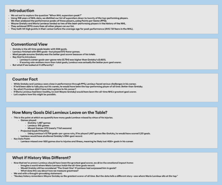
It was within this outline, though, that we discovered the deeper story of Mario Lemieux. And through the Social and Infographic, we manifested that story in different ways. For Power BI, we'll again create the story in a slightly different way – but still rely on the data and findings within the outline.
How Did We Shape the Story in Power BI?
We like to keep Power BI more about the numbers, so we're going to break things out into two reports: one for the top NHL superstars and one for Mario versus Gretzky. We'll do this for two reasons:
- The report shows how the NHL superstars compare, but it also shows that Mario Lemieux performed better than the other players (when it came to Goals per Game).
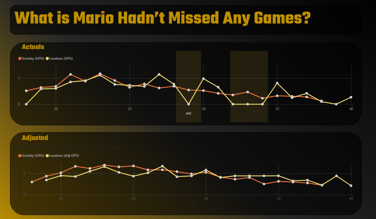
- The report shows a comparative view between Lemieux and Gretzky, which allows us to implement our hook: "What If Mario Hadn't Missed Any Games?" The report shows an actual and a projected view, so the hook reveals itself in the projected statistics.
The above two reports give a quasi summary and detail view, but in the summary view validate that Mario Lemieux was the strongest player when it comes to Goals per Game, and the second view compares his projected stats to the (now former) goal-scoring record holder Wayne Gretzky.
Let's explore the two views.
Report 1: Top NHL Superstars
The Power BI report here comprises seven elements: 1 title bar, 1 Slicer, 4 Cards and 1 Clustered column chart. We use PowerPoint to create the background image for Power BI and then add the data fields to each of the controls. With some re-formatting, we created a dark-themed design with a gradient background and a transparent logo for branding.
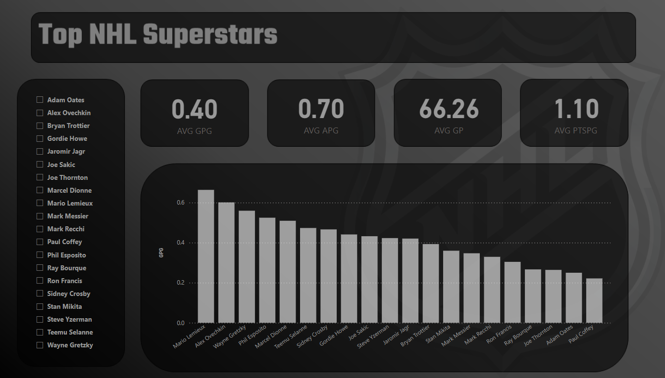
The default report shows all of the superstars that we curated for the project. You can use the Slicer to filter on specific players, and the Clustered column chart will update as will the metrics at the top of the report.
Report # 2: What if Mario Hadn't Missed Any Games?
The second report compares Lemieux and Gretzky using their actual career statistics and adjusted statistics. We did this through two Line charts. The top Line chart shows the two superstar's careers, but with Lemieux you can see the points where his statistics drop to zero – also shaded. The bottom chart is the same comparison, but this time we adjusted Lemieux's statistics (using his average Goals per Game to fill the missing years). You'll also note that we used a different branding on this report – one more in line with the Pittsburgh Penguins colors.
You could create more reports, and you'd want to tailor the reports to your audience using visualization best practices, such as:
- Intuitive titles
- Appropriate charts for the data
- Good (and accessible) color contrast
- Callouts where appropriate
- Clean design (with no "chart junk")
The more you practice creating your data stories in Power BI (or other, similar tools), the better your storytelling ability will get and your ability to create amazing reports.
What's Next?
For this lesson, you can access the data, background images and Power BI report through the course GitHub repo. Try and replicate what we've done here and then re-create and experiment your own reports. Implement your own unique branding styles; create different reports; and get creative with the story you tell through the reports.
Summary
In this lesson, we took the original data story outline we created earlier in the email course and then created a Power BI report to tell the story. The story was pretty small by dashboard standards, comprising two reports that had a summary view of all superstars and a more detailed comparison (actuals and adjusted) for Lemieux and Gretzky.
At this point, we've created the data story using Socials, Infographics, and now Power BI. Our next challenge is to create the data story using video. We left this modality to later in the course because it's more tricky to create and produce videos. However, they are a lot of fun and highly rewarding!
Subscribe to our newsletter to get the latest and greatest content on all things Data, AI and Hockey!
Member discussion