Module 7: Descriptive Hockey Analytics

At a Glance
- What is Descriptive Analytics?
- What is the Process to Create a Descriptive Analysis?
- What are Common Statistics in Descriptive Analytics?
- Using Quartiles to Analyze Top NHL Teams
What is Descriptive Analytics?
Descriptive analytics focuses on the analysis and interpretation of historical data to understand past performance, patterns, relationships, and trends to guide future decisions and actions. According to Gartner, descriptive analytics
answer[s] the question 'What happened?' (or What is happening?), characterized by traditional business intelligence (BI) and visualizations such as pie charts, bar charts, line graphs, tables, or generated narratives.
Descriptive analytics typically combine summary statistics, data visualization techniques and generic and custom metrics to describe and unearth patterns, relationships and trends.
Let's look at each of these.
Summary Statistics
Summary statistics provide an overview of the data through, for example, measures of central tendency, such as mean (average), median and mode, and measures of dispersion, such as standard deviation and range.
Using summary statistics, you can answer questions like:
- What is the average Save Percentage of an NHL team?
- Who make up the top 25% of players in the NHL based on total points?
- What country has the players who fight the most in the NHL?
Data Visualization Techniques
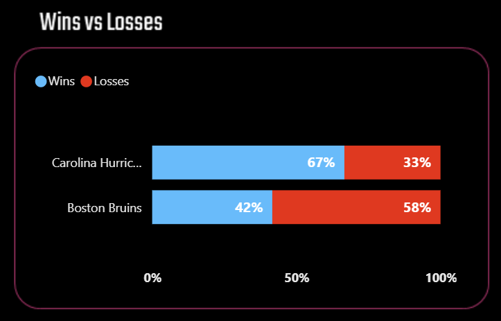
After creating an initial dataset summary using summary statistics, you represent that data through a visualization. Data visualizations, such as bar charts, line graphs, histograms, and scatter plots, help present data in a meaningful way and help you spot trends, patterns, relationships, and outliers. For example, here's an example of the ratio (expressed as a percentage) between a team's wins and losses.
You create visualizations using various methods and tools. As an Armchair Analyst, you likely use popular spreadsheets like Microsoft Excel or Google Sheets. As your skills grow, you'll use more advanced BI and programming tools, such as Microsoft Power BI, Tableau, R/RStudio, etc.
Generic and Custom Metrics
At some point, you will need to go beyond summary statistics and will create specialized metrics to represent different hockey concepts, trends or events. For example, in hockey there's a range of statistics/metrics that are used to represent different aspects of the game – e.g., offensive metrics, and defensive metrics. As an Armchair Analyst, creating an overall picture of your player, or your team, or the league as a whole will factor into your work.
The following are examples of calculated metrics for hockey:
- Face Off Win Percentage for a player or a team
- Save Percentage for a team
- CORSI measure for player or a team (which uses Shots on Goal, Shots Missed, and Blocked Shots to represent puck possession)
At some point, you will also begin to create your own custom metrics. This might mean combining statistics or creating your own metric through calculations. You can see examples of general and custom metrics we've created on our Reports page.
What is the Process to Create a Descriptive Analysis?
As a hobbyist who is likely looking for something quick and low maintenance (e.g., a tracking spreadsheet for your favorite players and teams), the process is manual, but simple.
To create a descriptive analysis:
- Define the objective of the analysis
- Source the hockey data (preferably a source that can provide "clean" data)
- Explore the data
- Prepare some visualizations that address your objective
To follow is an example:
- Objective: Create a report for the Top 20 Players by Total Points.
- Hockey Data: Go to the Player Stats page on NHL.COM, sort the stats table by Points (P) and click Export to export the data to an Excel file.
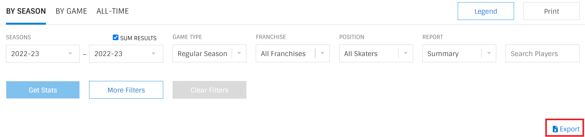
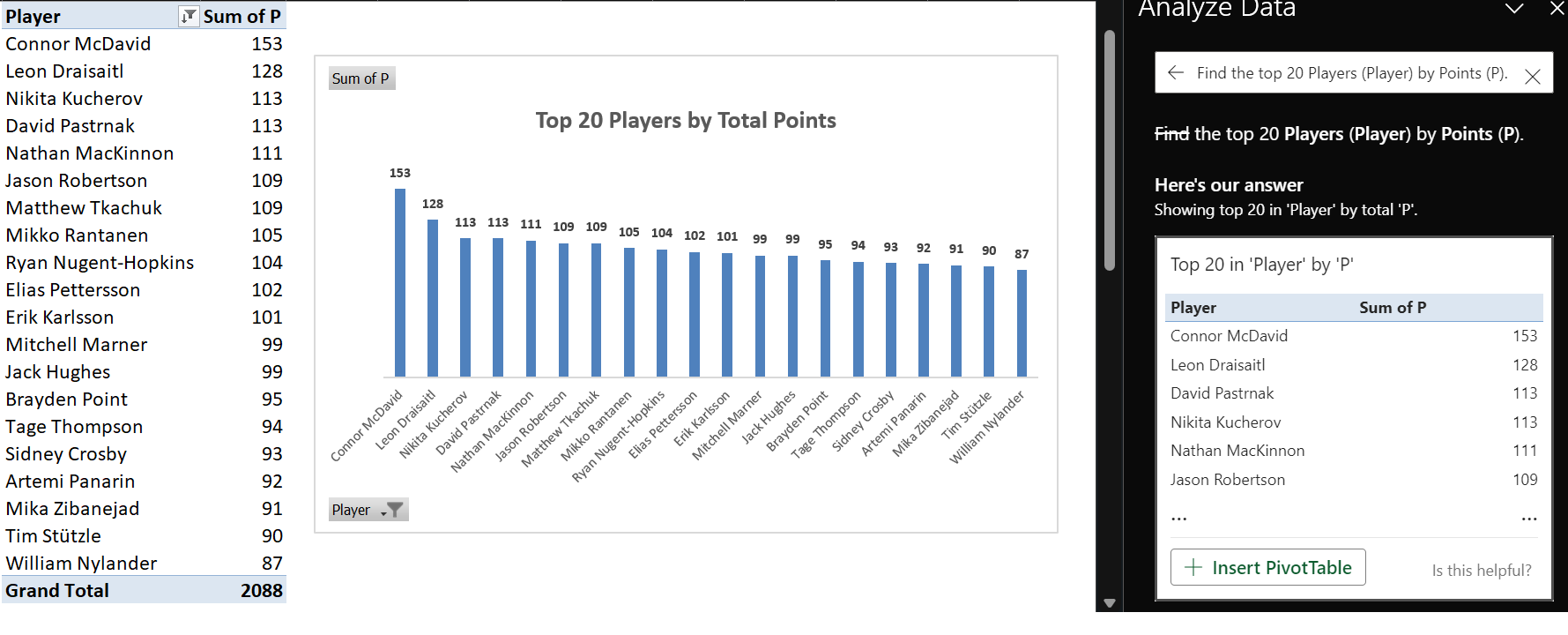
- Explore: Open the Excel file on your local desktop, position the cursor in the top left-hand cell and click Format as Table and choose a table format style. Click Analyze Data (Microsoft's new, automated data analysis feature) and type "Find the top 20 Players (Player) by Points (P)" in the Analyze Data field.
- Visualizations: Click Insert PivotTable when you're presented with the results, navigate to the newly created worksheet, and use the table to create a bar chart.
With this very quick and simple process, the result should be similar to the below.
You can type in different questions into the Analyze Data field to create different analyses.
What are Common Statistics in Descriptive Analytics?
If you're interested in hockey analytics, even if it's for basic analyses, you should have some statistical knowledge. The more knowledge in statistics you have, the better. But if you're new to statistics, don't worry! The stats we'll cover below are straightforward and can be used with hockey data (and be generalized to other areas of life).
Here are the most common statistics you'll use when first starting out in hockey analytics:
- Mean: The arithmetic mean, aka "average," is the sum of all values in a dataset divided by the total number of observations. It represents one measure of central tendency.
- Median: The median is the middle value of a dataset when it is sorted from smallest to largest. It is less sensitive to extreme values and provides another measure of central tendency.
- Mode: The mode is the value that appears most frequently in a dataset. A dataset can have one mode (unimodal), two modes (bimodal), or more (multimodal).
- Standard Deviation: The standard deviation measures the dispersion or spread of the data points around the mean. A higher standard deviation indicates greater variability in the data.
- Range: The range is the difference between the maximum and minimum values in a dataset. It provides a simple measure of the spread of the data.
- Interquartile Range (IQR): The IQR is the range between the first quartile (25th percentile) and the third quartile (75th percentile). It is useful for understanding the spread of the middle 50% of the data, excluding outliers.
- Variance: The variance is the average of the squared differences between each data point and the mean. It is another measure of data spread.
- Skewness: Skewness measures the asymmetry of the data distribution. Positive skewness indicates a longer tail on the right, while negative skewness indicates a longer tail on the left.
- Percentiles: Percentiles divide a dataset into 100 equal parts. The nth percentile represents the value below which a given percentage of the data falls.
If you exported the first page of the 2022-2023 Regular Season Player Stats from the NHL site and then applied the Excel formulae for the above common statistics, then you'd arrive at the following summary statistics for the Top 50 Players by Points. (We added the specific Excel formula that corresponds to each of the above summary statistics.)
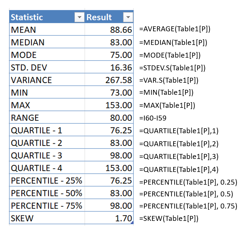
These basic statistics provide a foundation for understanding and interpreting data in a descriptive analysis. They are instrumental in revealing patterns, trends, and important characteristics of a dataset. Descriptive statistics play a crucial role in summarizing complex information concisely and making it more accessible for further analysis and decision-making.
Let's use quartiles in an example.
Using Quartiles to Analyze Top NHL Teams
No matter what type of analyst you are, you create categories to better separate and analyze your data. There are different ways to do this, and in this walkthrough we'll use the Quartile statistic to create and analyze the total points earned in the 2022-2023 regular NHL season.
- The first step is to get some data. So, go to the NHL.COM team stats page and filter on the 2022-2023 Regular Season, select All Franchises and click Export.
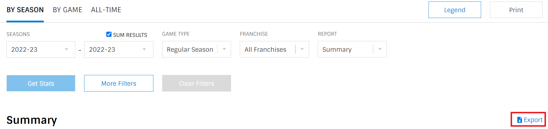
- Save the file locally as an Excel file.
- Delete all but the Team and P column (or copy and paste these two columns in a new tab). Note below, we renamed the Team column to NAME and P column to PTS.
- Using the Excel formulae from earlier, create four quartiles called Q1, Q2, Q3 and Q4.
- Create a new column called QUARTILE and enter the following formula in the first cell. This compares each cell in the QUARTILE column with the Quartiles you created and will automatically assign Q1, Q2, Q3 or Q4 to the teams.
=IF(B2<=$F$2, "Q1", IF(B2<=$F$3, "Q2", IF(B2<=$F$4, "Q3", "Q4")))
- Lastly click the top cell in the bottom right (to get the + sign) and drag your cursor across all of the cells in the QUARTILE column to apply the formula to all cells.
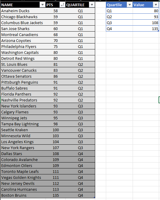
You now have the teams divided into quartiles based on the total points earned in the 2022-2023 regular season. More importantly, you have a Quartile pattern that you can apply to any statistic or hockey data. For example, you can use this pattern for Power Play Percentage, Faceoff Percentage, etc., and then look for patterns within specific quartiles. This can give you clues as key qualities that make an NHL team a top 25% club.
Check out the below video to see how you can create quartiles for team stats data.
Summary
In this module, we introduced you to the idea of descriptive statistics, which can be used to create summary and detailed hockey analyses. Descriptive statistics incorporate summary statistics, hockey statistics (raw and calculated) and can be used to categorize your data, for example, into quartiles.
In our next module, we're going to walk through how to build a Team Performance Report.
Subscribe to our newsletter to get the latest and greatest content on all things hockey analytics!
Member discussion