Chart 3: Choropleth Map for Player's Birth Cities

This is the third tutorial in our premium content series: Fifty Charts. In this week's tutorial, we'll walk through how to create a choropleth map in Datawrapper that shows the total count of NHL players' birthplace from different cities in North America. You might think of this as a proxy for what cities produce the most NHL players in North America.
Creating a Choropleth Map using Datawrapper
Datawrapper is an easy-to-use online tool designed for creating interactive charts, maps, and tables without requiring coding knowledge. It's widely used by journalists, content creators, data analysts, and other professionals to visualize data in a clear and compelling way.
What is a Choropleth Map?
A choropleth map is a type of thematic map where areas (like countries, states, or regions) are shaded or colored based on the values of a variable, providing a visual representation of data distribution across geographical areas. The shading usually follows a gradient, with darker or more intense colors representing higher values and lighter or muted colors representing lower values.
Choropleth maps are best suited for displaying data normalized across regions, like population density, crime rates, or income levels. The color scale often ranges from light to dark, with intermediate shades representing the gradation of values, making it easy to identify areas with higher or lower values at a glance. A well-designed legend is important because it explains what each color or shade represents in terms of actual data values.
For hockey data, choropleth maps are useful for showing points of origin for hockey players, point production across teams in different cities, and so on.
In platforms like Datawrapper, you can further enhance choropleth maps with tooltips, images, and interactive elements to help viewers dive deeper into specific areas.
In this tutorial, we'll build a choropleth map that answers the following question: What cities have higher proportions of NHL players in North America?
Getting the Resource Files
The resource files for this tutorial can be found below:
- NHL Player Data
- R Code to Clean and Transform the Player Data
- Filtered Player Dataset (City and Count)
You'll use R/RStudio, Microsoft Excel (or equivalent spreadsheet application) and Datawrapper in this tutorial.
Let's get started!
Step 1: Download the Data
For this tutorial, download the NHL Player Data into a new folder you create locally.
After you create a new folder and download the NHL Player data, open it using Microsoft Excel (or other spreadsheet application) to verify it downloaded correctly.
At this point, continue to Step 2.
Step 2: Load and Transform the Data
The next step is to load and transform the data. You'll use R and RStudio to do this.
To load and transform the data:
- Open RStudio and create a new project in an existing folder (use the folder you created above).
- Create a new file for the project. (We use Markdown files so we can re-use the file for application documentation.)
- Add the following application code to the R Markdown file.
The first code snippet loads the dplyr library that you will use in the application.
library(dplyr)
The next code snippet loads the NHL Player Data into a data frame.
nhl_player_df <- read.csv("Full_NHL_Roster.csv")
The final code snippet creates a new data frame called na_player_by_city and groups the data by city and counts the instances of players in each city. It then saves the data frame locally as a CSV file, so you can use it for Datawrapper.
na_player_by_city <- nhl_player_df %>%
  filter(BIRTH_COUNTRY %in% c("USA", "Canada")) %>%
  select(BIRTH_CITY) %>%
  group_by(BIRTH_CITY) %>%
  summarize(TOT_COUNT = n()) %>%
  arrange(desc(TOT_COUNT))

write.csv(na_player_by_city, "na_nhl_player_by_city.csv", row.names = FALSE)
Step 3: Create a Visualization
To create the visualization, navigate to Datawrapper and walk through the process of creating a new choropleth map. To do this:
- Click Create New in your dashboard.
- Click XLS/CSV upload, navigate to the data you saved in the last step, and make sure it appears correctly.
- When done, click Proceed.
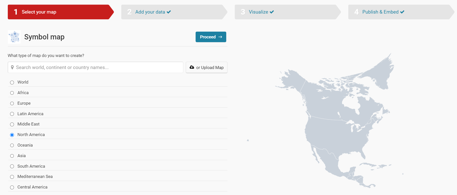
The first step in the Datawrapper wizard process is to select the geographical region for your map. Our dataset covers Canada and the USA, so select North America and click Proceed.
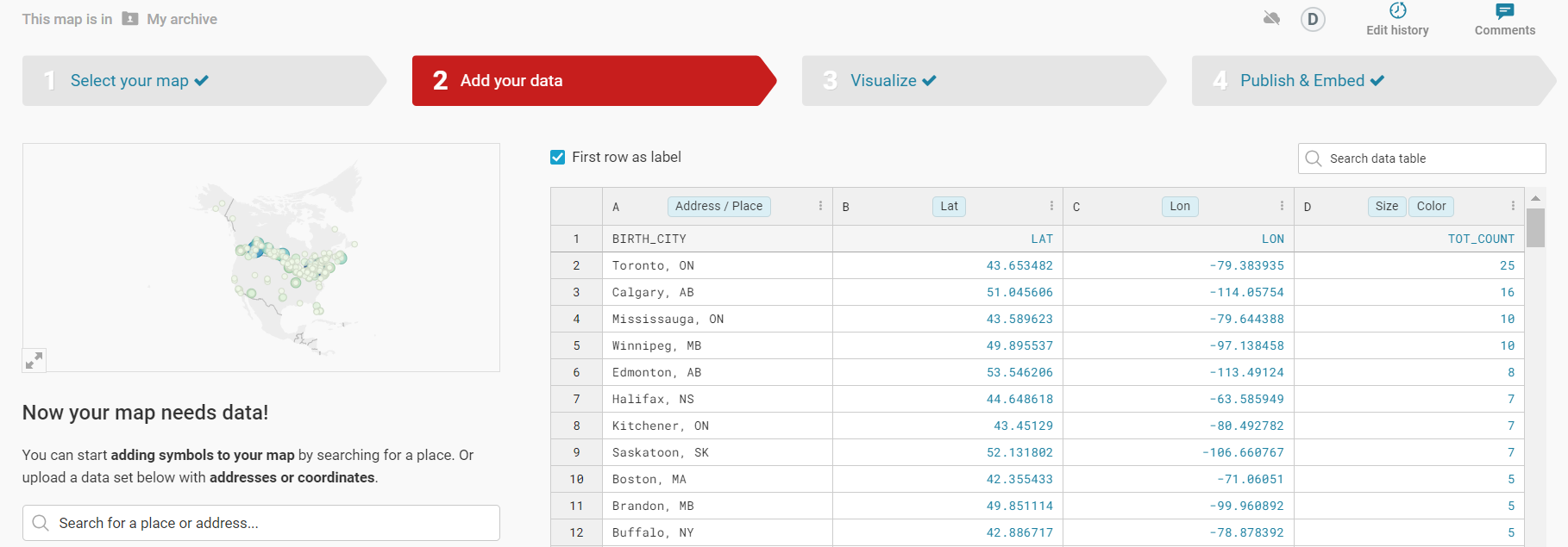
Click the Upload file button, navigate to the CSV file you downloaded from the last step (na_nhl_player_by_city.csv) and click the file and then Open.
After Datawrapper auto-generates the coordinates, you are ready to proceed to the next step.
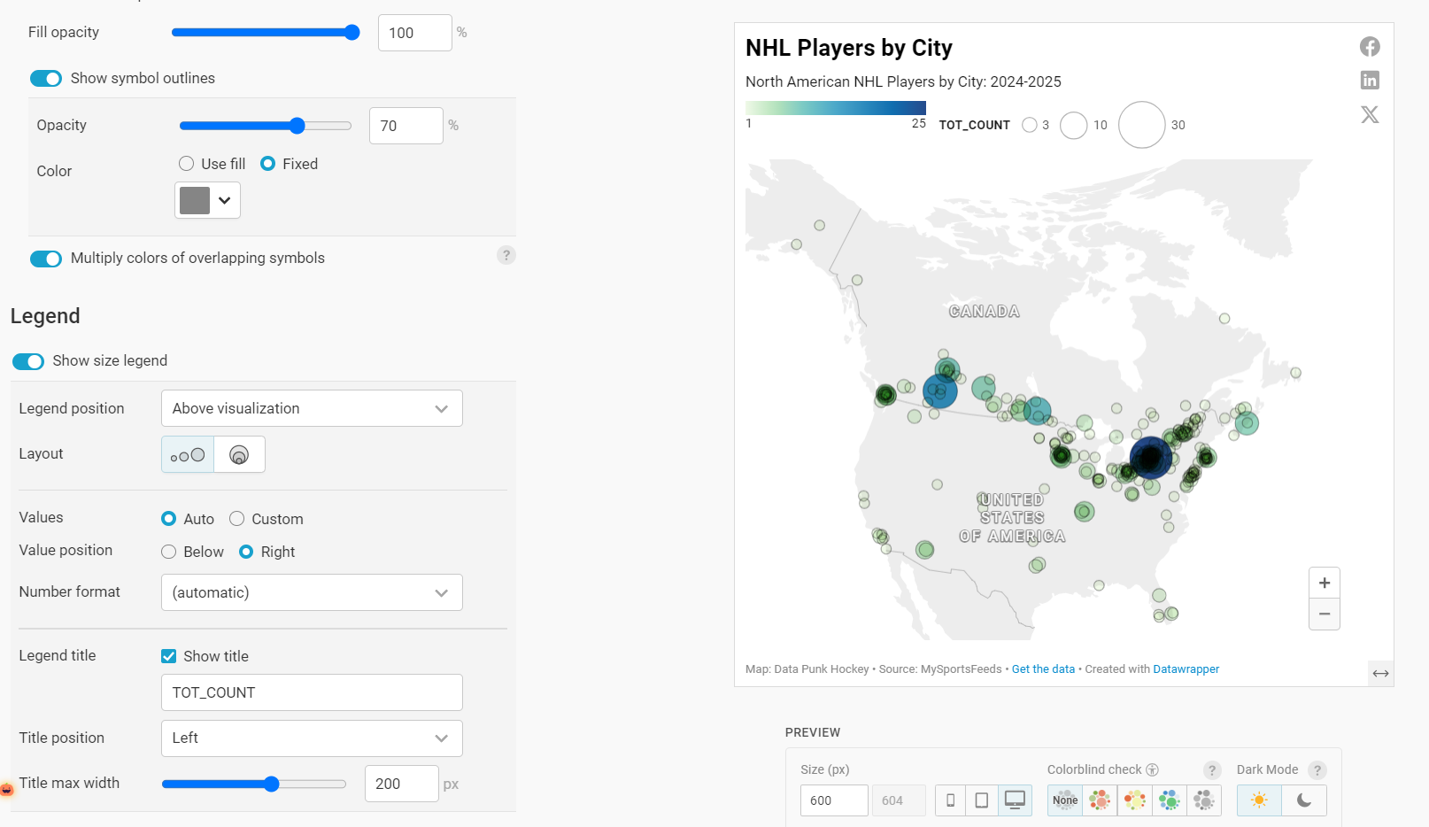
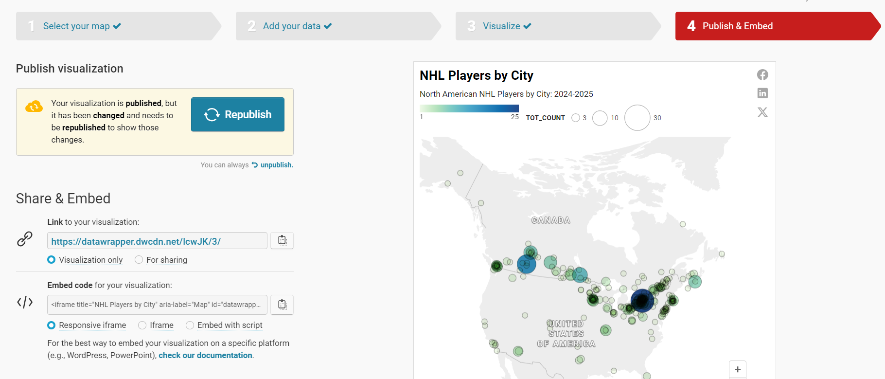
You can now configure and style the choropleth map to your liking. Below, we've used the Symbol map and then configured the color palette to be a light green-to-blue gradient.
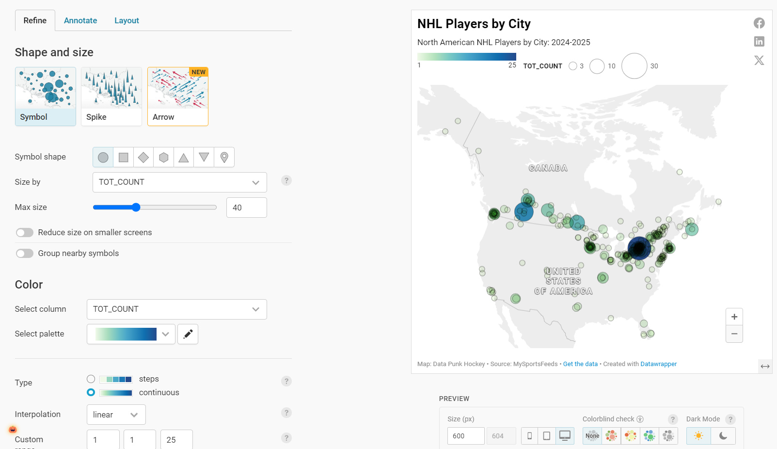
We've also added a legend at the top of the map and are showing the total count of players for a given city (TOT_COUNT). We've also given the map a title and subtitle and added some additional information towards the bottom of the map.
The final step is to publish (or republish) the map by clicking Publish & Embed and clicking the Publish (Republish) button.
You can now move to the final step in the tutorial.
Step 4: Integrate the Visualization in your Content
The final step is to integrate the choropleth map in your content. This could be an article, report or even a PowerPoint presentation. Datawrapper is a great tool to use to integrate with your content because the charts and maps are displayed as interactive and dynamic charts.
To do this:
- Click the copy icon on Share & Embed.
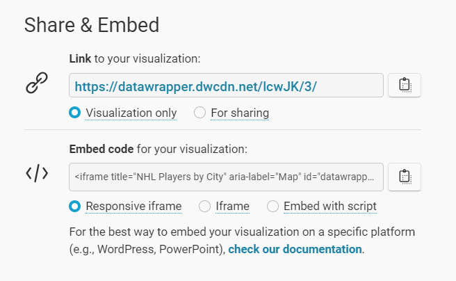
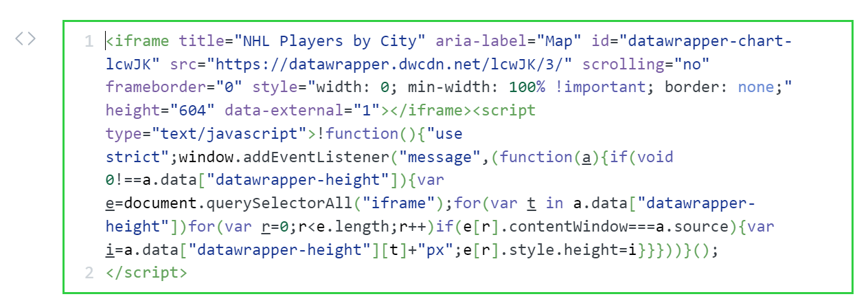
- In your content platform, copy and paste this code into the HTML module. Note that where you find this may be specific to that platform, but most content platforms have this feature.
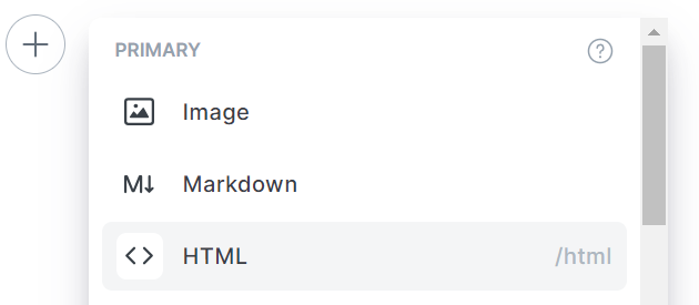
- Copy the embed code into the HTML module.
Depending on your platform, you can now preview the page and the choropleth map will be live and interactive.
Congratulations! At this point, you should now have a working choropleth map that is live and integrated with your content.
Looking for more datasets and tutorials? Check out our Resources page!
Member discussion