Chart 2: Column Chart for Top-Scoring Enforcers

Creating a Column Chart using Datawrapper
Datawrapper is an easy-to-use online tool designed for creating interactive charts, maps, and tables without requiring coding knowledge. It's widely used by journalists, content creators, data analysts, and other professionals to visualize data in a clear and compelling way.
What is a Column Chart?
A column chart uses vertical bars to represent data values. Each bar, or column, represents a category, and the height of the column reflects the value associated with that category. This type of chart is straightforward and effective for comparing values across different categories or tracking changes over time.
Column charts are good for comparing discrete categories, like total points across different hockey conferences, divisions or teams. They’re also used to show changes in a single variable over time, especially if there are only a few time points (e.g., Total Points by Season).
In this tutorial, we'll build a column chart that answers the following question: Who is the NHL's all time, top point-producing enforcer?
If you'd like more background on the topic, take a few minutes to check out the following YouTube video.
Getting the Resource Files
The resource files for this tutorial can be found below:
- 108 Years of Player Stats
- R Code to Clean and Transform the Player Data
- Top Five Point-Producing Enforcers
You'll use R/RStudio, Microsoft Excel (or equivalent spreadsheet application) and Datawrapper in this tutorial.
Let's get started!
Step 1: Download the Data
We've curated and cleaned a dataset that represents 108 years worth of player data. Download the player stats data into a new folder you create locally.
Be sure to create a new folder, into which you'll download the Player Stats data. After you've completed the download into your new folder, you're ready for Step 2.
Step 2: Load and Transform the Data
The next step is to load and transform the data. We've done a lot of the cleaning work already, but there's still a bit of work to do here. You'll want to load the data into a data frame, so you can implement your transformations. You'll use R and RStudio to do this.
To load and transform the data:
- Open RStudio and create a new project in an existing folder (use the folder you created above).
- Create a new file for the project. (We typically use Markdown files so we can re-use the file for application documentation.)
- Add the following application code to the R Markdown file.
The first code snippet loads two libraries that you will use in the application.
library(dplyr)
library(knitr)
The next code snippet loads the data into a data frame, filters the data frame for the data we'll use and then adds some calculated columns.
Note that each new calculated metric is rounded by 2 decimal points.
nhl_player_stats <- read.csv("all_player_stats_1917_to_2024.csv")

sub_nhl_player_stats <- nhl_player_stats %>%
  select(SEASON, PLAYER_NAME, AGE, TEAM, POS, GP, G, A, PTS, PIM) %>%
  filter(GP > 10)

sub_nhl_player_stats$GPG <- round(sub_nhl_player_stats$G / sub_nhl_player_stats$GP, 2)
sub_nhl_player_stats$APG <- round(sub_nhl_player_stats$A / sub_nhl_player_stats$GP, 2)
sub_nhl_player_stats$PTSPG <- round(sub_nhl_player_stats$PTS / sub_nhl_player_stats$GP, 2)
sub_nhl_player_stats$PIMPG <- round(sub_nhl_player_stats$PIM / sub_nhl_player_stats$GP, 2)
sub_nhl_player_stats$EPI <- round(sub_nhl_player_stats$PTSPG * sub_nhl_player_stats$PIMPG, 2)
You'll want to remove any NAs from the data, so this next snippet of code counts, identifies and removes any NA data.
na_count <- sum(is.na(sub_nhl_player_stats$EPI))
print(na_count)

sub_nhl_player_stats_clean <- sub_nhl_player_stats[!is.na(sub_nhl_player_stats$EPI), ]

na_count_2 <- sum(is.na(sub_nhl_player_stats_clean$EPI))
print(na_count_2)
We broke the 108 years into five eras, so you'll need to add this categorization with the data. Also, note that if a player was traded within a single season, you'll see an extra entry for them where the team is 2TM with their totals for that season. We're going to remove those entries.
nhl_player_data_w_era <- sub_nhl_player_stats_clean %>%
  mutate(ERA = case_when(
    SEASON >= '1916_1917' & SEASON <= '1942_1943' ~ 1,
    SEASON > '1942_1943' & SEASON <= '1969_1970' ~ 2,
    SEASON > '1969_1970' & SEASON <= '1979_1980' ~ 3,
    SEASON > '1979_1980' & SEASON <= '1999_2000' ~ 4,
    SEASON > '1999_2000' ~ 5
  ))

nhl_player_data_w_era <- nhl_player_data_w_era %>%
  filter(TEAM != "2TM")

nhl_player_data_w_era
You'll next need to create a weighted EPI score using the Total Games Played and then filter for the top five players within each era, shown in the below code snippet.
nhl_players_w_era_weighted <- nhl_player_data_w_era %>%
  group_by(ERA) %>%
  mutate(MAX_GP_ERA = max(GP),
         W_EPI = EPI * GP / MAX_GP_ERA
  ) %>%
  ungroup()


top_5_players_by_era <- nhl_players_w_era_weighted %>%
  group_by(ERA) %>%
  arrange(desc(W_EPI)) %>%
  slice_head(n = 5) %>%
  ungroup()
And the last task is to create a top five player list. We do this by filtering on only that data we'll need (and also taking only those players who played more than 15 games). We then create a variable for Average Points (avg_pts) and Average PIM (avg_pim) that we use to get the list to five players who have a balanced EPI score.
We then write the top five players to a CSV file, which we'll use in Datawrapper.
top_five_epi_players <- top_5_players_by_era %>%
  select(PLAYER_NAME, TEAM, POS, GP, PTSPG, PIMPG, W_EPI) %>%
  filter(GP > 15)

top_five_epi_players

avg_pts <- mean(top_five_epi_players$PTSPG)
avg_pim = 2.5 # Use this to get five players

filtered_epi_players <- subset(top_five_epi_players, PTSPG > avg_pts & PIMPG > avg_pim)

top_balanced_epi_players <- head(filtered_epi_players[order(-filtered_epi_players$W_EPI), ], 5)

write.csv(top_balanced_epi_players, "top_balanced_epi_players.csv", row.names = FALSE)
Step 3: Create a Visualization
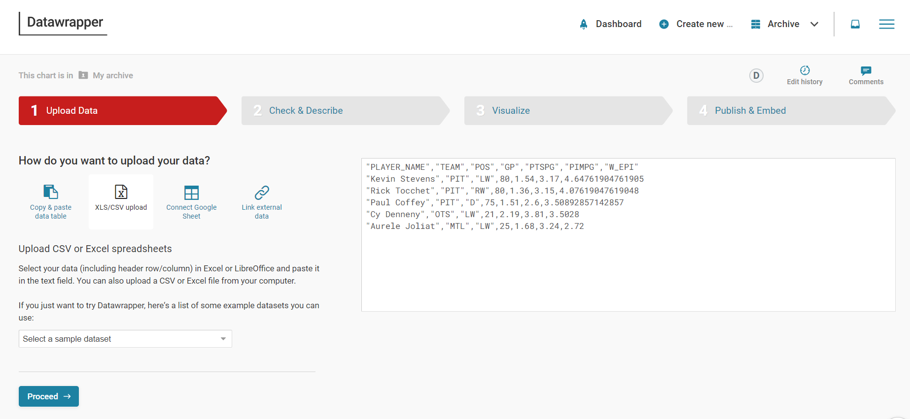
To create the visualization, we'll head over to Datawrapper and walk through the process of creating a new column chart. To do this:
- Click Create New in your dashboard.
- Click XLS/CSV upload, navigate to the data you saved in the last step, and make sure it appears correctly.
- When done, click Proceed.
You'll only use the Player Name (PLAYER_NAME) and EPI Score (W_EPI), so hide all the other columns. To do this, select the column and click Hide column from visualization.
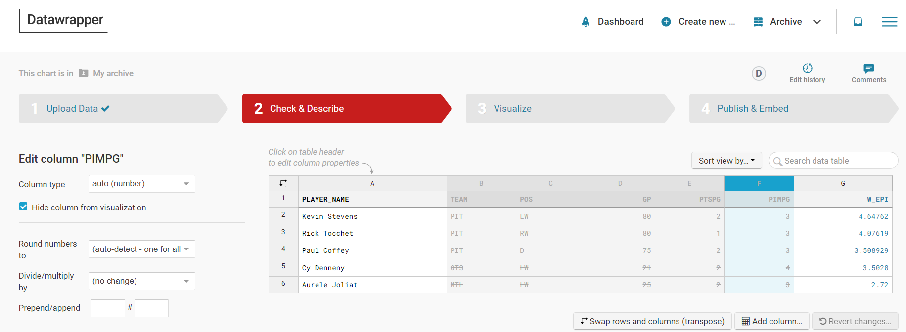
When done, click Visualize or Proceed.
Select Column Chart in the Chart type tab and then click Refine. Here you can configure the chart to your liking. When done, click Annotate.
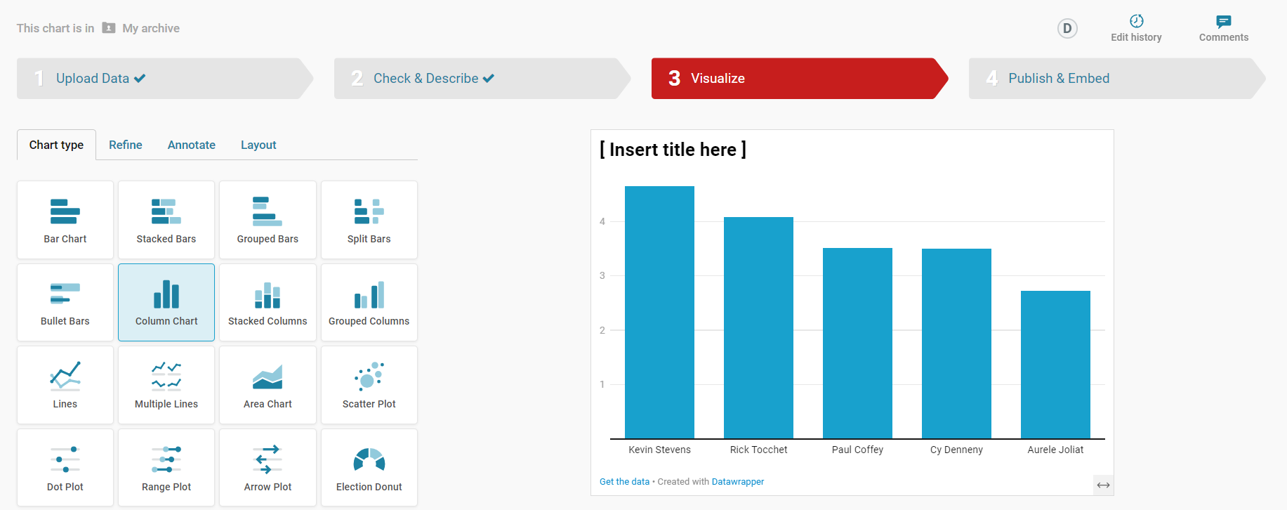
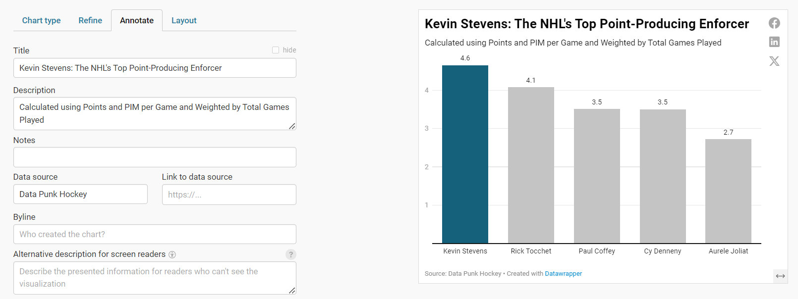
Note that at this point, you could continue on and create a column chart that shows the top five point-producing enforcers of all time. But, this is kind of boring. Instead, think of a story that might be more interesting to tell. For example, you could focus on the top point-producing enforcer and build a story around his rise. The story is simpler and gives you a chance to get more personal with that player.
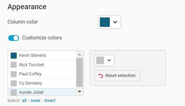
So, let's go ahead and click Refine and configure the visualization to highlight the top point-producing enforcer of all time, who in this case is Kevin Stevens. You'll want to differentiate the color of one column to have that column stand out when compared to the others. You can do this in the Appearance section of the Refine tab.
On the next Annotate tab, adjust the title and subtitle so it focuses on that one player: the data story is about Kevin Stevens and the contrast in the column chart trains the user's eyes on that specific data point.
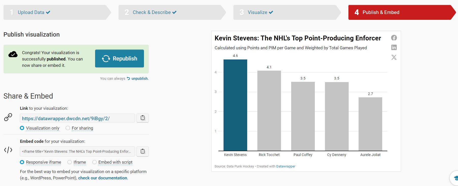
When you're done, click Layout. Here, you can change the look and feel, theme and toggle different options (e.g., Dark Mode, Data Download, etc.).
When you've finished with your layout, click Publish and Embed. On this final step, click the Publish now button to publish your visualization.
Let's move to the final step, embedding the chart into an article.
Step 4: Integrate the Visualization in your Content
The final step is to integrate the column chart in your content. This could be an article, report or even a PowerPoint presentation.
To do this:
- Click the copy icon on Share & Embed.
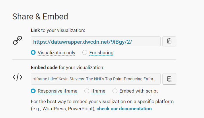
- In your content platform, copy and paste this code into the HTML module. Note that where you find this may be specific to that platform, but most content platforms have this feature.
We use Medium and Ghost as our publishing platforms, so it's very easy to add an HTML module and then copy the visualization embed code in that module. The auto-generated code from Datawrapper looks similar to the below.
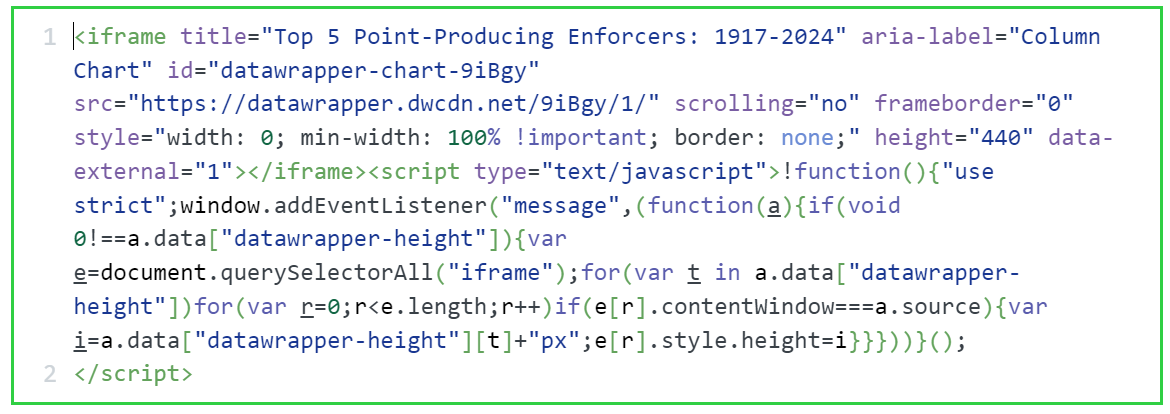
Depending on the platform you're using, your visualization will automatically appear on your web page or you may need to preview the page to see the embedded HTML render properly.
Quick-Hit Video Walkthrough
For a quick-hit tutorial, check out the YouTube video below.
Looking for more datasets and tutorials? Check out our Resources page!
Member discussion