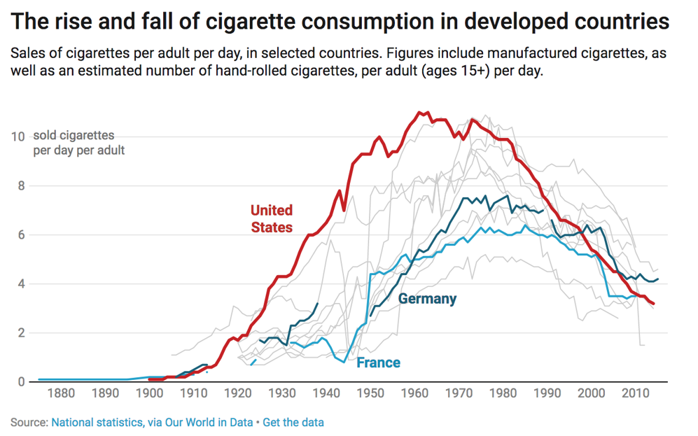
Chart 1: Line Chart for Points Percent by Era

Creating a Line Chart using Datawrapper
Datawrapper is an easy-to-use online tool designed for creating interactive charts, maps, and tables without requiring coding knowledge. It's widely used by journalists, content creators, data analysts, and other professionals to visualize data in a clear and compelling way. Below is an example visualization created using Datawrapper.
We use Datawrapper to create and publish visualizations for our newsletters, blogs, articles, etc. as embedded charts. You can also export the visualization you create and use in other applications such as PowerPoint or as a PDF.
In this tutorial, we'll create a line chart using Datawrapper to answer the following question: What was the top Points Percent across all five eras of NHL hockey?
The resource files for this tutorial can be found below:
- 108 Years of NHL Hockey History - Team Data
- R Code to Clean and Transform Data
- Points Percent by Era View Dataset (Result of Data Transformation)
You'll use R/RStudio, Microsoft Excel (or equivalent spreadsheet application) and Datawrapper in this tutorial.
Let's get started!
Step 1: Download the Data
We've curated and cleaned a dataset that represents 108 years worth of NHL hockey history. For this tutorial, we'll use the Team Stats Dataset.
Note that we created five eras, based on different pivots in NHL hockey history. For more information, check out From Chalkboards to AI: 108 Years of NHL Hockey History.
Be sure to create a new folder, into which you'll download the Team Stats data. After you've completed the download into your new folder, you're ready for Step 2.
Step 2: Prepare the Data
The next step is to prepare the data. Because we created a clean version of the data, there's not too much for you to do save for filtering and getting the data down to a small dataset you can then analyze. You'll use R and RStudio to do this.
To prepare the data:
- Open RStudio and create a new project in an existing folder (use the folder you created above).
- Create a new file for the project. (We typically use Markdown files so we can re-use for application documentation.)
- Add the following application code to the R Markdown file.
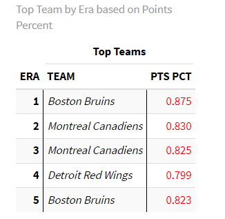
This code loads the libraries that you'll use for the data cleaning, loads the data into a data frame called nhl_stats, filters the data into a new data frame called top_teams_by_time_period that represents top Points Percent (PTS_PCT) by era (TIME_PERIOD), cleans the column headers, prints out the data frame, and saves the dataset as a CSV file.
library(dplyr)
library(knitr)
library(kableExtra)

nhl_stats <- read.csv("clean_historical_nhl_stats.csv")

top_teams_by_time_period <- nhl_stats %>%
  group_by(TIME_PERIOD) %>%
  arrange(desc(PTS_PCT)) %>%
  slice_head(n = 1) %>%
  select(TIME_PERIOD, TEAM, PTS_PCT)

colnames(top_teams_by_time_period) <- c("ERA", "TEAM", "PTS PCT")

top_teams_by_time_period %>%
  kable("html", caption = "Top Team by Era based on Points Percent") %>%
  kable_styling(bootstrap_options = c("striped", "hover", "condensed", "responsive"),
                full_width = F,
                position = "center") %>%
  column_spec(1, bold = T, border_right = T) %>%
  column_spec(2, italic = T, border_right = T) %>%
  column_spec(3, color = "red") %>%
  add_header_above(c(" " = 1, "Top Teams" = 2))

write.csv(top_teams_by_time_period, "Top_Teams_by_Era.csv", row.names = FALSE)
The table in RStudio should look something like the below.
The next step is to create the visualization in DataWrapper.
Step 3: Create a Visualization
To create the visualization, we'll head over to Datawrapper and walk through the process of creating a new line chart. To do this:
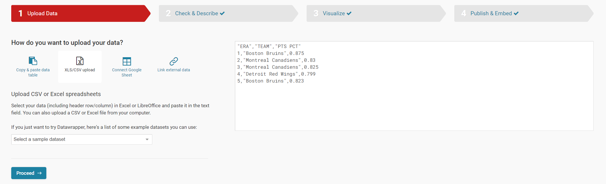
- Click Create New in your dashboard.
- Click XLS/CSV upload, navigate to the data you saved in the last step, and make sure it appears correctly.
- When done, click Proceed.
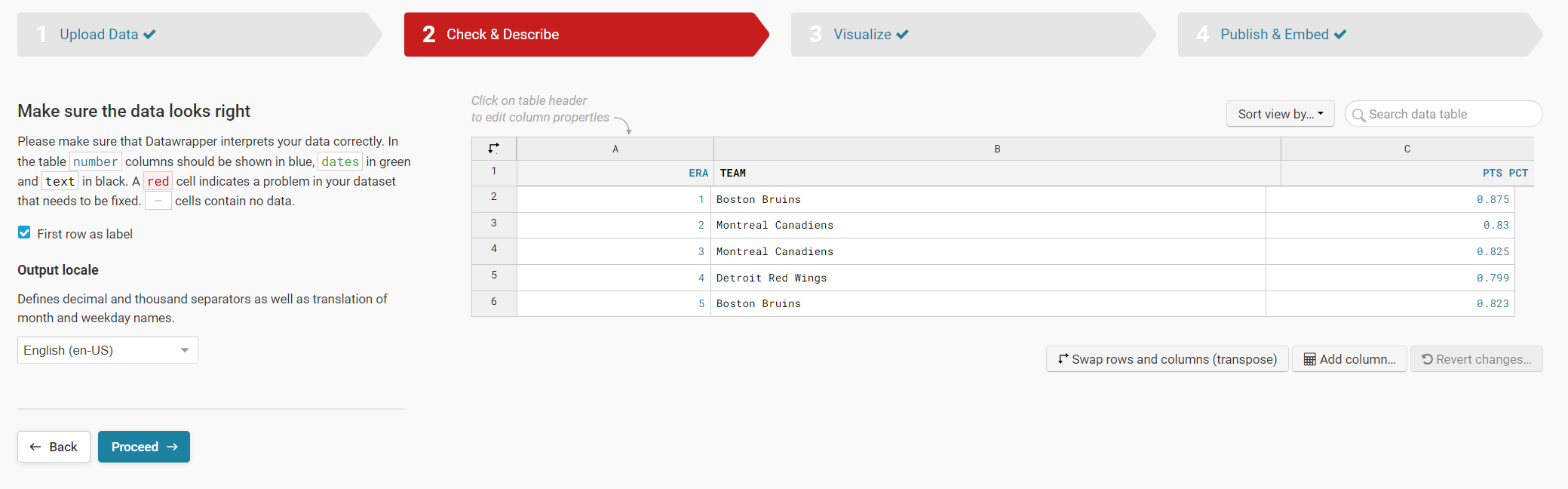
- You can check the data here again, change the column heads, etc. When done click Proceed.
- Here is where you select the chart that you want. You do this in the Chart type tab.
- Select Line Chart and then click Refine to configure the chart – see below for our selections.
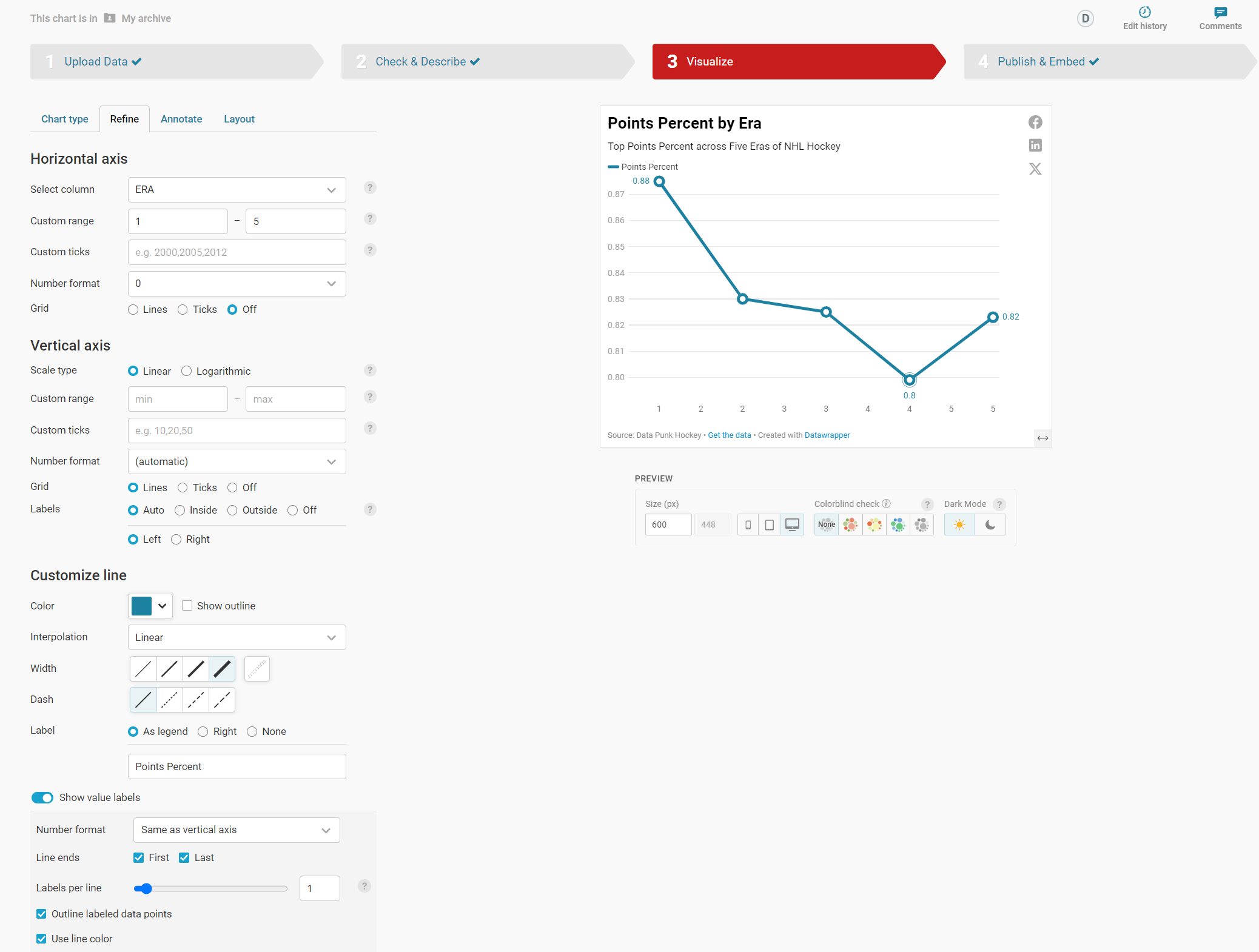
- When done click Annotate to add the title and subtitle and click Layout to complete the configuration.
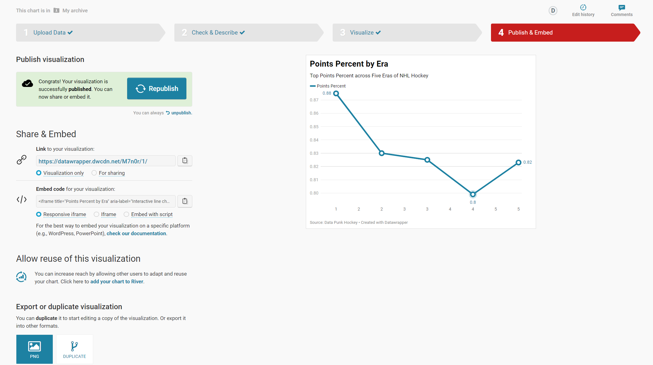
- Finally, click Publish and Embed. This publishes your visualization to an endpoint and creates embed code for you to use in your content.
At this point you are ready to use the visualization in your content.
Step 4: Integrate the Visualization in your Content
The final step is to integrate the line chart in your content. This could be an article, report or even a PowerPoint presentation.
To do this:
- Click the copy icon on Share & Embed.
- In your content platform, copy and paste this code into the HTML module. Note that where you find this may be specific to that platform, but most content platforms have this feature.
We use Medium and Ghost as our publishing platforms, so it's very easy to add an HTML module and then copy the visualization embed code in that module.
You now have an interactive visualization – the line chart showing Points Percent by Era – for use in your content. Check it out below!
Quick-Hit Video Walkthrough
For a quick-hit tutorial, check out the YouTube video below.
Looking for more datasets and tutorials? Check out our Resources page!
Member discussion