Chart 7: Range Plot for PPE Index

Creating a Range Plot using Datawrapper
In this tutorial, we'll create a Range Plot to analyze the range for a recent Point-Producing Enforcer (PPE) Index we wrote about. The range will be the average PPE Index of the player for three seasons. We'll use Datawrapper as the tool to create the plot.
What is Datawrapper?
Datawrapper is an easy-to-use online tool designed for creating interactive charts, maps, and tables without requiring coding knowledge. It's widely used by journalists, content creators, data analysts, and other professionals to visualize data in a clear and compelling way.
In this tutorial, we'll build a Range Plot that answers the following question: Who is the Top Point-Producing Enforcer in the Last Three Seasons?
What is a Range Plot?
A Range Plot is a type of data visualization that highlights the range or spread of data within a dataset. It is useful for showcasing variability, differences, or distributions within categories or over time. The plot typically displays the minimum and maximum values, along with other statistics, such as the mean or median, to give a clear picture of the data's extent.
The range is typically represented by a line or bar that spans from the minimum value to the maximum value. This helps visually depict the variability within a dataset. Some range plots also include a marker (like a dot) for the mean, median, or another measure of central tendency. Often, the range is plotted for different categories (e.g., teams, players) or across time (e.g., games, seasons). Range plots simplify data by focusing on extremes and central trends rather than all individual data points.
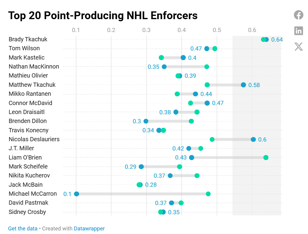
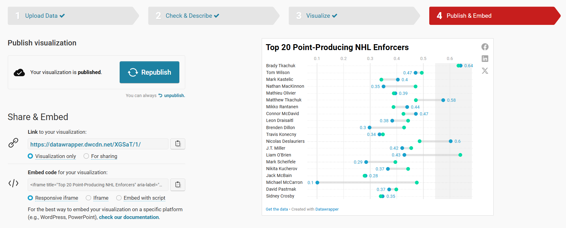
For this tutorial, we'll create a Range Plot that uses three seasons as the time period and then evaluates for the PPE Index across each of those seasons. You can then see the range of the PPE Index for each of the players. Below is what the finished plot will look like, with players down the left-hand side, the PPE Index range for the three seasons, and a highlighted area towards the right for the highest index values.
So, let's get started!
Getting the Resource Files
The resource files for this tutorial can be found below:
- Player Statistics Dataset (for 3 seasons)
- Enforcer Metrics for All Players
- R Code to Clean and Transform Data
- Top 20 Players
You'll use R/RStudio, Microsoft Excel (or equivalent spreadsheet application) and Datawrapper in this tutorial.
Let's get started!
Step 1: Download the Data
For this tutorial, download the player data into a new folder you create locally.
After you create a new folder and download the player data, open it using Microsoft Excel to verify it downloaded correctly.
At this point, continue to Step 2.
Step 2: Load and Transform the Data
The next step is to load and transform the data. You'll use R and RStudio to do this.
To load and transform the data:
- Open RStudio and create a new project in an existing folder (use the folder you created above).
- Create a new file for the project. (We use Markdown files so we can re-use the file for application documentation.)
- Add the following application code to the R Markdown file.
The first code snippet loads the dplyr library that you will use in the application. This library is one we use all the time and allows you to transform the data in different ways.
library(dplyr)
The next line of code reads the CSV file into a data frame.
all_stats_data_df <- read.csv("all_seasons_player_stats.csv")
This next code snippet calculates the PPE Index and saves the resulting data frame as a CSV file.
player_stats <- all_stats_data_df %>%
  mutate(
    POINTS = ifelse(is.na(POINTS), 0, POINTS),
    PIM = ifelse(is.na(PIM), 0, PIM),
    FIGHTS = ifelse(is.na(FIGHTS), 0, FIGHTS)
  )

enforcer_with_all_columns <- player_stats %>%
  group_by(SEASON) %>%
  mutate(
    Max_Points = max(POINTS, na.rm = TRUE),
    Max_PIM = max(PIM, na.rm = TRUE),
    Max_Fights = max(FIGHTS, na.rm = TRUE),
    Normalized_Points = POINTS / Max_Points,
    Normalized_PIM = PIM / Max_PIM,
    Normalized_Fights = FIGHTS / Max_Fights,
    Enforcer_Metric = (0.4 * Normalized_Points) +
                      (0.3 * Normalized_PIM) +
                      (0.3 * Normalized_Fights)
  ) %>%
  ungroup() %>%
  arrange(SEASON, desc(Enforcer_Metric))

write.csv(enforcer_with_all_columns, "enforcer_metric_w_all_data.csv", row.names = FALSE)
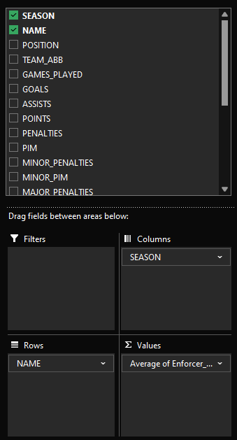
At this point, we chose to open the CSV file (enforcer_metric_w_all_data.csv) in Excel and complete the last mile there. What we need for this plot is a table four columns: 1 column for player name and 3 columns for the PPE Index for each season. To do this:
- Click the upper left-hand cell in the first tab of the spreadsheet and select Format as Table.
- Then click Insert, PivotTable and select where you want to add the PivotTable.
- Configure the PivotTable with the following parameters.
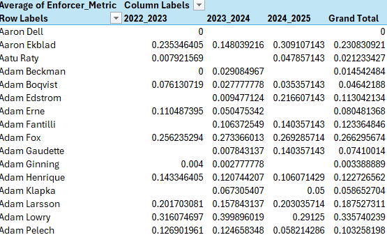
You should see something similar to the below.
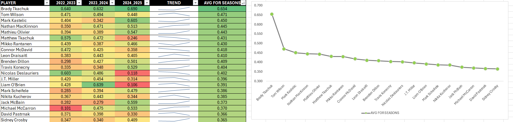
Copy and paste that data into a new spreadsheet, format the data as a table and sort by the overall average PPE Index (this is the AVG FOR SESONS column in the below image).
You can also copy and paste the data for the top 20 players (direct or as a CSV) from the first four columns into Datawrapper to create the visualization. Note that when you do this, you don't have that date in a CSV file, so you lose the ability to reuse the data file elsewhere.
Let's assume you copy the data into a new CSV file and save it separately. You can now use the CSV file to create a new visualization in Datawrapper.
Step 3: Create a Visualization
To create the visualization, navigate to Datawrapper and work through the process of creating a new Range Plot. To do this:
- Click Create New in your dashboard.
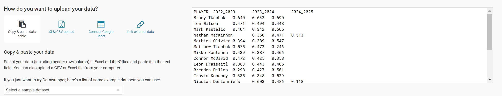
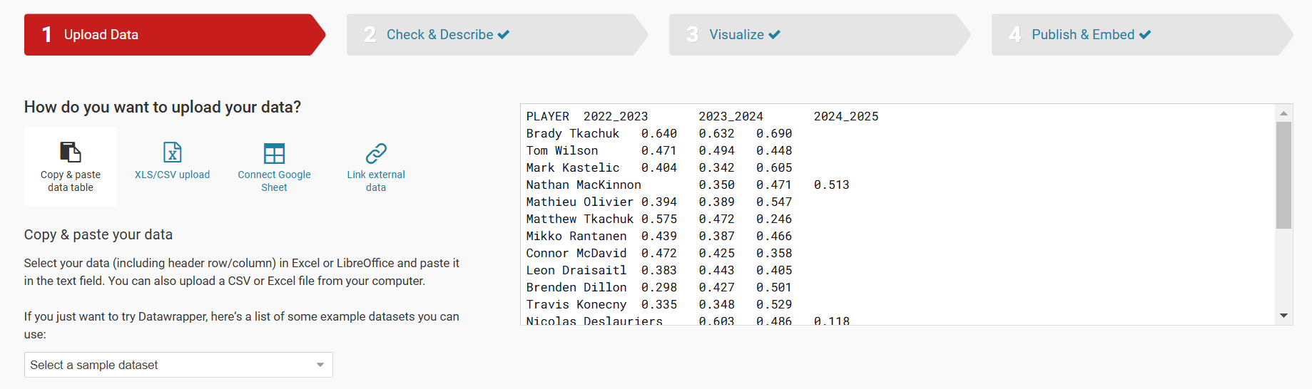
- In the Upload Data step, click XLS/CSV Upload and navigate to the CSV file you just downloaded.
- Click Proceed (or Check & Describe) and verify that the data is accurate.
You should see something similar to the below.
Click the Visualize button and then select Range Plot in the Chart Type tab. Click the Refine tab and configure to your liking.
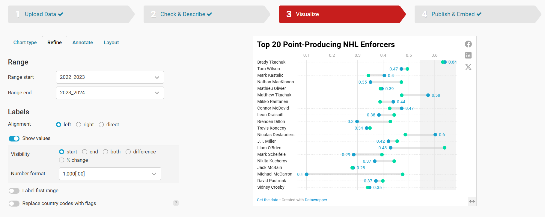
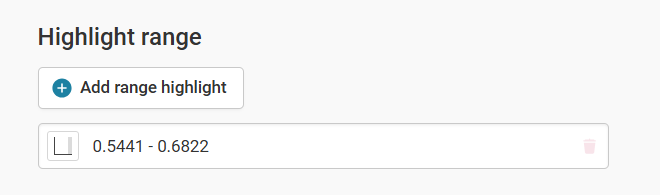
Note that we've added a highlight in the Range Plot to show the high watermark for Brady Tkachuk – and others who are close to him. To do this, click the Add range highlight button and drag where you want the highlight on your Range Plot.
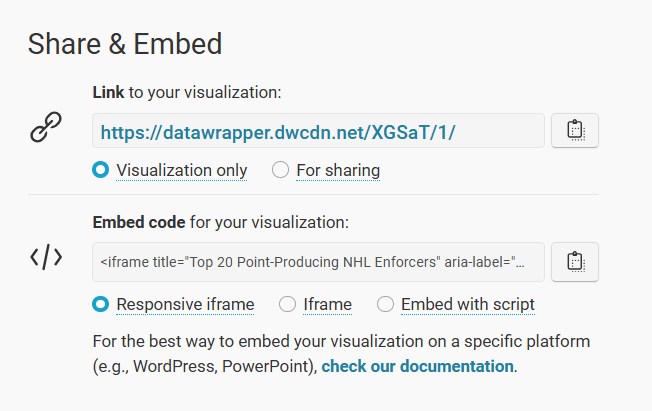
You can now add a title, subtitle and other details using the Annotate tab and finalize the configuration using the Layout tab. And the last step is to click the Publish (or Republish) button to push your chart out to the world.
At this point, your visualization is published and ready to integrate into other content platforms.
Step 4: Integrate the Visualization in your Content
The final step is to integrate the Range Plot in your content. This could be an article, report or even a PowerPoint presentation. Datawrapper is a great tool to use to integrate with your content because the charts and maps are displayed as interactive and dynamic charts.
To do this:
- Click the copy icon on Share & Embed.
- In your content platform, copy and paste this code into the HTML module. Note that where you find this may be specific to that platform, but most content platforms have this feature.
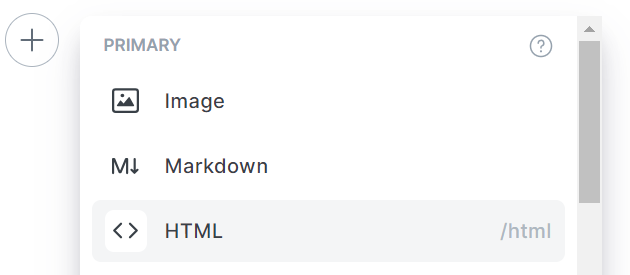
- Copy the embed code into the HTML module.
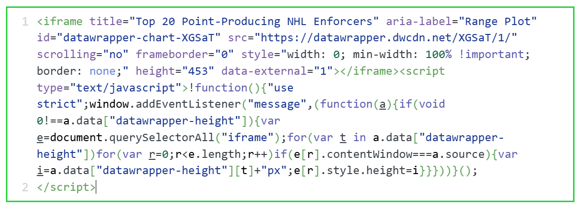
Depending on your platform, you can now preview the page and the Range Plot will be live and interactive.
Looking for more datasets and tutorials? Check out our Resources page!
Member discussion