Chart 5: Creating a Heatmap to Compare the Top Rookies

Microsoft Excel & Heatmaps
What is Microsoft Excel?
Microsoft Excel is a software application designed for data organization, analysis, and visualization. It is part of the Microsoft Office suite and is available for Windows, macOS, and mobile devices. Excel is popular for its versatility and user-friendly interface, making it a go-to tool for personal, academic, and professional tasks involving numerical data.
For data analysts that work in sports, Microsoft Excel is a heavily-used spreadsheet application. In fact, many data analysts use Excel to build "databases" by using multiple tabs, lookups and complex formulae. It's also used for managing CSV files and running ad-hoc analyses, which you can then integrate into other Microsoft Office applications (such as PowerPoint and Word).
For the Sports Analytics student, Excel (or Google Sheets) should be in your arsenal.
What is a Heatmap?
Heatmaps are data visualization tools that use colors to represent the intensity, frequency, or value of data points in a two-dimensional space. They are widely used across various fields such as sports analytics, business intelligence, and scientific research to provide an intuitive way of identifying patterns, trends, or anomalies in data.
Excel is a great choice for creating heatmaps when you need a quick, accessible, and cost-effective way to visualize data. Its simplicity, combined with its robust functionality, makes it a go-to tool for professionals in various fields.
Below is the finished heatmap that we will create in this tutorial. The process to get the heatmap looking like this is 1) clean and transform the data in RStudio, 2) create a heatmap in Excel, and 3) export the heatmap to PowerPoint.
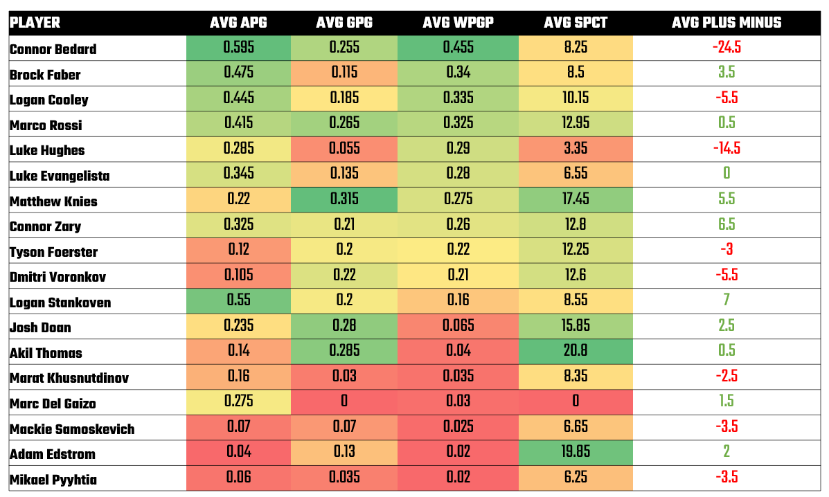
The goal of building the heatmap will be to answer the following question: How do the Top Rookies Compare across Key Production Statistics?
Getting the Resource Files
The resource files for this tutorial can be found below:
You'll use R/RStudio, Microsoft Excel (or equivalent spreadsheet application) and Datawrapper in this tutorial.
Let's get started!
Step 1: Download the Data
For this tutorial, download the two seasons of player stats data into a new folder you create locally.
After you create a new folder and download the player data, open it using Microsoft Excel to verify it downloaded correctly.
Step 2: Load and Transform the Data
The next step is to load and transform the data. You'll use R and RStudio to do this.
To load and transform the data:
- Open RStudio and create a new project in an existing folder (use the folder you created above).
- Create a new file for the project. (We use Markdown files so we can re-use the file for application documentation.)
- Add the following application code to the R Markdown file.
The first code snippet loads the dplyr library that you will use in the application.
library(dplyr)
The next code snippet reads in the dataset with the two seasons worth of player stats in it. It then uses an array called player_list to filter the players we want to analyze.
two_seasons_of_player_stats_df <- read.csv("two_seasons_of_player_stats.csv")

player_list <- c("Logan Stankoven", "Connor Bedard", "Brock Faber",
                 "Luke Hughes", "Connor Zary", "Logan Cooley", "Marco Rossi", "Luke Evangelista",
                 "Dmitri Voronkov", "Matthew Knies", "Tyson Foerster", "Mackie Samoskevich",
                 "Akil Thomas", "Marc Del Gaizo", "Josh Doan", "Aatu Raty", "Adam Edstrom",
                 "Marat Khusnutdinov", "Mikael Pyyhtia")

filtered_rookies_df <- two_seasons_of_player_stats_df %>%
  select(Season, Player, GP, G, A, PTS, X..., SPCT, ATOI) %>%
  filter(Player %in% player_list) %>%
  arrange(desc(Player))
The next code snippet cleans up the column headers, adds some additional calculated metrics and then transforms some of the columns by rounding them to two decimal places and recasting the Average Time on Ice (ATOI) variable to be a double.
colnames(filtered_rookies_df) <- c("SEASON", "PLAYER_NAME", "GP", "G", "A", "PTS",
                                   "PLUS_MIN", "SPCT", "ATOI")

filtered_rookies_df$GPG <- round(filtered_rookies_df$G/filtered_rookies_df$GP, 2)
filtered_rookies_df$APG <- round(filtered_rookies_df$A/filtered_rookies_df$GP, 2)
filtered_rookies_df$PPG <- round(filtered_rookies_df$PTS/filtered_rookies_df$GP, 2)
filtered_rookies_df$WEIGHT <- round(filtered_rookies_df$GP/82, 2)
filtered_rookies_df$W_PPG <- round(filtered_rookies_df$PPG * filtered_rookies_df$WEIGHT, 2)
filtered_rookies_df$ATOI <- as.double(filtered_rookies_df$ATOI)
filtered_rookies_df$ATOI <- round(filtered_rookies_df$ATOI, 2)
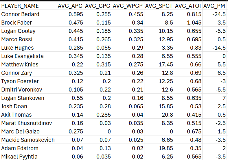
The final code snippet creates averages across seasons for the selected players and then saves the resulting data frame as a CSV file.
average_stats_for_players_df <- filtered_rookies_df %>%
  group_by(PLAYER_NAME) %>%
  summarize(AVG_APG = mean(APG), AVG_GPG = mean(GPG), AVG_WPGP = mean(W_PPG,),
            AVG_SPCT = mean(SPCT), AVG_ATOI = mean(ATOI), AVG_PM = mean(PLUS_MIN)) %>%
  arrange(desc(AVG_WPGP))

write.csv(average_stats_for_players_df, "average_rookie_stats_df.csv", row.names = FALSE)
You can now use the CSV file to create a new visualization in Excel.
Step 3: Create a Visualization
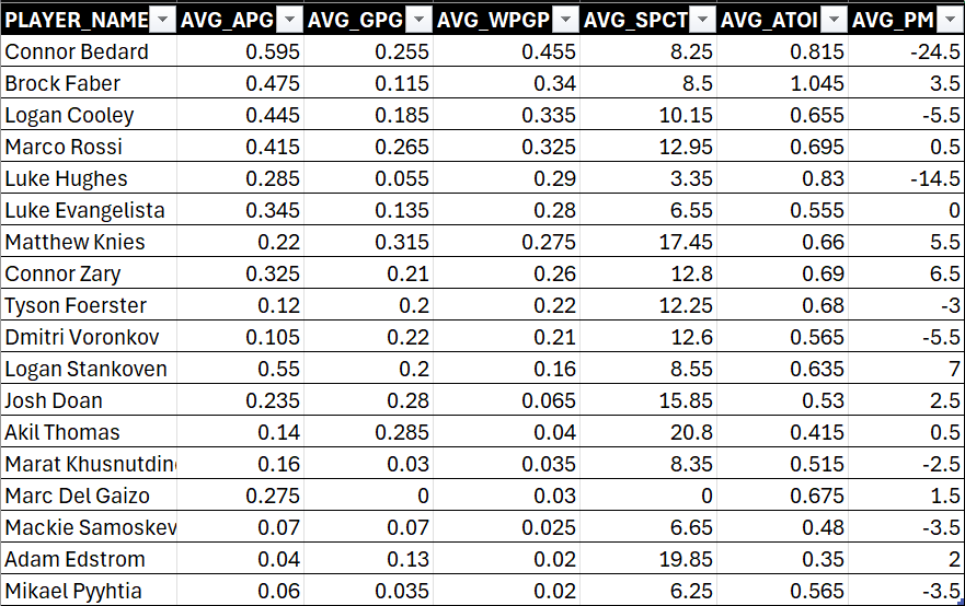
To create the heatmap visualization, open the CSV file using Microsoft Excel. You should see something similar to the below.
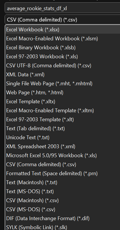
Next, save the file as an Excel workbook by clicking File, Save As, amending the file name, and selecting Excel Workbook, and clicking Save.
Create a new tab called Rookie_Heatmap and copy and paste the data from the average_rookie_stats_df tab into it.
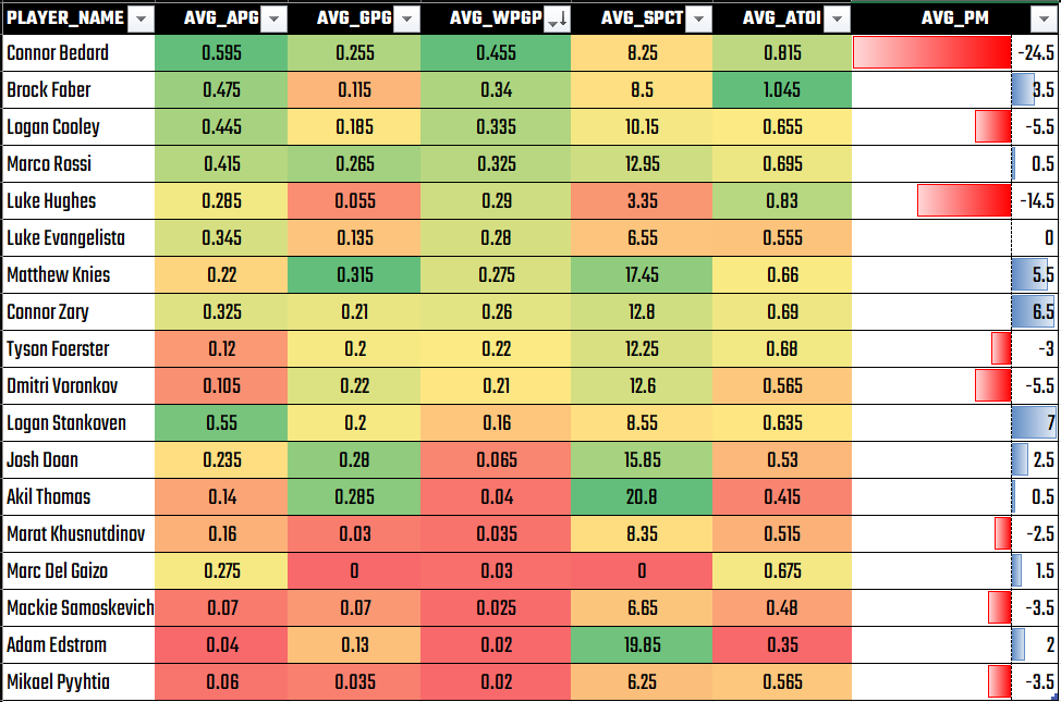
Click the upper left cell (A1) and select Format as Table, pick a design and click OK (when prompted to select the cell range). Your table should look like the below.
Select the cells in the AVG_APG column and click Conditional Formatting, Color Scales, and select a color scale. Your first column should now look something like the below.
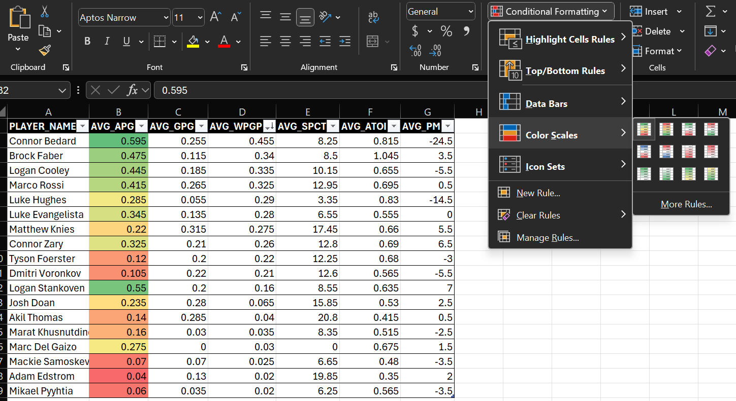
Repeat for all of the other columns. The only exception is for AVG_PM where instead of Color Scales, you'll select Data Bars.
You can also choose to configure the text and re-format the size of the font. We chose the Teko font and increase the font size.
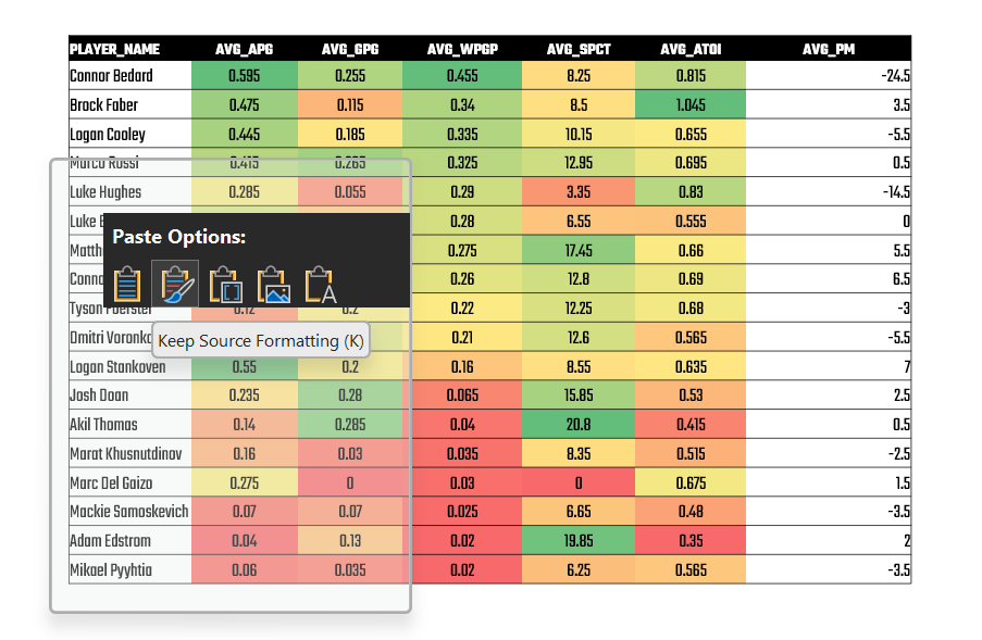
The final step is optional. If you want to present the above in a PowerPoint slide, you copy the heatmap and then paste it into a slide. When you paste the heatmap, right-click and select Keep Source Formatting as shown below.
You can then adjust the color of the cell borders and the colors of the AVG_PM numbers. You should now have something like the below.
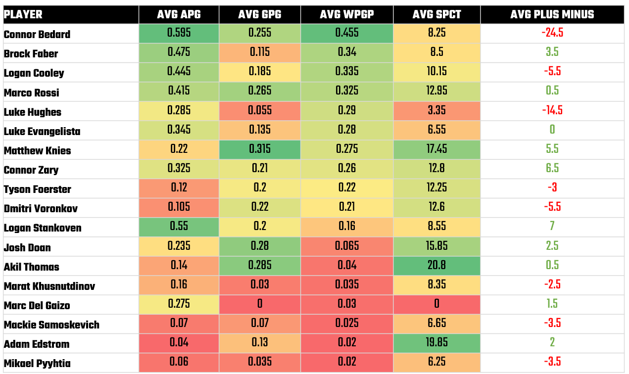
And that's it! You now have a heatmap that compares the top rookies in the NHL!
Looking for datasets and tutorials? Check out our Resources page!
Member discussion