Chart 4: Scatter Plot to Show the Top Enforcers

Creating a Scatter Plot using Datawrapper
Datawrapper is an easy-to-use online tool designed for creating interactive charts, maps, and tables without requiring coding knowledge. It's widely used by journalists, content creators, data analysts, and other professionals to visualize data in a clear and compelling way.
In this tutorial, we'll build a scatter plot that answers the following question: Who is the Top Enforcer in 108 Years of NHL Hockey?
What is a Scatter Plot?
A scatter plot (also known as a scatter chart) is a type of data visualization that displays the relationship between two numerical variables. Each point (or dot) on the chart represents an observation in the data, with one variable's values plotted on the x-axis and the other variable's values on the y-axis. This allows you to see patterns, trends, and potential correlations between the variables.
Within a scatter plot, each axis represents a different variable. For example, in this tutorial, the Y axis is Total Fights and the X axis is Total PIM. Each point within the plot represents one observation. The position of each point is determined by the values of both variables. With Total Fights and Total PIM, a scatter chart shows where these two variables intersect. Scatter charts are also commonly used to assess the relationship between variables, of which there are typically three:
- Positive correlation: As one variable increases, the other tends to increase as well. The points form an upward trend.
- Negative correlation: As one variable increases, the other tends to decrease. The points form a downward trend.
- No correlation: The points are scattered without a clear pattern, indicating no relationship between the variables.
Scatter plots are used to explore the relationship between two variables, detect outliers (points that significantly deviate from the general pattern of the data) and visualize regression lines (which show the best-fit line that describes the relationship between variables).
Getting the Resource Files
The resource files for this tutorial can be found below:
You'll use R/RStudio, Microsoft Excel (or equivalent spreadsheet application) and Datawrapper in this tutorial.
Let's get started!
Step 1: Download the Data
For this tutorial, download the player data into a new folder you create locally.
After you create a new folder and download the player data, open it using Microsoft Excel to verify it downloaded correctly.
At this point, continue to Step 2.
Step 2: Load and Transform the Data
The next step is to load and transform the data. You'll use R and RStudio to do this.
To load and transform the data:
- Open RStudio and create a new project in an existing folder (use the folder you created above).
- Create a new file for the project. (We use Markdown files so we can re-use the file for application documentation.)
- Add the following application code to the R Markdown file.
The first code snippet loads the dplyr library that you will use in the application.
library(dplyr)
The second code snippet loads the CSV file you downloaded and cleans, transforms and adds a new statistic: PIM per Game (PIM_PG).
nhl_player_df <- read.csv("all_player_stats_1917_to_2024.csv")

nhl_player_df <- nhl_player_df %>%
  filter(PLAYER_NAME != "League Average")

top_fighter_df <- nhl_player_df %>%
  select(SEASON, PLAYER_NAME, TEAM, POS, GP, PIM, HIT) %>%
  mutate(PIM_PG = round(PIM/GP,2))
The final code snippet gets the top ten players in the dataset and saves them to a CSV file.
top_goons_by_pim <- top_fighter_df %>%
  group_by(PLAYER_NAME) %>%
  summarize(TOT_PIM = sum(PIM, na.rm = TRUE), AVG_PIM_PG =  round(mean(PIM_PG),2)) %>%
  filter(TOT_PIM > 3000) %>%
  arrange(desc(TOT_PIM)) %>%
  slice_head(n = 10)

write.csv(top_goons_by_pim, "top_goons.csv", row.names = FALSE)
You can now use the CSV file to create a new visualization in Datawrapper.
Step 3: Create a Visualization
To create the visualization, navigate to Datawrapper and work through the process of creating a new scatter plot. To do this:
- Click Create New in your dashboard.
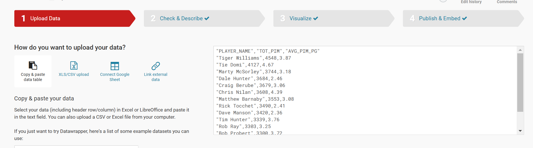
- Click XLS/CSV upload, navigate to the data you saved in the last step, and make sure it appears correctly.
- When done, click Proceed.
In the Upload Data step, click XLS/CSV Upload and navigate to the CSV file you just downloaded. Click Proceed (or Check & Describe) and verify that the data is accurate.
Next, click Visualize and select Scatter Plot. This will plot the TOT_PIM and AVG_PIM_PG on the plot. You can now click the Refine tab to configure the visualization. You can see the choices we made below for the horizontal and vertical axes.
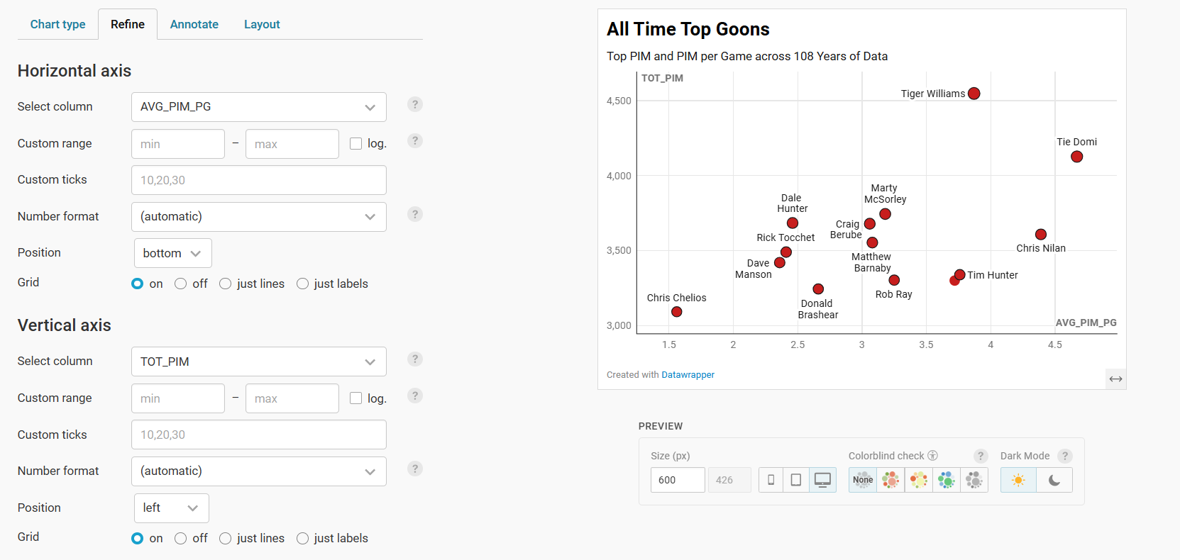
When you scroll down on the Refine tab, you'll see some other options to select from, such as color of marker, opacity, size, and so on.
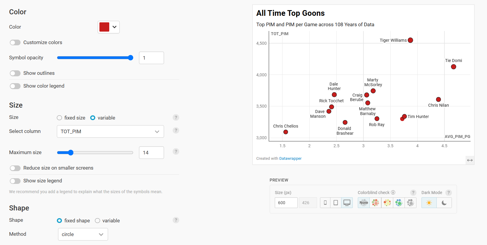
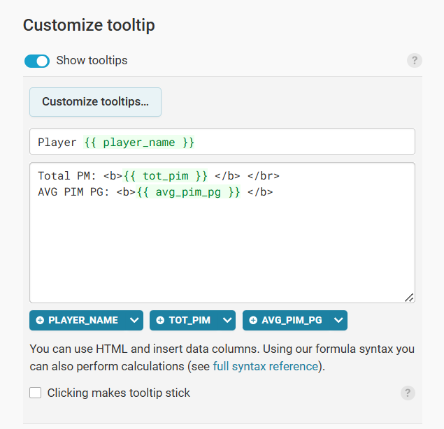
You can use the Annotate and Layout tabs to further configure the scatter plot to your liking. Note that you can create custom tooltips for your scatter plot, so when you mouse over the markers, the visualization displays information about the player.
When complete, click Publish & Embed to complete the publishing of the plot. Here you click Publish (or Republish).
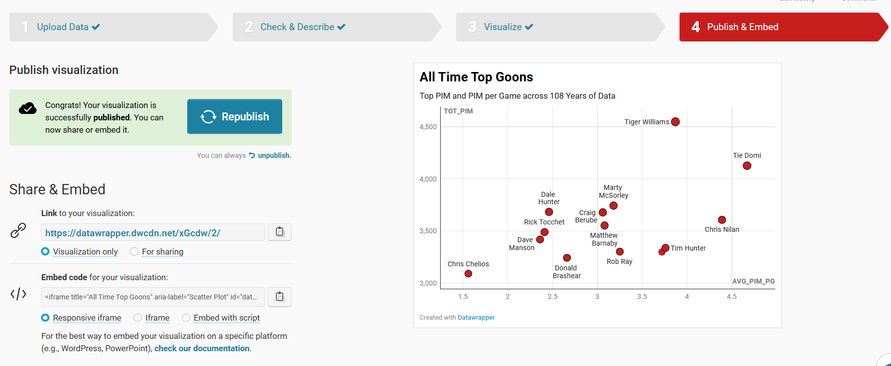
At this point, your visualization is published and ready to integrate into other content platforms.
Step 4: Integrate the Visualization in your Content
The final step is to integrate the Scatter Plot in your content. This could be an article, report or even a PowerPoint presentation. Datawrapper is a great tool to use to integrate with your content because the charts and maps are displayed as interactive and dynamic charts.
To do this:
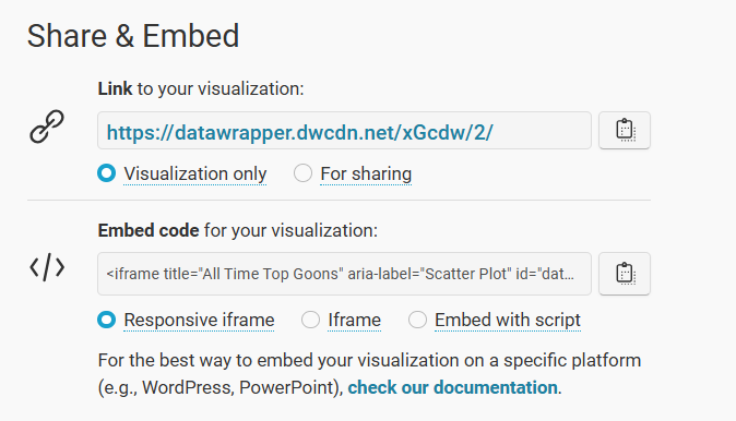
- Click the copy icon on Share & Embed.
- In your content platform, copy and paste this code into the HTML module. Note that where you find this may be specific to that platform, but most content platforms have this feature.
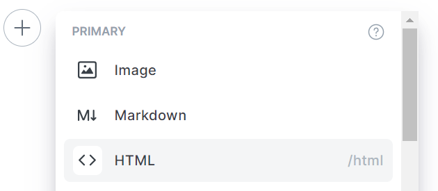
- Copy the embed code into the HTML module.
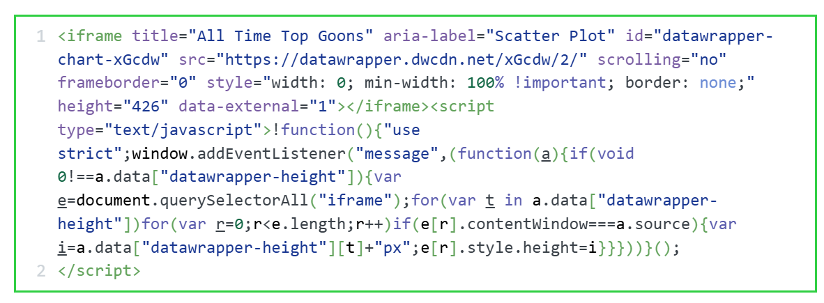
Depending on your platform, you can now preview the page and the Scatter Plot will be live and interactive.
Looking for more datasets and tutorials? Check out our Resources page!
Member discussion