Putting the Team Balance Index to the Test
At a Glance
Introduction
In this season's inaugural newsletter, we introduced you to the idea of composite metrics (and Crazytown). The example metric we explored was called Team Balance Index (TBI), representing offense, defense, goaltending and grit. We like composite metrics because they can be useful ways to break down a team's performance into dimensions. They are by no means the one way to measure it all, but directionally they can be useful.
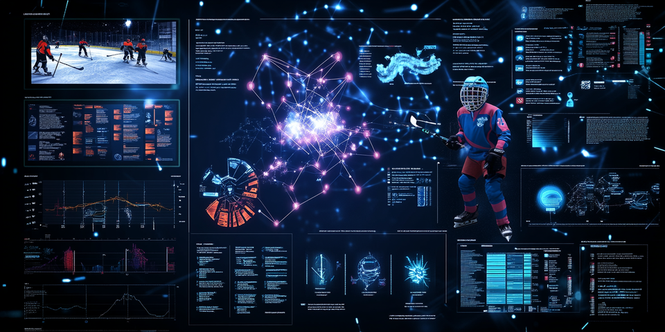
This week, we want to put the metric to test and see what it looks like when we analyze actual data. That is, when we analyze teams using the metric, does it make sense? Can we discern something useful from the analysis? To do this, we'll take a snapshot of 2024-2025 NHL data and build a set of reports in Power BI.
What is TBI
In modern hockey analytics, you often look at team performance through single-dimension metrics — Goal Differential, Corsi, Power-Play Percentage, Penalty Kill Percentage, etc. These are great ways to analyze a specific part of a team's game, but hockey, by nature, is a multi-dimensional game. Teams win not just because they score or defend well, but because they maintain balance across phases of play.
That’s where the TBI comes in.
TBI is a composite metric designed to allow us to measure how evenly a team performs across key dimensions of the game — offense, defense, goaltending and grit. Think of it as a “consistency score.” A team with a high TBI may not dominate any one area, but they rarely collapse in any either.
The reason we wanted to start developing a composite metric is that during the playoffs, we started noticing that there were key dimensions that mattered. For example, in the 2025 NHL Stanley Cup Finals, Edmonton and Florida played off for the Cup. And while the Oilers were technically stronger on offense, they fell behind significantly in goaltending and physicality. And in the playoffs, having a strong physical presence on the ice is a significant differentiator.

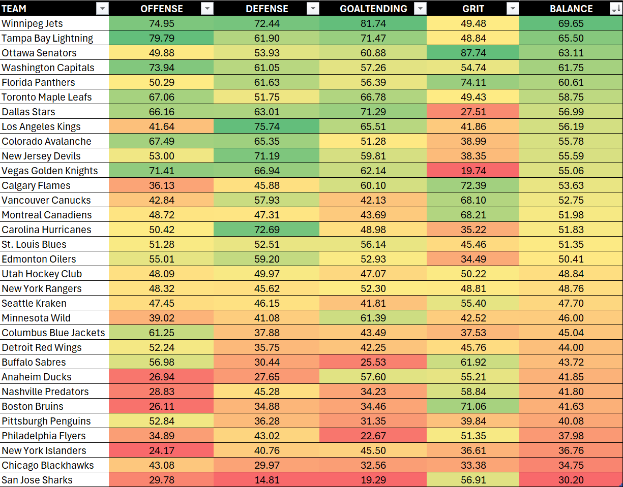
If you've watched the Panthers, you know they kind of feel like they're the gritty understudy of the Broad St. Bullies of the late 70s, early 80s with a heck of a lot more production prowess. As you can see from above, they scored high in Grit and Goal, and their overall Balance was significantly higher than Edmonton.
Short of having all core hockey statistics light up a heatmap, we wanted a more generalized, normalized set of dimensions that we could use as higher-level indicators. The goal of TBI isn't to replace traditional measures like Expected Goals Differential (xGD) or Win Probability (WP%); it's more to complement them by introducing structural balance as a concept. It asks: Is this team’s success sustainable because it’s evenly distributed, or fragile because it leans on one dimension?
As an example, here's a summary view of all NHL teams from the 2024-2025 season. The view is sorted by Balance, but you can see where teams are stronger or weaker in specific areas.
This season, our goal is to use TBI to predict consistency, track progress for team performance (across key dimensions), identify regression candidates, and profile teams that may be bound for the playoffs. The magic of TBI is that it’s not descriptive; it’s diagnostic. It tells you not just how well a team is performing, but how stable that performance profile is.
Why Build a Dashboard
Once you calculate TBI, the next step is to make it usable — not just a static metric that sits in a spreadsheet. This is where dashboards come in. In our practice, we use tools like Excel, Google Sheets, Power BI, and Tableau for building reports. (For more sophisticated modeling, we also use RStudio and Python.) For this week, we'll focus on Power BI.
A dashboard turns data into a living, breathing report. By connecting your TBI dataset to a live data source — say, a CSV that refreshes daily from the NHL API or your own data pipeline — you can:
- Track how team balance evolves over time.
- Compare balance versus performance metrics like win probability.
- Identify outlier teams whose balance diverges from results (e.g., a team that wins despite poor balance).
For analysts, this means turning the TBI from a post-hoc insight into a decision-support tool. Imagine updating your dashboard each morning and instantly seeing which teams’ balance improved overnight or which are trending toward instability.
The benefits of a dashboard that is powered by a data pipeline is as follows:
- Automation Saves Time: No more manual data imports — Power BI or Tableau can connect to an auto-refreshing dataset.
- Immediate Insight: Changes in team performance reflect in real-time visuals.
- Interactive Storytelling: Filters and slicers let you isolate divisions, weeks, or opponents.
- Collaboration: Coaches, analysts, and creators can all work from the same, up-to-date source.
In short, a refreshable dashboard transforms your TBI model from an experiment into an operational analytics product. For creators and data storytellers, it’s also a way to visualize narratives dynamically — you can literally watch the story of balance evolve as the season progresses.
Building the Dashboard
Let’s build a Power BI dashboard that features three interactive reports:
- Balance Summary Report
- Balance vs Win Loss Ratio
- Balance vs Win Percent
Each report helps test the level of usefulness of TBI.
Step 1: Download and Explore the Data
The data that sits behind the dashboard is below:
You'll want to create a new folder on your local drive and download the CSV dataset into the folder.
After you've done this, explore the dataset. You'll find metadata (e.g., TEAM_ID, TEAM, etc.) and values (e.g., GAMES, WINS, LOSSES, etc.).
At this point, you can add your own calculated fields, remove columns, etc. and then re-save the file.
Step 2: Load Data into Power BI
Now that you've explored (and potentially transformed the data to your liking), it's time to load the data into Power BI.
- Open Power BI Desktop.
- Go to Home → Get Data → Text/CSV.
- Select your file.
- Click Load.
- In the Model view, verify that all columns are correctly typed (numbers, decimals, text).
For refreshable data:
- Replace the static CSV path with a web-connected data source (e.g., a daily JSON feed or API endpoint).
- In Data Source Settings, set your refresh schedule (e.g., every 24 hours).
Note that if you're new to Power BI:
- You can download and install the desktop (free) version from here; and
- Download the Balance Dashboard from here or create a new Power BI file and start from scratch creating the reports.
Step 3: Create the Reports
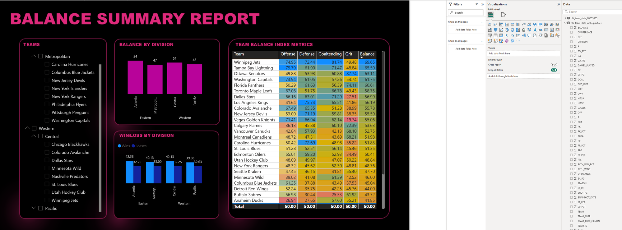
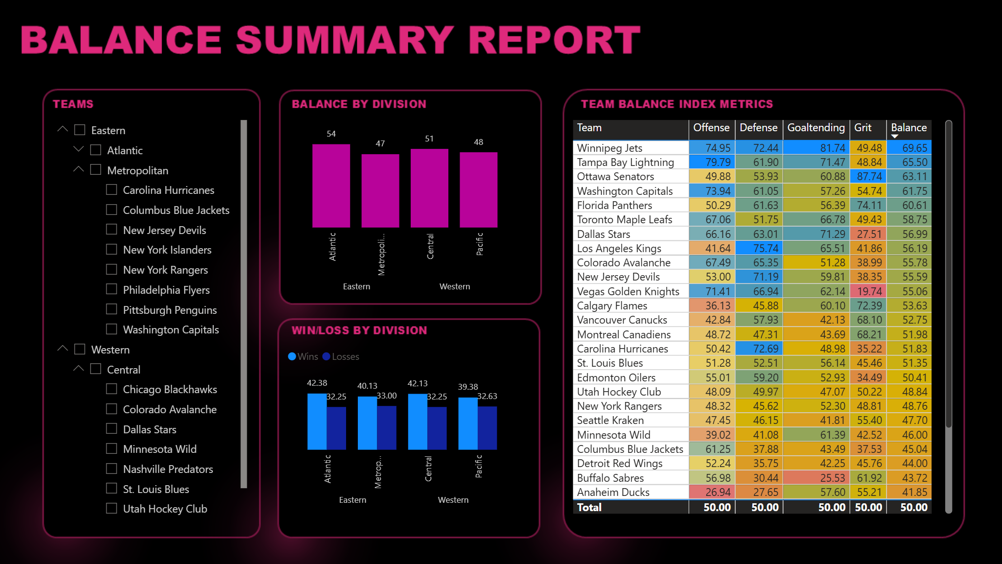
Power BI is a relatively straightforward user interface. You click the report canvas, select the visualization you want and then drag the data to the appropriate fields. Each visualization has a slightly different configuration. For example, the following report (Balance Summary Report) has a Slicer control (which acts as a filter), two Column charts and a Table. To the right of the report are the Filters, Visualizations and Data panes – which you can configure at the visualization and page level.
The types of visualizations and controls that are used in each of the reports are as follows:
- Balance Summary Report - 1 Slicer control, 2 Column charts, & 1 Table
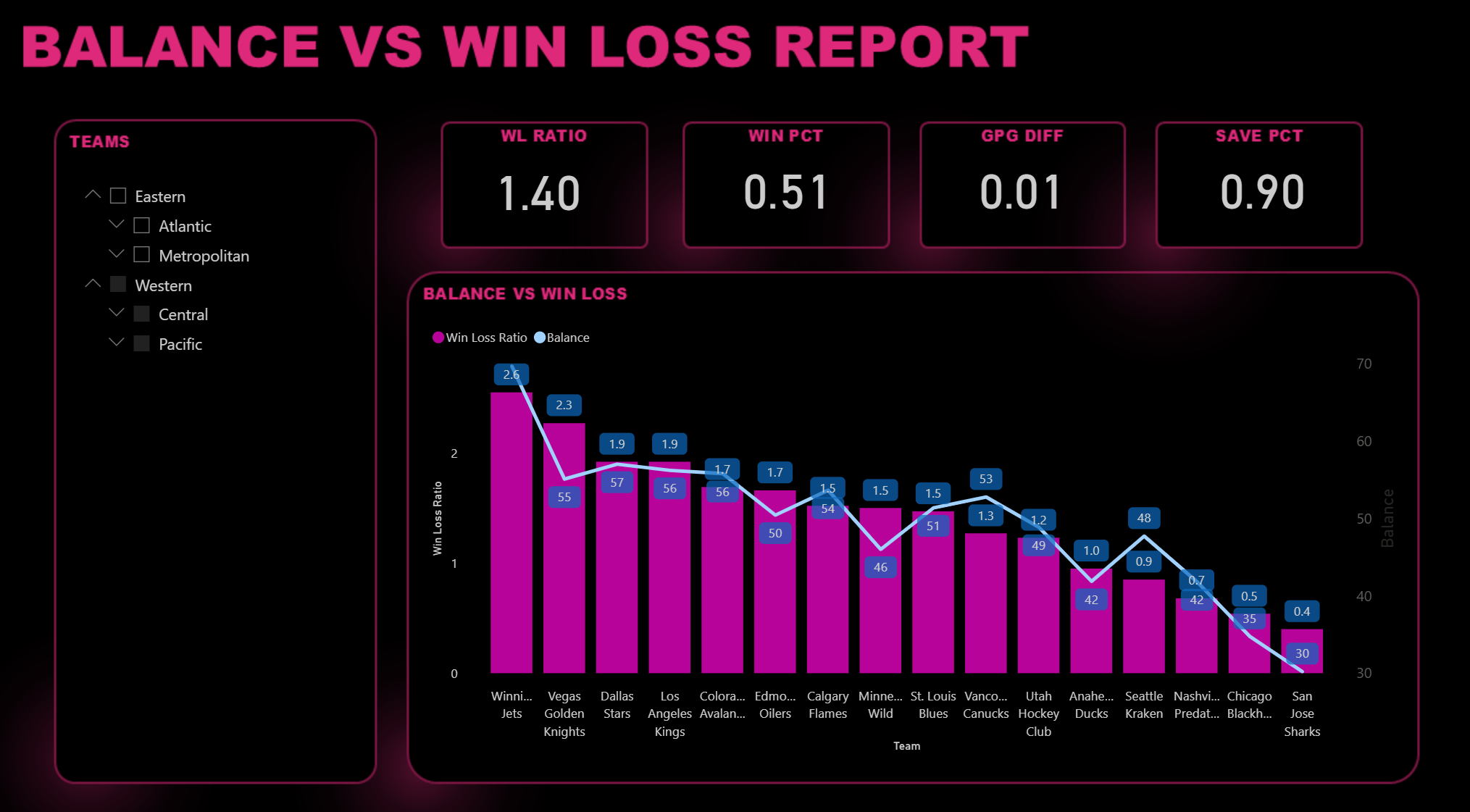
- Balance vs Win Loss Ratio - 1 Slicer control, 1 Line and Clustered Column chart, and 4 Cards.
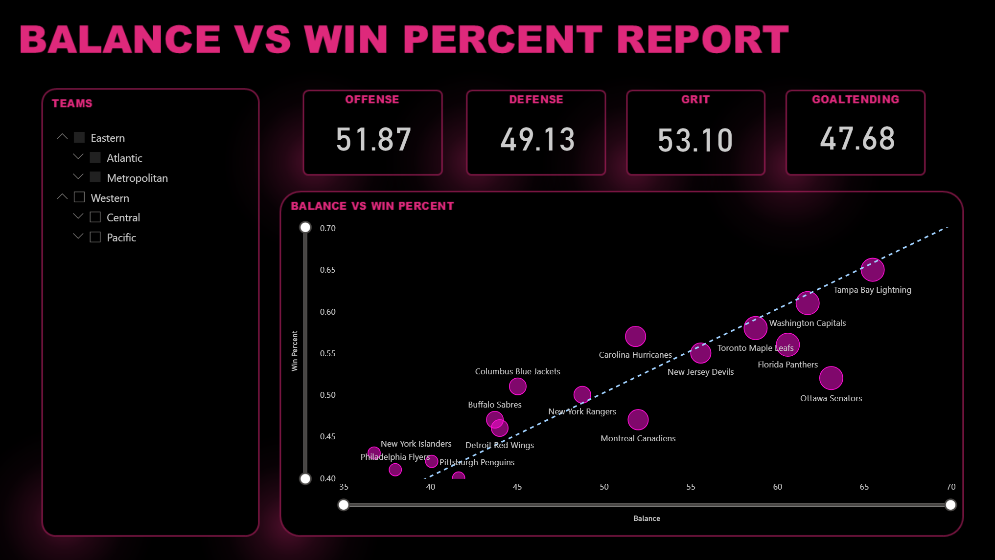
- Balance vs Win Percent - 1 Slicer control, 1 Scatter chart, and 4 Cards.
You can also click View, Themes and then quickly create a similar theme across the reports.
Testing the Metric
By the time you finish, you’ll have a starter dashboard that begins to show how Balance shows up across the league (through the lens of the 2024-2025 NHL season).
You’ll be able to see:
- How the conferences, divisions and teams compare when it comes to Balance and other metrics.
- The relationship between Balance and the Win/Loss ratio of teams (along with related metrics).
- The relationship between Balance and Win Percentage for teams (along with related metrics).
So, how does TBI hold up?
For each report, it is evident that there is potential merit in TBI (in the least as a novelty metric). For example, the Balance Summary Report shows that there are significant differences across each division when it comes to Balance. The Metropolitan division has the lowest Balance score, and when you scan the teams through the heatmap table, you can see where some teams have weaknesses (even though they may have higher Balance scores).
The next report, Balance vs Win Loss Report, also shows some interesting data. Here we begin to see the relationship between the Win/Loss Ratio and Balance. Here, we've filtered on the Western Conference, but you can see the average scores above the Line and Clustered Column chart and the fact that the line and columns in the chart run in the same direction (implying a relationship between them). We'd want to test further, but a preliminary takeaway would be lower Balance runs in the same direction as lower Win/Loss ratios. (We'd want to more deeply test the correlation to gauge what drives the win or loss.)
The final report is the Balance vs Win Percent Report. Here, we chose a Scatter chart because we wanted to poke a bit more at the relationship between Balance and the likelihood that a team will win. The Win Percent score is based on the Pythagorean Win Probability (aka Pythagorean Expectation), which uses Goals For and Goals Against to create a win probability between 0 and 100. Here, we can see a positive correlation – and it looks pretty strong.
Our takeaway then?
This first exploration shows:
- Interesting differences within each team across the dimensions of Balance;
- An ability to compare Balance across teams, divisions and conferences; and
- Untested correlations with Win/Loss Ratio and Win Percentage.
This gives us evidence for directionality; however, we'd want to go back into the calculations and redo them to improve the ability to use Balance as a predictor. For example, Shots on Goal (SOG) is one of the offensive metrics that makes up Balance, and on its own SOG is not a great predictor. However, if you were to filter on SOG close to the net (such that distance becomes a factor), this impacts the ability to score thus impacts the predictive value of one of the constituent variables.
Point being: raw hockey stats in and of themselves are directional, so useful, but not always predictive.
Summary
In next week’s newsletter, we’ll spend a bit more time with the TBI dashboard, perhaps exploring the relationship with other metrics, to see how much usefulness we can squeeze out of the composite metric in its current form. We'll also explore how you can use Power BI dashboards to tell a story with this type of metric.
We surmise some use; however, believe that truer value will arrive when we go back and tear apart and reconstitute the composite metrics to calculate a more predictive metric. Then, it could get interesting.
Sign up to get free access to more weekly content and courseware on all things Hockey Analytics.
Member discussion