Who are the Top Forwards Taking Their Team to the Playoffs?

Why elite point producers don’t matter equally — and where they will swing series if the playoffs started today
At a Glance
- Top NHL Point Producers
- Top Players Don't Guarantee A Playoff Spot
- So Who Cares
- Reproducing the Analysis
Introduction
A small cohort of top point-producing players are driving the numbers across the NHL. However, if the NHL playoffs started today, we’d be talking about 16 teams but far fewer of these top players.
To hit the postseason, teams have to be firing on multiple cylinders, one of which are forwards who can bend a series. These are players who force system changes, break structure and execution, and put defense on their heels. But not all of these impact players will see the playoffs, so the question driving this week's newsletter is:
Which forwards are producing at elite levels and does it matter for a team's playoff aspirations?
To answer this question, we'll use three datasets (curated from our daily data pipeline run):
- The top 35 forwards (top 25% of the top quartile by point production);
- Team Balance Index (TBI) scores to understand the environment each forward operates in; and
- Rolling 20-game points-per-game trends to check whether production is real, rising, or fragile.
Through an analysis of this data, we will separate great point producers from potential playoff teams.
Check out our YouTube short, featuring "Puck Baby", for a quick-hit video on this topic.
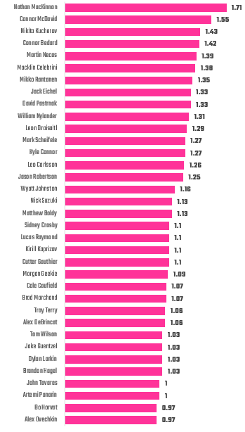
Top NHL Point Producers
The top of the Points per Game leaderboard is dominated by players operating at the highest levels in the NHL. These are the top 6.25% of the league, which roughly translates to the ability to score 1 or more points per game.
These aren’t just “top scorers.” At ~1.3–1.7 points per game, these players are determining the outcomes of games through their performance. Here are a view of the top point-producing cohort.
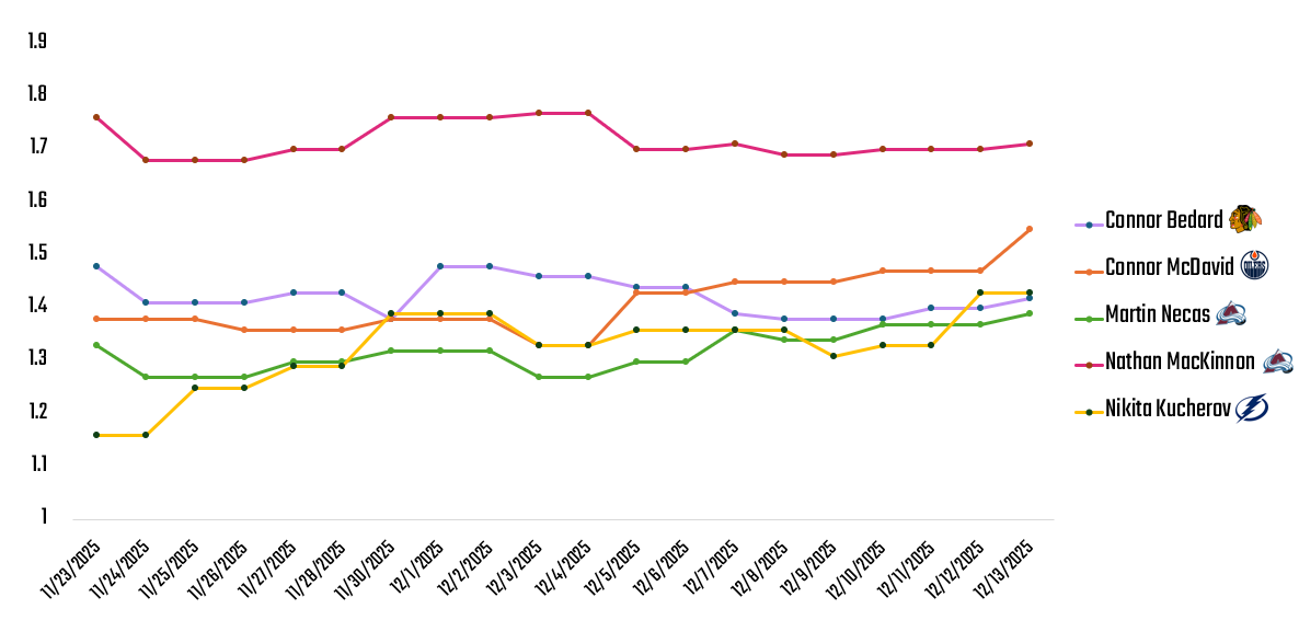
While it's great to see the top 6.25%, it's even more impressive to see the top 5 forwards and their performance across the past 20 games. The clear leader in the league is Nathan MacKinnon followed by Connor McDavid, whose performance is on the increase over the past 10 games.

MacKinnon has been remarkably consistent at around 1.7 Points per Game, and those below him are trending to an average of 1.38 Points per Game. (Though, note McDavid's steady climb.)
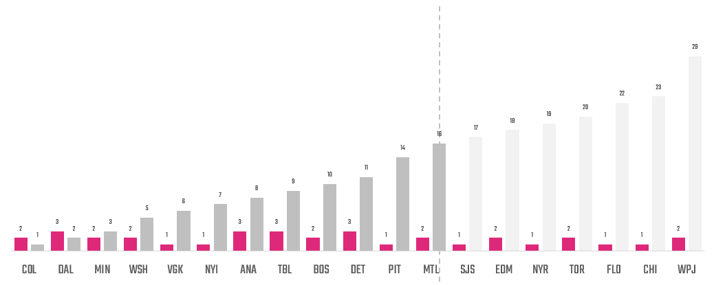
Scoring only becomes leverage when it compounds with opportunity, so it's important to look at how point-producing forwards can help their team make the playoffs. For example, if we were to start the playoffs today, here are the teams that would make it along with the number of top point-producing forwards. For the top teams on this list, we see some strong forwards who can help lead outcomes for that team. However, we also see top forwards whose teams may not make the playoffs – begging the question of does it really matter?
Now, even though these top 16 teams have top point-producing players, it doesn't automatically mean they will make the playoffs and hoist the Cup. To explain, let's dig into the 'balance' of the team across offense, defense, goaltending, and physicality.
Top Players Don't Guarantee a Playoff Spot
Earlier this season, we introduced a novelty metric called Team Balance Index (TBI) or Balance. We created this metric to represent four key dimensions of play, which in the playoffs need to be all moving in the same direction. Balance is the average of four composite metrics (Offense, Defense, Goaltending and Grit), which you can see below. What's interesting about this metric is it positively correlates to Win Probability – notionally a better-balanced team has a higher probability of winning, which you can see below.

Further you can see the breakout of how each team is performing across the four dimensions. For example, below you can see a snapshot view of the 16 teams that would make the playoffs if we were to play them today (or as of the day of us writing this article). The key dimensions are called out below, along with the average – represented in the Balance column. Using the heatmap, you can see where teams may be performing lower or higher, such as Minnesota and the Islanders performing lower on Offense and most teams (except for the Bruins and Canadiens) performing lower on Grit. In short, higher numbers and green is better than lower numbers and yellow/red. And if a team is lower in multiple areas, then they make have a lot of work to do.
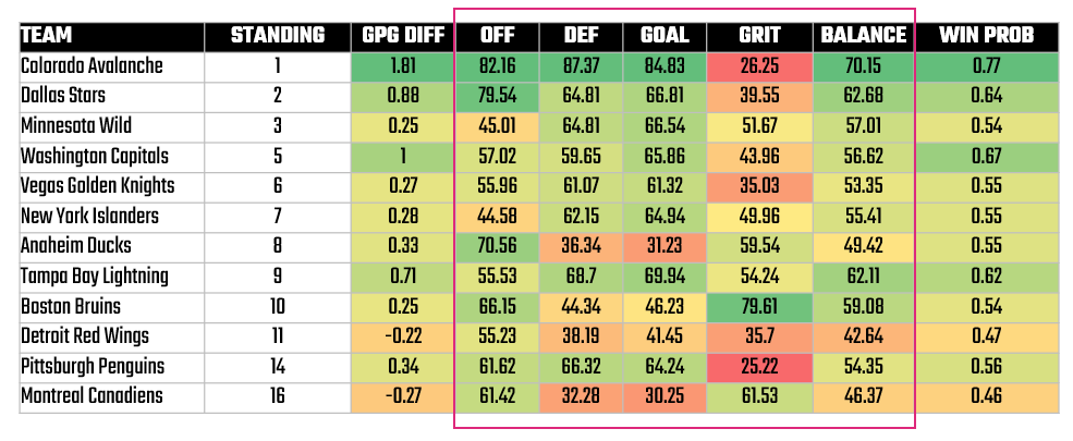
The way to use this view is not to just make conclusions about a team – e.g., Colorado needs a more physical game. While this may be true, the goal is to directionally use this view to understand why the dimension is performing lower and if this is a strategic part of a team's game.
With respect to top point producing players, we can use this heatmap to explore where a team would need to improve to help make the most out of their top forwards.
Who Cares
So, why would we do this type of analysis? Who cares? Two main reasons.
First, it's good to understand who is moving the league – and how much of an exclusive group this is. When it comes to point producers, it's a surprisingly small group compared to the rest of the NHL. And within this group, you can understand who, age-wise, might be maturing into free agency or out of the league and who might be the next up-and-comer in the league.
Second, we wanted to understand their team's proximity to playoff potential. If a team has the top point producers, but is not poised for a playoff spot one should ask why – and seek to understand where teams could improve. This provides another layer when thinking about predicting whether a team will make (and succeed in) the playoffs.
Beyond that, our higher-level goal is to get you thinking about how to connect data across different contexts. You can unearth interesting insights and relationships when connecting data, and this is a simple example of how to do this.
Reproducing the Analysis
Part of why we do this newsletter is to help the hockey community improve their understanding of analytics and AI – and we learn from you. With that in mind, here's how we created this analysis so you can reproduce it and hopefully make it better.
We've built a daily data pipeline that curates datasets, metrics and views from our paid data provider (My Sports Feeds). We primarily use Python and then implement R for specific, ad-hoc analyses. The files we curate were used for each of the analyses below.
Creating the View of Top Point Producers
Each day, we create an aggregated snapshot of all players and their statistics – in short, a summary view of their statistics. To create the view of the top point-producing forwards, we did the following:
- Filtered the player list on all forwards (C, LW & RW).
- Created a Quartile column using Points.
- Took the top quartile (top point-producing forwards) and then the top 25% of the top quartile.
- Created a separate view with key stats for that player (e.g., TEAM, GP, A, G, APG, GPG, PPG, etc.).
This gave us a snapshot of the top players, inclusive of their core stats.
Here's the link to the dataset:
Creating the Trend View of Top Point Producers
As a part of our data pipeline, we have a daily snapshot of each player's statistics. So, using a daily view, we can create trends across various stats. Depending on the tool, you would do this differently. We created this view in R (by creating a long view of the statistics) and then plotted in R and in Excel. R requires some coding skills, so if you're a beginner to hockey analytics start with Excel.
Here's the link to the dataset:
Creating the TBI View
The TBI view is a standard dataset we create on a daily basis. We pre-calculate the metrics as a part of our data transformation process, and this results in a daily view that we can use to evaluate the four key performance dimensions.
We make this daily dataset publicly available for you to use for your own projects/education. Below is an example snapshot.
Summary
In this article, we curated a list of the top 35 forwards based on points. This list is a small percentage of the overall NHL (~6%) and mostly comprises players who score 1 or more points per game. We then looked at their teams and discovered that many of those teams are not positioned to make the playoffs. If we were to start the playoffs on the day we did the analysis, seven of the teams wouldn't make the cut.
We then took our novelty TBI metric and used it to understand where those teams were strong and weak. Using a heatmap view, you can see where specific teams lack in areas, for example, like offense, defense, goaltending and physicality. Interestingly, many teams lack in the area of grit.
Using this analysis, you can reproduce a view where you a) curate the list of the top 6% of point-producing forwards (both from a snapshot and trend view) and b) see the likelihood that their teams will make the playoffs (and where they are strong and weak).
Subscribe to our newsletter to get the latest and greatest content on all things hockey analytics!
Member discussion