Finding the Top Snipers using K-Means Clustering

In this Edition
- Overview of K-Means Clustering
- Practical Use of K-Means Clustering
- Walkthrough: Finding the Top Snipers
Overview of K-Means Clustering
According to Brett Lantz (author of Machine Learning with R), "clustering is an unsupervised machine learning task that automatically divides the data into clusters, or groups of similar items. It does this without having been told how the groups should look ahead of time. Because we do not tell the machine specifically what we're looking for, clustering is used for knowledge discovery rather than prediction" (p. 348).
As a specific type of clustering approach, K-means clustering is a popular machine learning technique used for partitioning a dataset into distinct, non-overlapping subsets known as clusters. The goal of this algorithm is to group the data points into k clusters (k being a number), where each data point belongs to the cluster with the nearest mean (centroid), minimizing the variance within each cluster.
How the K-means Algorithm Works
The K-means algorithm operates through a process of iterative refinement. Here's a step-by-step outline of the algorithm:
- Initialization: Choose k initial centroids, which can be selected randomly or using specific methods that evaluate the number of groups based on the data.
- Assignment Step: Assign each data point to the nearest centroid, forming k clusters.
- Update Step: Calculate the new centroids as the mean of all data points assigned to each cluster.
- Repeat: Repeat the assignment and update steps until the centroids no longer change significantly or a predefined number of iterations is reached.
The objective function typically used in K-means clustering is the sum of squared distances between data points and their corresponding cluster centroids:
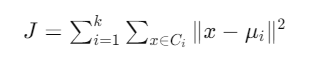
where:
- k is the number of clusters
- Ci is the set of data points belonging to cluster i
- x represents a data point
- μi is the centroid (mean) of cluster i
K-means clustering uses the Euclidean distance to measure the similarity or dissimilarity between data points and cluster centroids. Put simply, each cluster is created by how the data groups around the distance to the centroid, or arithmetic mean position, of that group. The centroid is the most commonly used distance metric in the K-means algorithm due to its simplicity and effectiveness in calculating the straight-line distance between points in a Euclidean space.

Key Characteristics of K-means Clustering
- Scalability: K-means is computationally efficient and scales well with large datasets. The time complexity is generally O(n * k * t), where n is the number of data points, k is the number of clusters, and t is the number of iterations.
- Convergence: The algorithm is guaranteed to converge, though it may converge to a local minimum rather than the global minimum. This characteristic can be mitigated by running the algorithm multiple times with different initializations and selecting the best outcome.
- Distance Metric: The algorithm relies on a distance metric, usually Euclidean distance, to determine cluster assignments. This makes it sensitive to the scale of the data, so preprocessing steps like normalization or standardization are often necessary.
- Cluster Shape: K-means assumes that clusters are spherical and equally sized, which may not always be the case in real-world data. This can lead to suboptimal clustering if the data has irregularly shaped or overlapping clusters.
Practical Use of K-means Clustering
K-means clustering is widely used across various fields due to its simplicity and effectiveness, for example:
- Market Segmentation: Identifying distinct customer groups based on purchasing behavior, demographics, or other attributes.
- Image Compression: Reducing the number of colors in an image by clustering pixel values and representing each cluster with its centroid color.
- Anomaly Detection: Identifying unusual patterns in data by detecting data points that do not fit well into any cluster.
- Document Clustering: Grouping similar documents based on the frequency of terms or topics.
- Simplifying Data: Creating smaller number of categories for "wide" data that helps describe relatively homogenous data.
Limitations and Improvements
Despite its advantages, K-means clustering has several limitations:
- Fixed Number of Clusters: The number of clusters – or k – must be specified beforehand, which is not always practical. Methods like the Elbow Method or Silhouette Analysis can help determine an appropriate value for k.
- Sensitivity to Initialization: Poor initialization can lead to suboptimal clustering. The K-means++ initialization method addresses this issue by spreading out the initial centroids.
- Difficulty Handling Outliers: Outliers can significantly affect the cluster centroids. Techniques like K-medoids, which use medoids instead of centroids, can be more robust to outliers.
K-means clustering is a powerful tool for partitioning data into meaningful clusters, making it a useful technique in exploratory data analysis and various practical applications. While it has its limitations, advancements and variations of the algorithm continue to enhance its effectiveness and applicability.
Walkthrough: Finding the Top Snipers
In this newsletter, we'll demonstrate how you can use K-means clustering to create clusters of players – specifically "snipers". We'll use Shot Percentage as the specific metric for determining the clusters, but you can take the principle of what we demo and apply other hockey statistics if you want.
To get started, create a new folder for the data and demo, download the dataset and explore the player data by looking at the different columns, data in the columns, etc.
To download the data and code, use the links below:
For the walkthrough, we'll use R and RStudio. Both are open source, and you can find more information on how to download and install here.
After you download and install R and RStudio, create a new project. To do this:
- Open RStudio and click File, New Project. Select Existing Directory, and navigate to the folder you created when downloading the player dataset.
- Then click File, New File, and R Markdown.
You'll now have the R Markdown file and dataset in the same folder.
The first code section in the R file will load the libraries you'll need for the K-means cluster analysis. You can see from the code snippet below, we'll use several libraries.
library(dplyr)
library(ggplot2)
library(tidyverse)
library(cluster)
library(knitr)
library(kableExtra)
Next, we'll load the CSV dataset you downloaded into a data frame called player_data. We'll then create a filtered version of the data frame that contains only centermen (POS == "C"), players who've played more than 20 games in the season we'll select (GP > 20), and only data from the 2023-2024 season (SEASON == "2023_2024"). We'll then select the columns we need for the K-means cluster analysis. The resulting data frame is called data_sniper.
player_data <- read_csv('multi_season_player_data.csv')

subset_player_data <- player_data %>%
  filter(POS == "C") %>%
  filter(GP > 20) %>%
  filter(SEASON == "2023_2024")

data_sniper <- subset_player_data %>%
  select(NAME, TEAM, GP, SHOT_PCT, PTS) %>%
  drop_na()
This next code snippet is longer, but does the following:
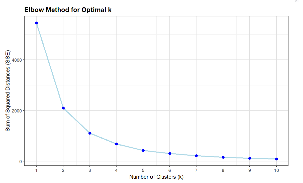
- It sets up a loop to perform K-means clustering on SHOT_PCT for k ranging from 1 to 10 clusters.
- For each value of k, it calculates the Sum of Squared Errors (SSE), which measures the compactness of the clusters.
- The SSE for each k is stored in the sse vector.
- It plots the results, which you can use to figure out the optimal k.
set.seed(42)
sse <- vector()
k_range <- 1:10

for (k in k_range) {
  kmeans_model <- kmeans(data_sniper$SHOT_PCT, centers = k, nstart = 25)
  sse[k] <- sum(kmeans_model$tot.withinss)
}

ggplot(data.frame(k = k_range, sse = sse), aes(x = k, y = sse)) +
  geom_line(color = "lightblue", size = 1) +
  geom_point(size = 2, color = "blue") +
    labs(
    title = 'Elbow Method for Optimal k',
    x = 'Number of Clusters (k)',
    y = 'Sum of Squared Distances (SSE)'
  ) +
  theme_bw() +
  theme(
    plot.title = element_text(size = 12, face = "bold"),
    axis.title = element_text(size = 10),
    axis.text = element_text(size = 8),
    panel.grid.major = element_line(color = "gray88"),
    panel.grid.minor = element_line(color = "gray95")
  ) +
  scale_x_continuous(breaks = k_range)
The resulting plot (using the Elbow Method referenced earlier in this newsletter) provides you with a way to decide the number of clusters you'll use as the k parameter in your K-means cluster analysis. The way to interpret the Elbow plot is that it shows where the SSE begins to decrease more slowly, which forms the "elbow" shape. By visually inspecting the Elbow plot, the optimal k is often at this elbow point because it balances the trade-off between having too few clusters (high SSE) and too many clusters (increased complexity with little SSE reduction). For our cluster analysis, we'll use 5 as the k parameter.
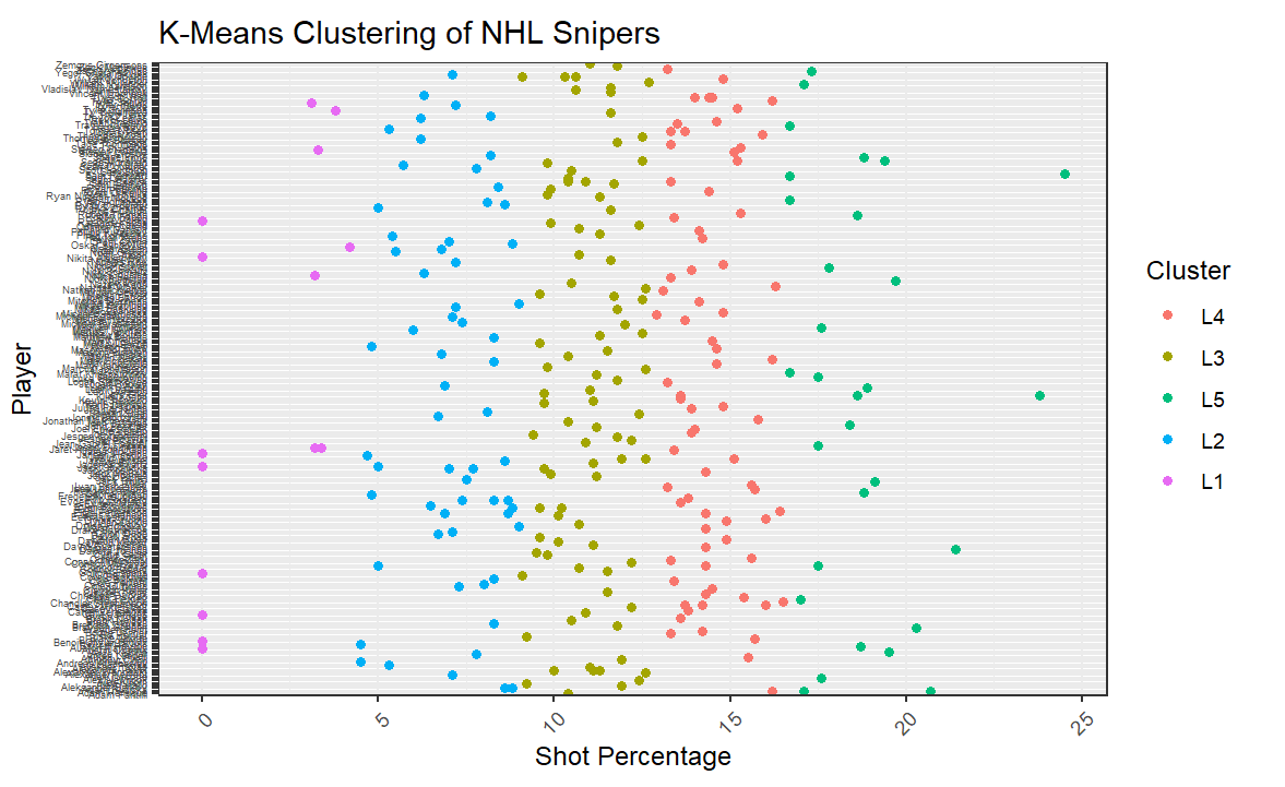
The next code snippet implements the K-means cluster analysis using the kmeans() function using the SHOT_PCT column.
We then plot the results.
set.seed(42)
kmeans_final <- kmeans(data_sniper$SHOT_PCT, centers = 5, nstart = 25)

data_sniper_cluster <- data_sniper %>%
  mutate(Cluster = as.factor(kmeans_final$cluster)) %>%
  mutate(Cluster = recode(Cluster,
                          `3` = "L5",
                          `1` = "L4",
                          `2` = "L3",
                          `4` = "L2",
                          `5` = "L1"))

ggplot(data_sniper_cluster, aes(x = NAME, y = SHOT_PCT, color = Cluster)) +
  geom_point() +
  labs(title = 'K-Means Clustering of NHL Snipers', x = 'Player', y = 'Shot Percentage') +
  theme_bw() +
  theme(axis.text.x = element_text(angle = 0, hjust = 1), axis.text.y = element_text(angle = 0, hjust = 1, size = 4)) +
  coord_flip()
The resulting visualization is partly useful; that is, the sample dataset contains too many players making the Y axis labels unreadable. However, at this point we're less concerned with the specific players across all clusters and more concerned with the shape (and boundaries) of the clusters. For example, here you can see that L5 (the best snipers – using the Shot Percentage as the determinant) start at around 16.5%.
But, remember we're trying to find the top sniper(s), so now that we've discovered the groupings using the cluster analysis, we can now explore these groupings a bit more and then figure out who are the top snipers (who play center) in the 2023-2024 season.
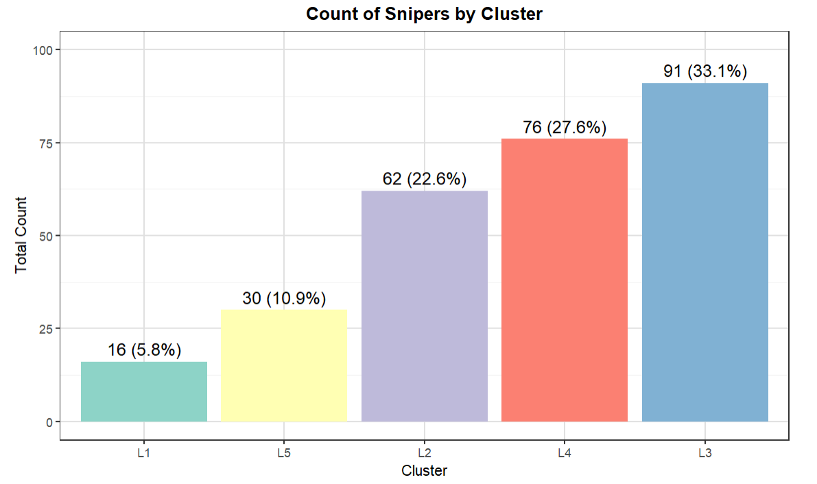
Let's first explore the total counts and percentages of players in each cluster. The below code creates a summary data frame and uses the total count in each cluster to create a percentage total – which we add as part of the labels in the visualization. We then plot the different clusters as a bar chart.
count_of_clusters_df <- data_sniper_cluster %>%
  group_by(Cluster) %>%
  summarise(TOTAL_COUNT = n(), AVG_SHOT_PCT = round(mean(SHOT_PCT),2)) %>%
  arrange(desc(AVG_SHOT_PCT))

total_count <- sum(count_of_clusters_df$TOTAL_COUNT)

count_of_clusters_df <- count_of_clusters_df %>%
  mutate(Percentage = TOTAL_COUNT / total_count * 100)

count_of_clusters_df$Percentage <- round(count_of_clusters_df$Percentage, 2)

count_of_clusters_df <- count_of_clusters_df %>%
  mutate(Cluster = fct_reorder(Cluster, TOTAL_COUNT))

ggplot(count_of_clusters_df, aes(x = Cluster, y = TOTAL_COUNT, fill = Cluster)) +
  geom_bar(stat = "identity", show.legend = FALSE) +
  geom_text(aes(label = paste0(TOTAL_COUNT, " (", round(Percentage, 1), "%)")), vjust = -0.5, size = 4) +
  labs(title = "Count of Snipers by Cluster", x = "Cluster", y = "Total Count") +
  theme_bw() +
  theme(
    plot.title = element_text(size = 12, face = "bold", hjust = 0.5),
    axis.title = element_text(size = 10),
    axis.text = element_text(size = 8),
    panel.grid.major = element_line(color = "gray88"),
    panel.grid.minor = element_line(color = "gray95"),
    panel.background = element_rect(fill = "white", color = NA),
    plot.background = element_rect(fill = "white", color = NA)
  ) +
  scale_fill_brewer(palette = "Set3") +
  ylim(0, max(count_of_clusters_df$TOTAL_COUNT) * 1.1)

count_of_clusters_df
The result from the above code is the visualization below. What's interesting is this shows the relative size of each of the clusters by total count and percentage of total. And L5, which represents the top snipers, is about 11% of the total NHL centermen in the 2023-2024 season.
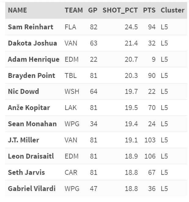
The final step is to focus more on L5, so in the following code snippet we create a data frame that filters the data further and arranges by Points (PTS). We then take the top ten players and sort it by Shot Percentage (SHOT_PCT).
sub_final_cluster <- data_sniper_cluster %>%
  filter(Cluster == "L5") %>%
  arrange(desc(PTS))

top_10_records <- sub_final_cluster %>%
  top_n(10, SHOT_PCT) %>%
  arrange(desc(SHOT_PCT))

top_10_records %>%
  kable("html") %>%
  kable_styling(full_width = F, bootstrap_options = c("striped", "hover", "condensed", "responsive")) %>%
  column_spec(1, bold = T) %>%
  row_spec(0, bold = T, background = "#D3D3D3")
The result is the following list that includes the name of the centerman, the team they play for, the total count of the games they played, their Shot Percentage and Points, and the Cluster – L5. From our analysis, we discover Sam Reinhart is the top sniper.
Lastly, whenever you publish or present a report like the above, it's good to note your assumptions. For example, if you're creating a new composite metric, and you want that metric to be adopted within the hockey analytics community, it should hold up to peer and expert scrutiny. In such a case, calling out assumptions creates a foundational understanding in your approach and statistical rationale and allows others to repeat your statistical experiments.
In the above cluster analysis, our assumptions were as follows:
- Top Sniper was defined using Shot Percentage. This may be limiting (i.e., there's more to a sniper than just Shot Percentage), so you'd want to evaluate what hockey statistic/composite metric works for you.
- We only took players who played more than 20 games. This is because we saw higher Shot Percentages in some players with low games. This didn't seem fair when comparing players who had endured more games in the season and had equally high Shot Percentages.
- We only used centermen in our sample. This could have filtered out strong wingers who also have high Shot Percentages.
You can also check out our quick-hit YouTube video below:
Summary
In this newsletter, we introduced you to clustering generally and a specific clustering technique called K-means clustering. K-means clustering is an unsupervised machine learning algorithm used to discover groups that you then use to do further analysis.
We walked through some of the practical uses of K-means clustering and then demonstrated how to discover the top snipers in the NHL using a K-means cluster analysis. We provided the resources for the cluster analysis, which are also listed below:
You can use the code as a template to try out other hockey statistics – either single metrics or your own composite metrics.
Subscribe to our newsletter to get the latest and greatest content on all things hockey analytics!
Member discussion