How to Create a Team-Level PDO Report

In this Tutorial
We walk you through how to create a PDO report addressing three questions:
- How do team's PDO scores compare?
- What is the PDO score trend for teams?
- What is the relationship between PDO and various hockey statistics?
We include a dataset and Power BI report that you can use to create and customize your own report.
Getting the Code, Data and Power BI Report
For this tutorial, you can find the code, data and Microsoft Power BI report links below:
- R Tutorial Code (to clean and create PDO dataset)
- PDO Dataset with hockey stats
- Power BI Sample Report
The R code file loads a larger game details file (Updated_DW_Game_Data_Details.csv) and does some minimal cleaning and saves the file with a different name (pdo_data_w_stats_by_game.csv).
pdo_team_data_df <- read.csv("Updated_DW_Game_Data_Details.csv")

pdo_team_data_df$GAME_DATE <- as.Date(pdo_team_data_df$GAME_DATE, format="%Y-%m-%dT%H:%M:%S.000Z")
pdo_team_data_df$GAME_DATE <- format(pdo_team_data_df$GAME_DATE, "%m-%d-%y")

write.csv(pdo_team_data_df, "pdo_data_w_stats_by_game.csv", row.names = FALSE)
Designing the Power BI Report
Our standard process for designing a Power BI report is as follows:
- Outline what questions we're trying to answer
- Sketch out the visualizations that help answer (or explore) those questions
- Mock up the visualizations (in Figma, PowerPoint or other design tools)
- Create the design for the Power BI report
For this tutorial, we're going to jump to the design stage.
An easy way to design a background for your Power BI report is with PowerPoint. That is, create a slide, add some shapes, choose your colors and then save the slide as a PNG file. You can then import the PNG file (as your report canvas background) when creating your Power BI report.
For our reports, we will have two reports (across two tabs) that together address the three questions. This requires two designs, one for each report. The first report design is below, which comprises four shapes, each of which will house a control. The controls are as follows:
- 1 Slicer control that acts as a filter for the report
- 1 Clustered column chart for the PDO scores (by team)
- 1 Area chart for a time-based view of the PDO scores (by team)
- 1 Text control for the title of the report

Similarly, we created a second design for the second Power BI report. This report will contain six controls. The controls are as follows:
- 1 Slicer control that acts as a filter for the report
- 4 Scatter chart controls (exploring various relationships between hockey stats and PDO scores)
- 1 Text control for the title of the report

After you create your report background designs, you can move on to the next step.
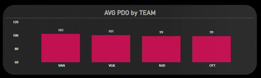
How Do Team's PDO Scores Compare?
One of our visualizations in the PDO report is a comparative view of PDO scores across NHL teams. For example, below is a visualization that shows the average PDO by team. It shows four teams; the average PDO scores represent the 2023-24 regular season.
The above visualization will be one of three controls on the first report (PDO Summary). To create this control:
- Open Power BI and click New, and then Report.
- Click Get Data, Text/CSV and Connect.
- Navigate to the pdo_data_w_stats_by_game.csv file you created earlier (see the R code in the section entitled Getting the Code, Data and Power BI Report.
- Click Open and Load. (You can at this point optionally choose to transform the data.)
After you complete the above, you should see the data loaded into the Power BI Data pane.
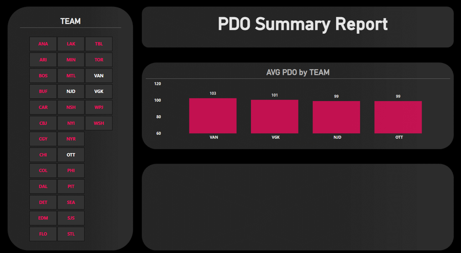
Add a Slicer control to the left-hand side of the canvas, a Text control in the title area and a Clustered column chart in the section below the title. For the Slicer control, drag the TEAM_ABB (team) data and configure to your liking. And for the Clustered column chart, drag and drop TEAM_ABB (team) to the X-axis and PDO to the Y-axis. Be sure to configure the PDO scores to be the average rather than the default sum. Lastly, add a title with your text of choosing.
After you've completed this, your report should look something similar to the below. Note that we've made the backgrounds of each control 100% transparent and used a similar color palette across the controls to get a decent contrast with the background design. To test the report, select one or more teams from the Slicer control and view their PDO scores in the AVG PDO by TTEAM visualization.
At this point, you're ready to add the next control, which will show PDO trending.
What is the PDO Score Trend for Teams?
The fourth control you'll add for our first report is a comparative view of PDO Scores for teams over time. The visualization you'll use is the Area chart. To create this visualization, click the Area chart control and then drag and drop GAME_DATE for the X-axis and PDO for the Y-axis. Configure the GAME_DATE to be Day and ensure the PDO is set to Average rather than Sum.
After you add the new visualization, your first report should look something similar to the below. Here again we've configured the design and color palette of the Area chart to align with the broader report design.
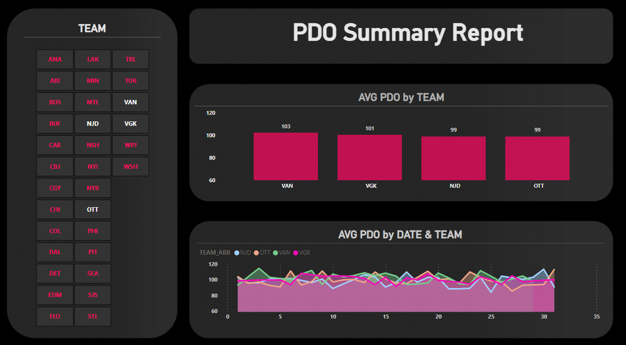
To test this first report, use the Slicer control to select different teams to compare them. You'll notice that with all teams selected, the Area chart is busy, so select a small set of teams to compare. This could be two teams, evaluating a forthcoming match-up or teams that comprise a division for an intra-division comparison. To demonstrate, we've left the same four teams selected in the Slicer control (VAN, VGK, NJD and OTT).
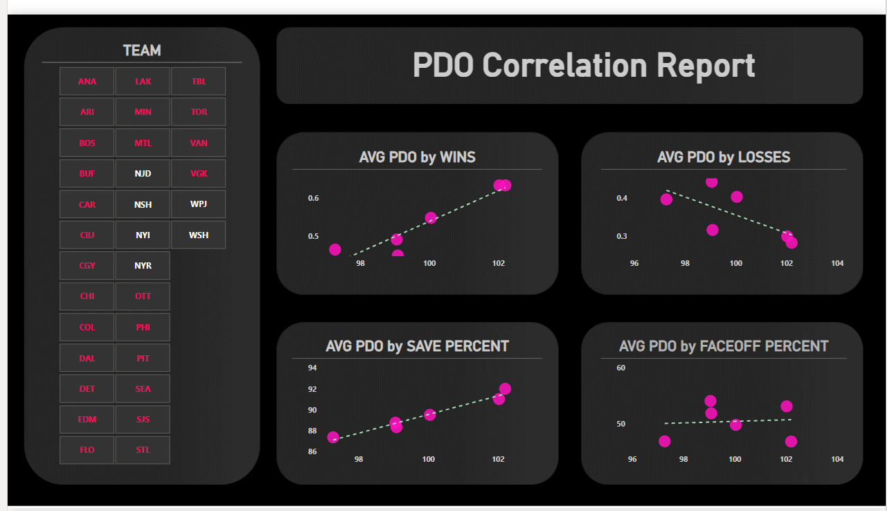
What is the relationship between PDO and various hockey statistics?
The second report explores the relationship between four hockey statistics and PDO: Wins, Losses, Save Percent and Faceoff Percent. Each Scatter plot is configured the same way:
- Click the Scatter plot control in the Visualizations pane
- Drag PDO to the X-axis (configure it to Average)
- For each of the four Scatter plots, drag WINS, LOSSES, SAVE_PCT and FO_PCT to the Y-axis, configuring all of these statistics to be the Average rather than Sum
Note that we added a trend line for each of the Scatter plots, so the direction (positive, negative or neutral) and degree of the trend line will indicate the nature of the relationship between each hockey statistic and PDO Score.
You should now have something similar to the below. You can see we've configured the controls and color palette to be consistent with the background design. You should configure yours per your design needs.
At this point, you should now have two tabs in Power BI, each with a report comprising multiple controls. Feel free to experiment with different hockey statistics and conduct more advanced analyses (such as linear regression models) if you see a relationship worth exploring.
Summary
The goal of this tutorial was to build a team-level PDO report. We did this by cleaning some data (using R) that we used as our starting point. We then brought that data into Power BI and created two tabs, each containing a report. The first report compares team's PDO scores and provides a trend view of those scores. The second explores the relationship across different hockey statistics and PDO.
Using the R code, dataset and Power BI report, you can explore and expand on this tutorial. In and of itself, PDO is an interesting calculated statistic. However, we recommend always looking to have supporting context for a metric so you can create and present a fuller picture.
If you'd like to read up more on PDO:
- Check out the newsletter edition entitled PDO: How Lucky are Ya?
- Chapter 7 in Joshua Pollock's Everything You Need to Know About Hockey Analytics.
Subscribe to our newsletter to get the latest and greatest content on all things hockey analytics!
Member discussion